

GLOBO GYM REBRANDING
Rebuilding a bold fitness brand for modern performance

SCOPE
Rebranding
INDUSTRY
Health/Wellness
Following a significant change in leadership and a period of negative public attention, Globo Gym faced the need to reestablish trust and credibility as a modern fitness brand. While the company maintained a strong presence and loyal following, its visual identity lacked the clarity and discipline required to support long-term growth. The rebrand focused on creating a cohesive, scalable system—refining the logo, typography, color palette, and iconography to bring structure and consistency across all physical and digital touchpoints. The result is a confident, performance-driven identity that is designed to push the brand forward.
01
DISCOVERY & STRATEGY
The discovery phase identified a clear opportunity to reposition Globo Gym away from its legacy of intimidation and toward a more empowering, inclusive form of aspiration. While competitors emphasize either passive acceptance or high-intensity toughness, Globo Gym occupies a distinct space centered on self-defined progress—helping members become who they want to be, not who a gym tells them to be. This strategy prioritizes confidence without ego, inclusion without indifference, and structure as a tool for empowerment rather than control.
Projected goals/impact
Improved brand clarity and visual consistency across digital and physical touchpoints
01
Increased recognition of core offerings through simplified iconography and hierarchy
02
Scalable identity system designed to support future locations, campaigns, and products
03
02
visual identity system
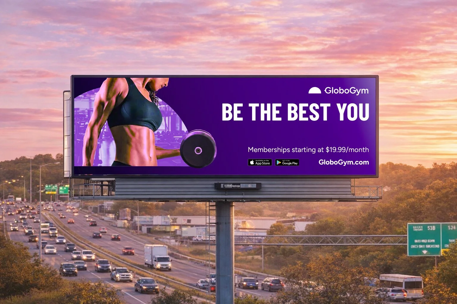
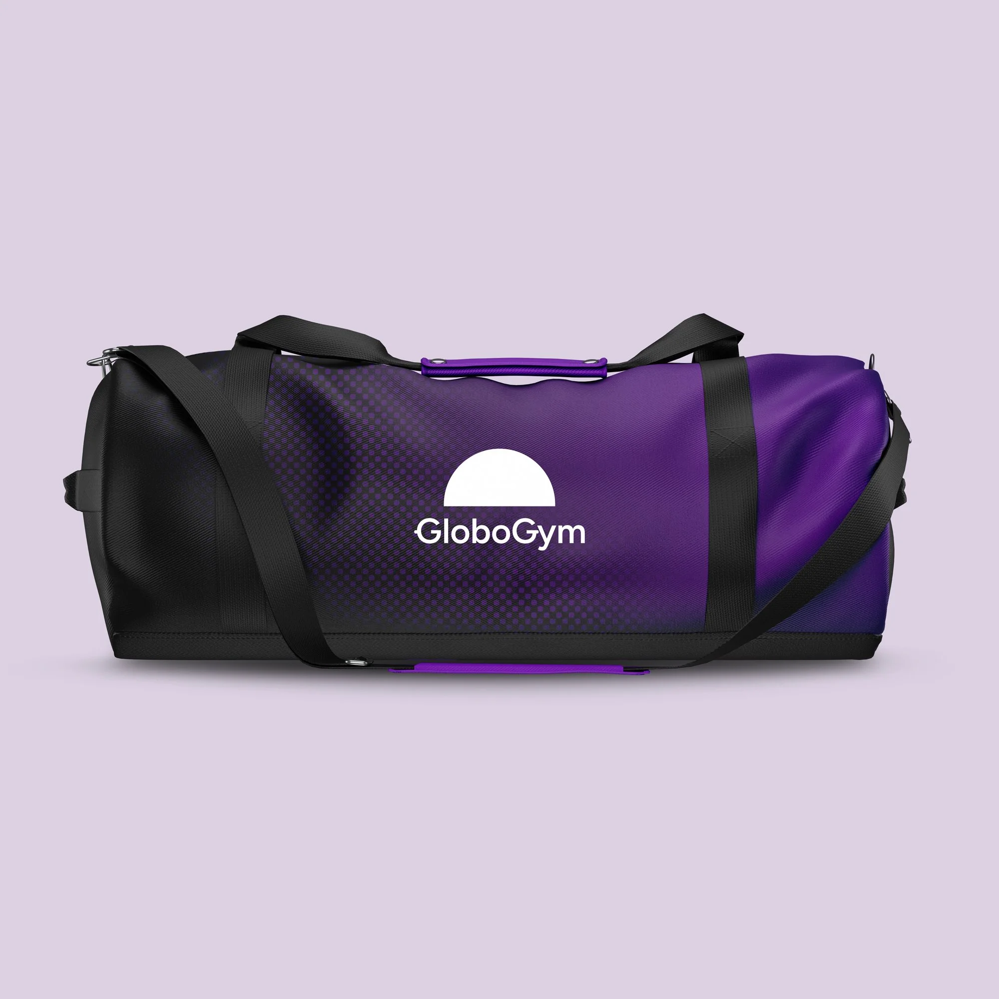
LOGO DESIGN
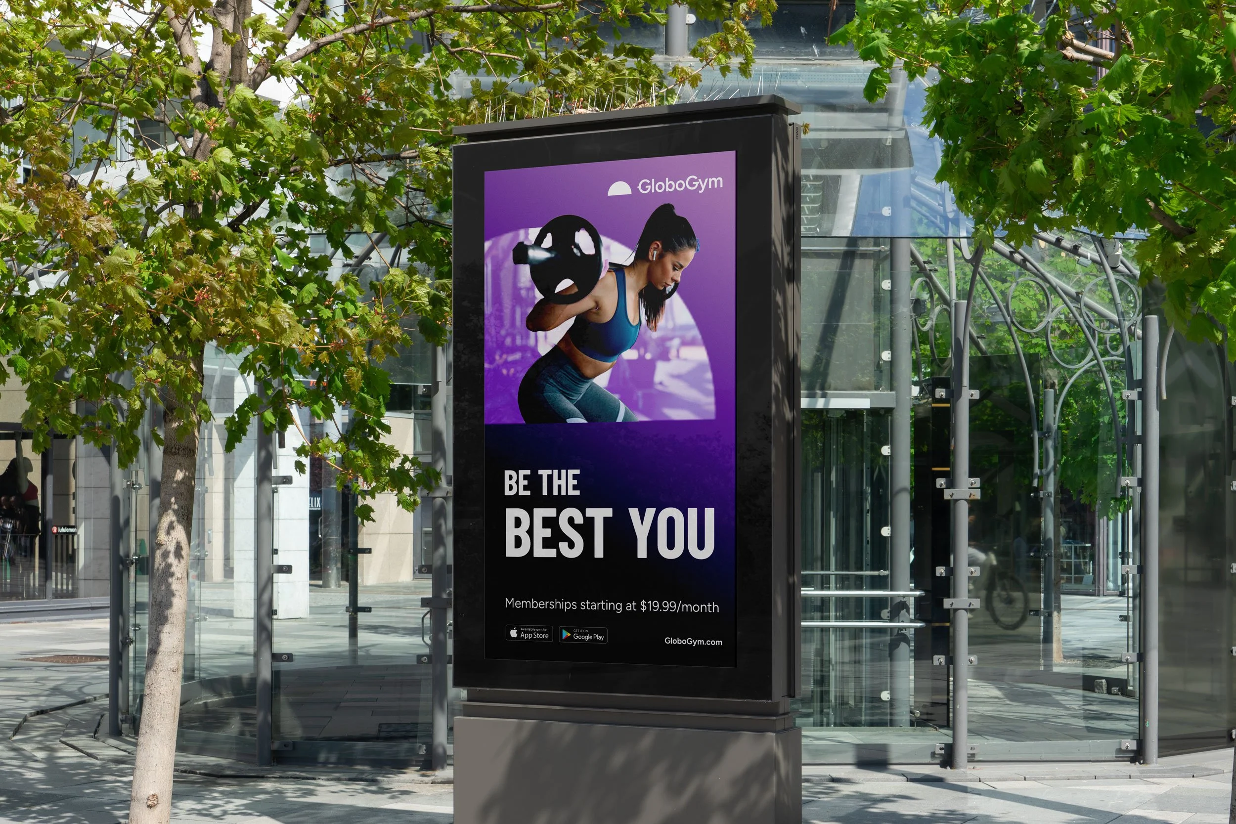
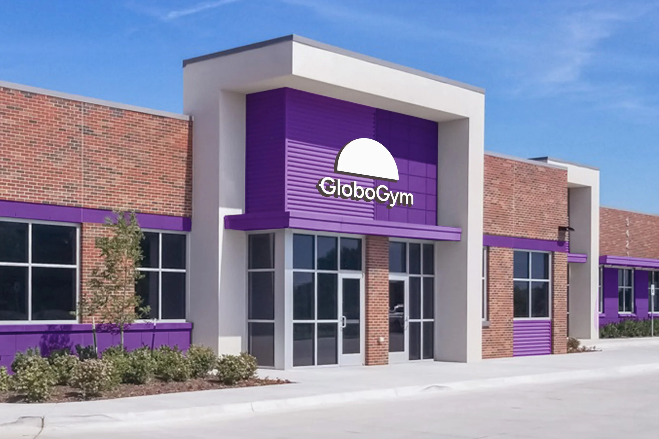
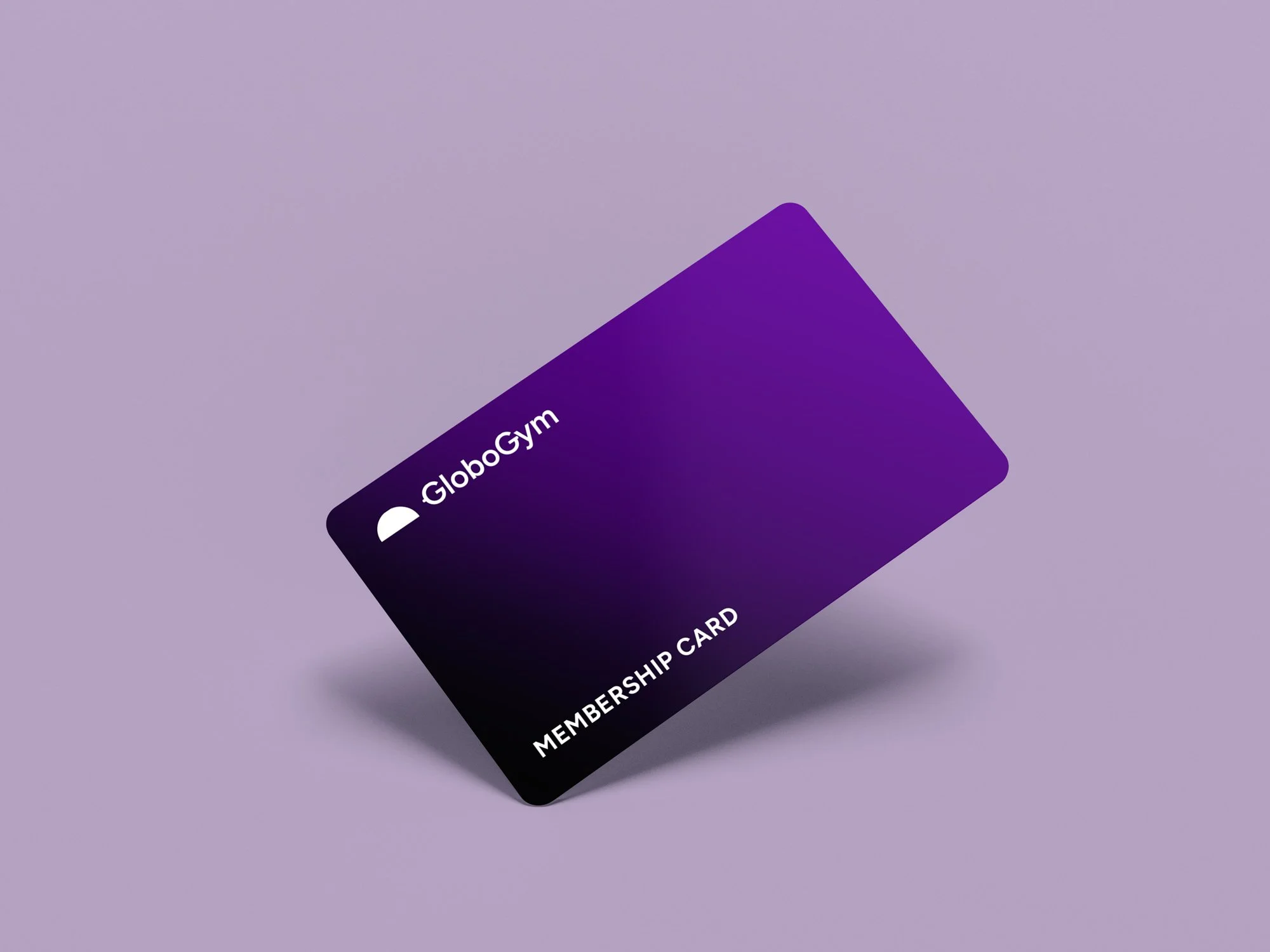
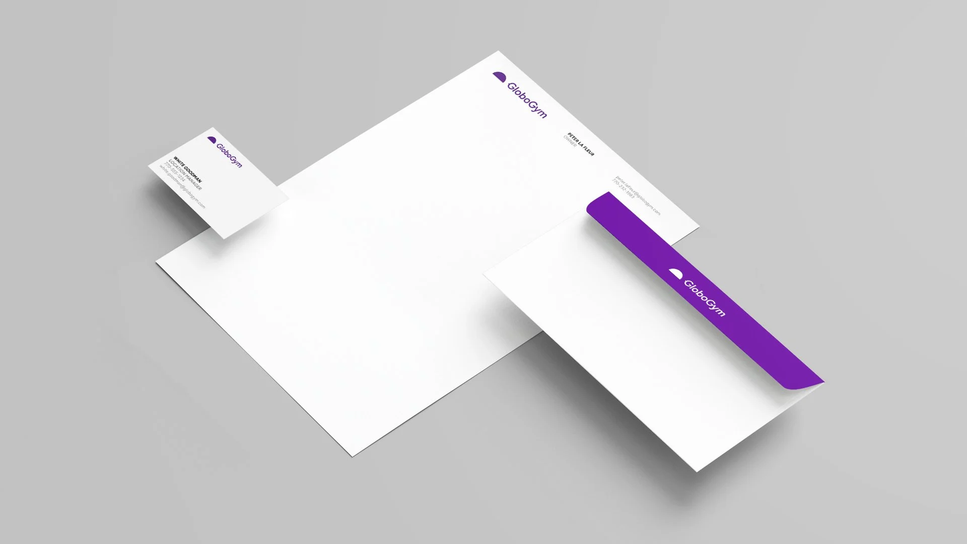
The logo design process began with broad visual research to establish a clear creative direction, followed by focused iteration around structure, symbolism, and balance. FigTree SemiBold was selected for its bold yet approachable character and refined into a custom wordmark. An abstract half-globe symbol represents growth and adaptability, while subtle modifications to the Gs introduce a quiet dumbbell reference—reinforcing the brand’s fitness roots without leaning on clichés. The final system includes flexible logo variations designed to scale across print, digital, and environmental applications. See the full process in the Figma link below.
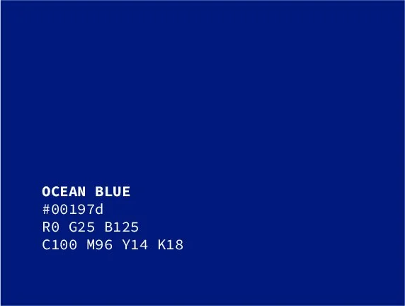
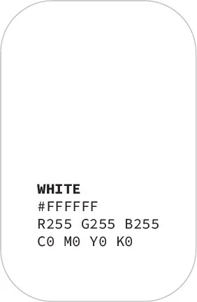
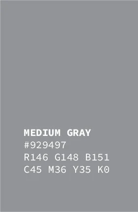
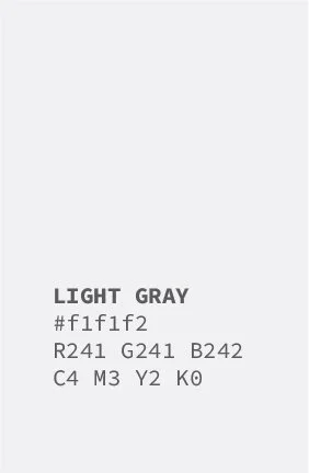
Color system
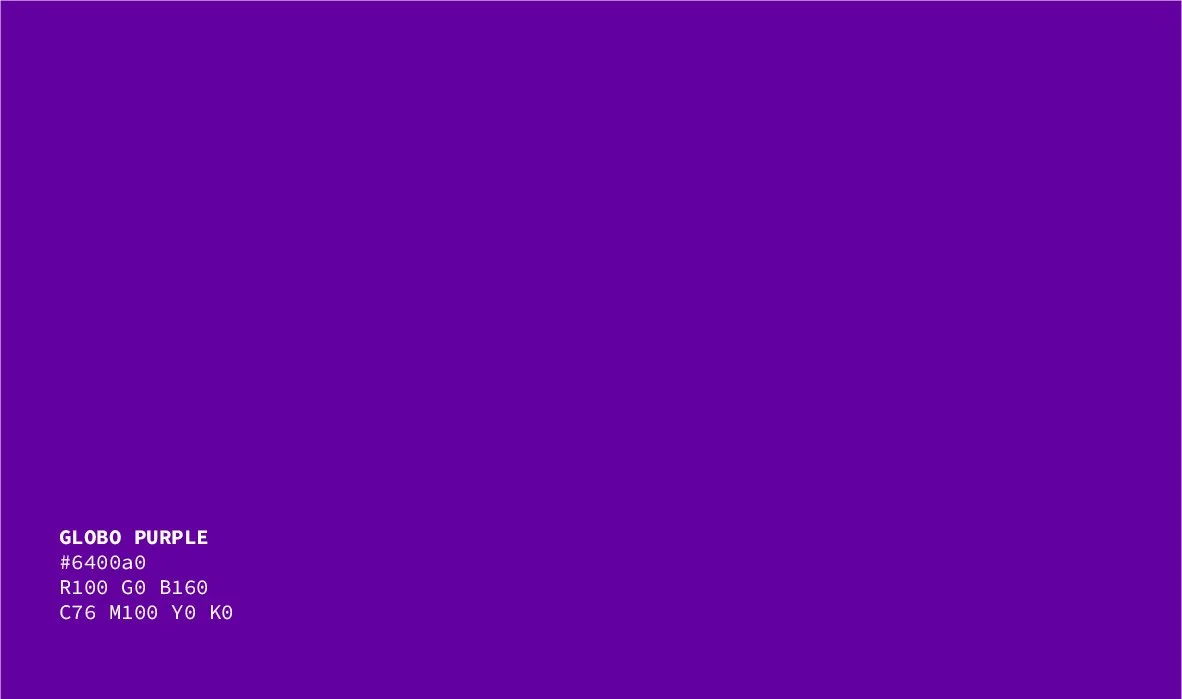
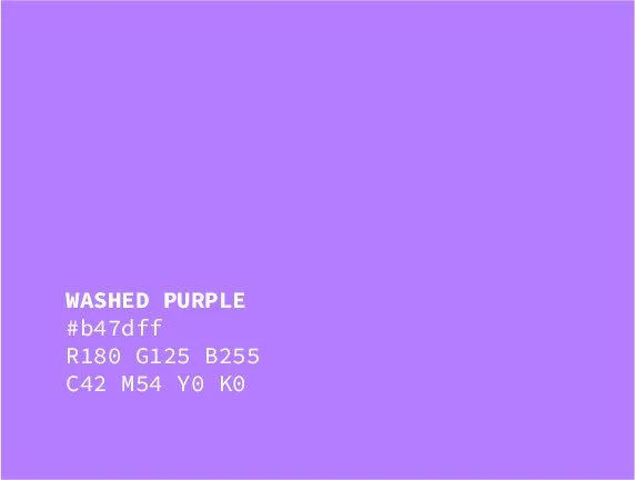
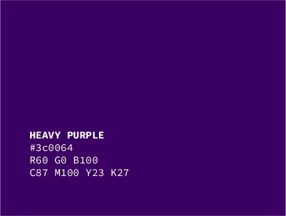
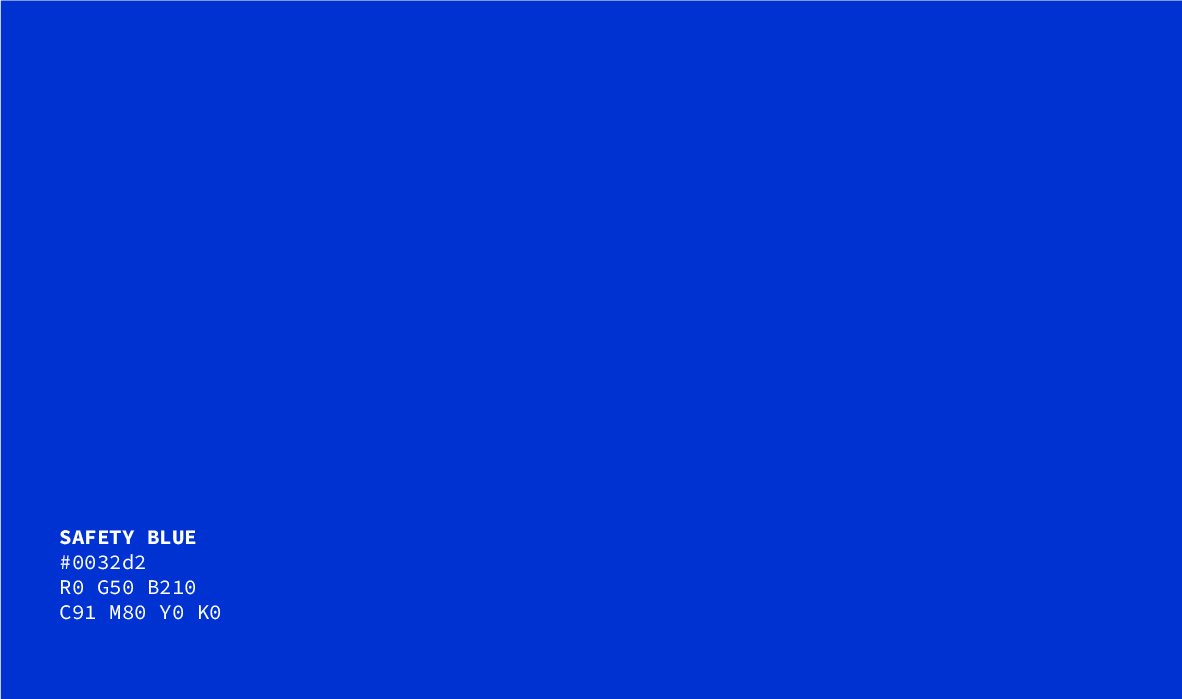
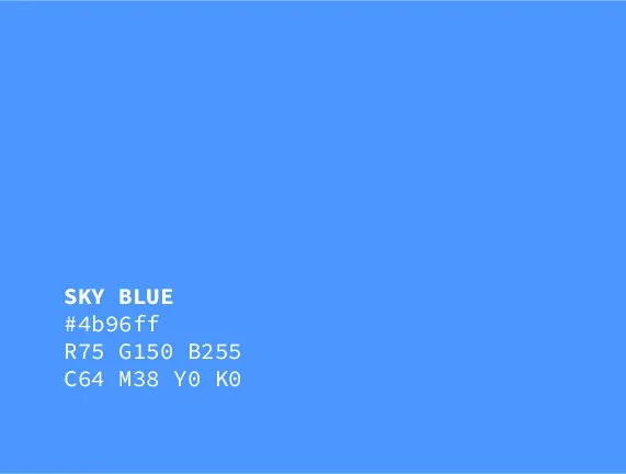
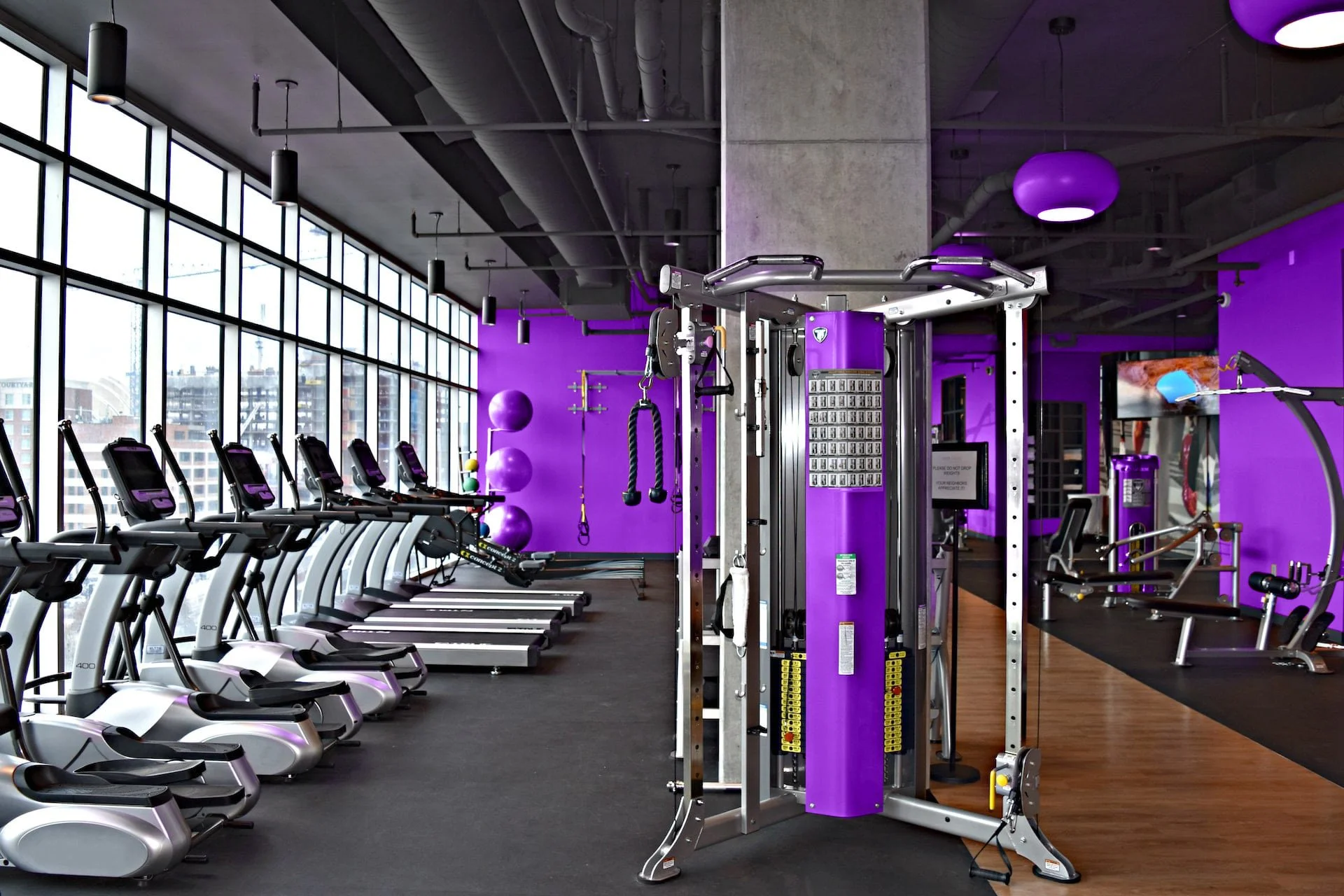
The color system was developed to balance authority and clarity, as well as freshen the identity without compromising its past. Globo Purple continues to serve as the primary brand color, albeit with a brighter hue, and now reinforced by a controlled range of tints and shades to support hierarchy and flexibility. A neutral foundation of charcoal, grays, and white will carry the majority of layouts, ensuring legibility across environments. Safety Blue functions as a limited spot color, reserved for informational, wayfinding, and trust-driven moments, reinforcing structure within an otherwise intense visual identity. A neon green also exists within the system for actionable moments and opportunities to show progress.


typography
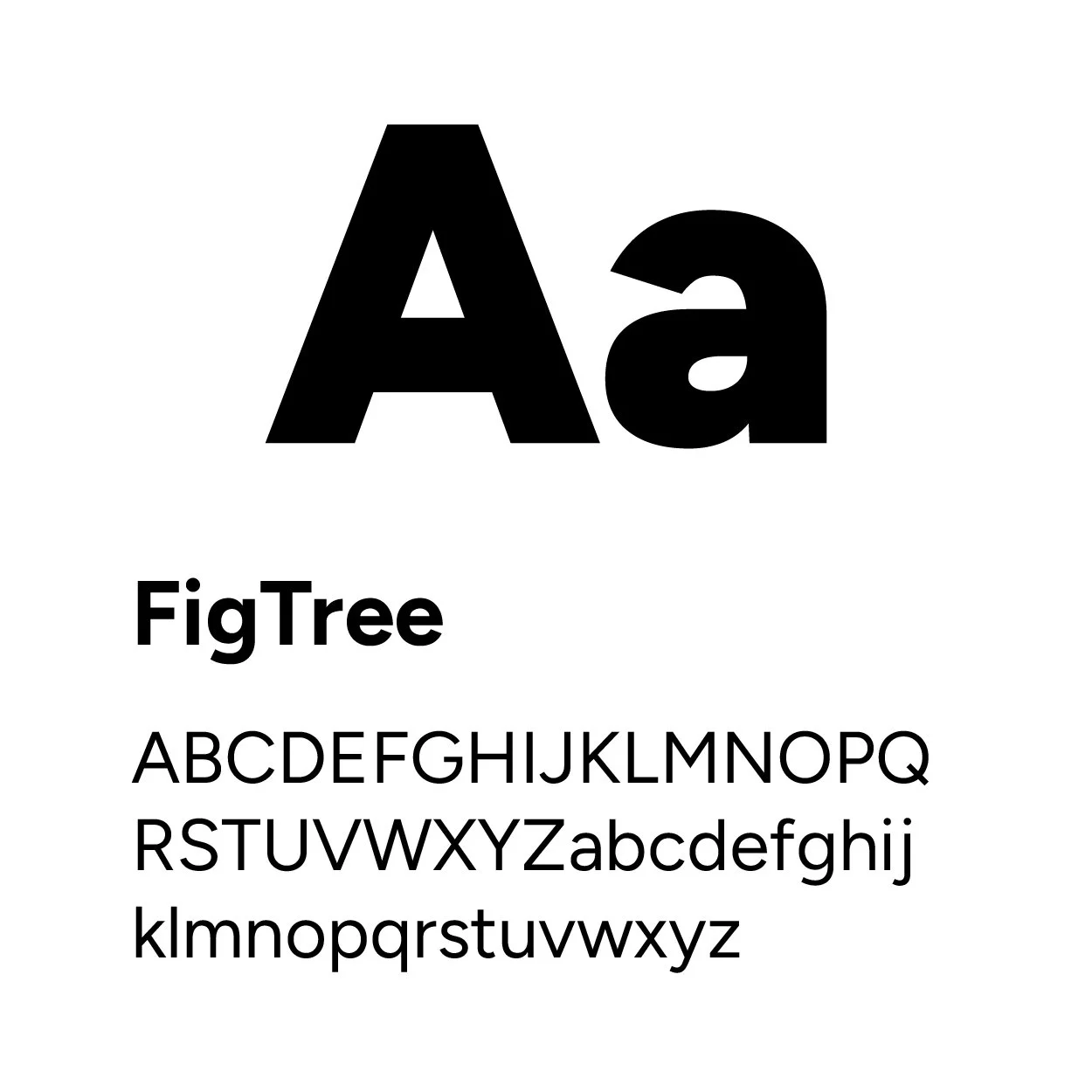
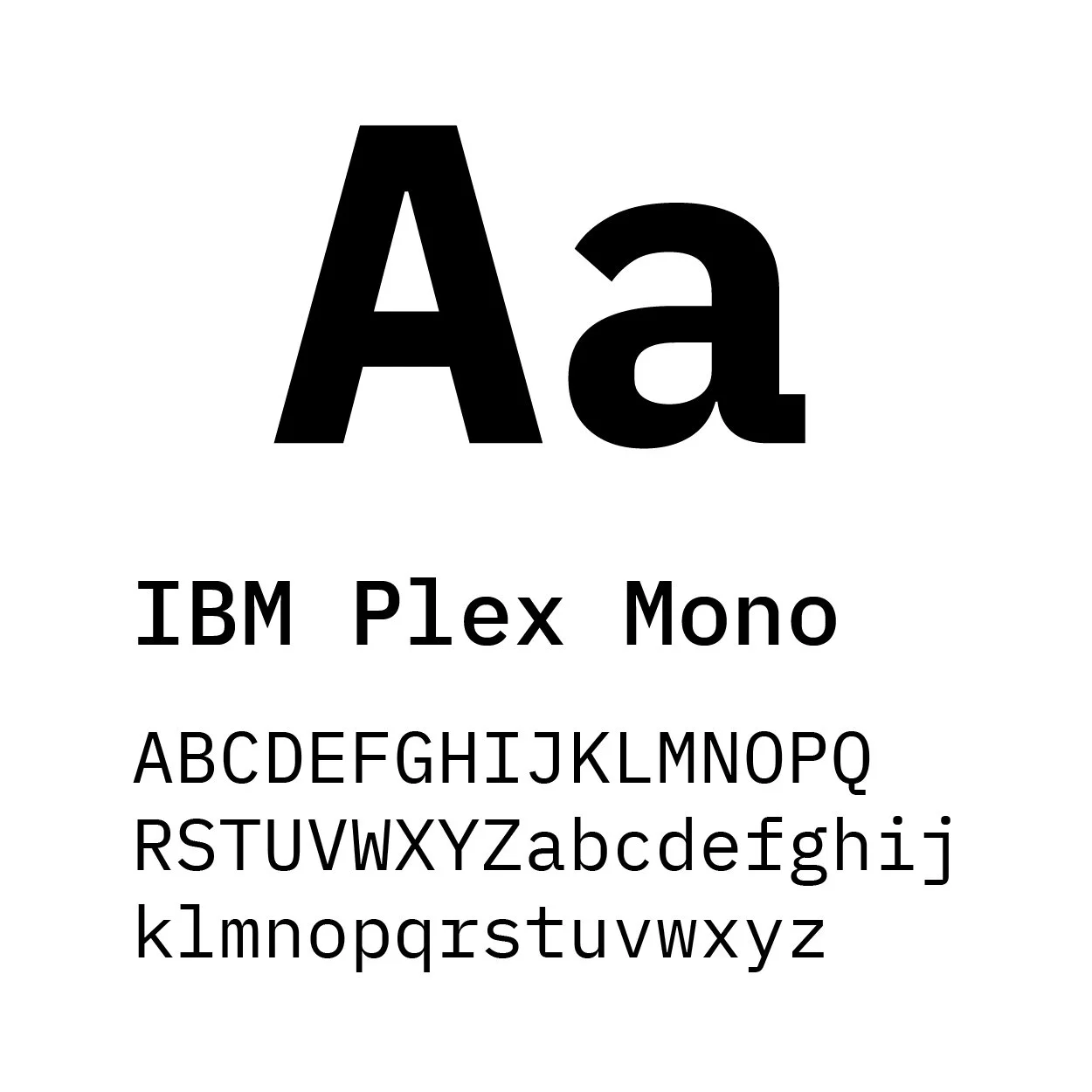
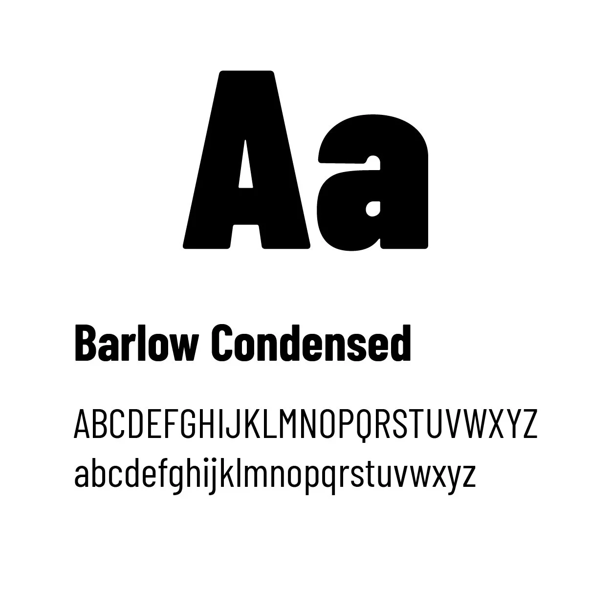
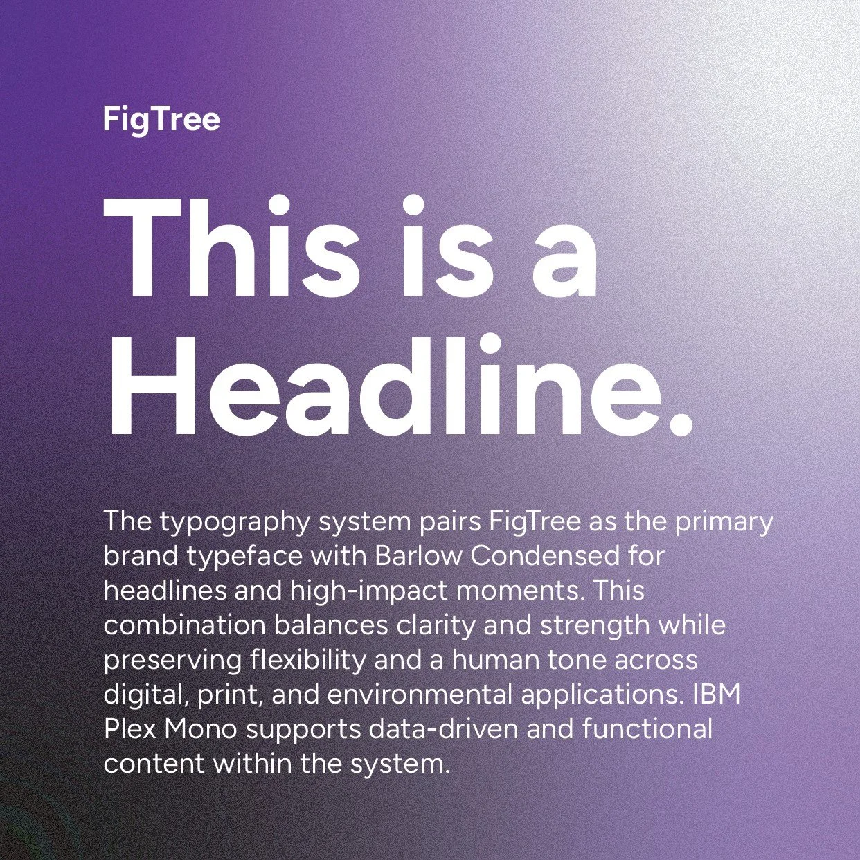
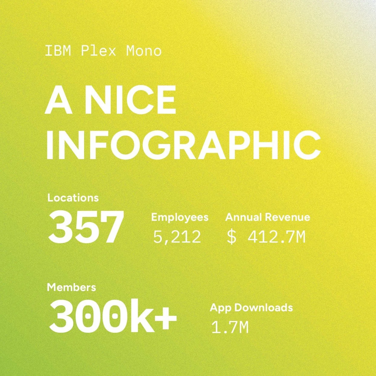
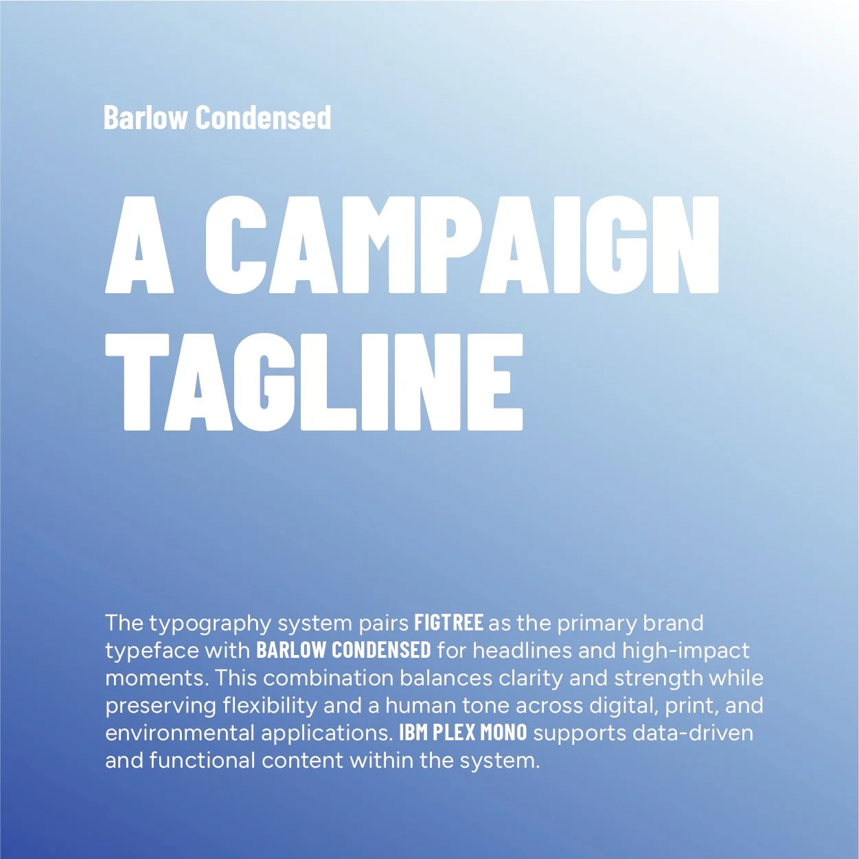
The typography system pairs FigTree as the primary brand typeface with Barlow Condensed for headlines, actionable, and high-impact moments. This combination balances clarity and strength while preserving flexibility and a human tone across digital, print, and environmental applications. IBM Plex Mono supports data-driven, informational, and functional content within the system.
03
applications

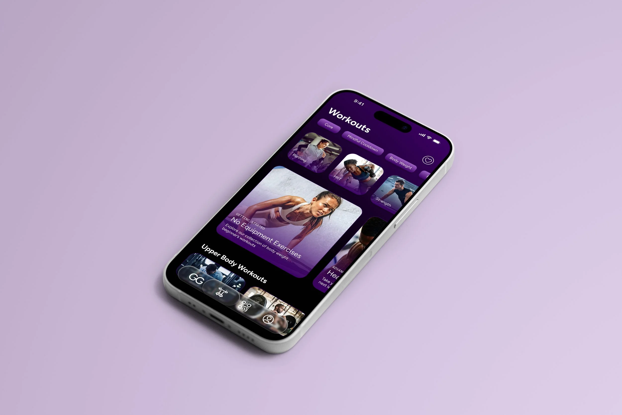
MOBILE APP
The Globo Gym identity system was designed to extend naturally into digital environments, prioritizing clarity, motivation, and performance over novelty. The app translates the brand’s bold, confident visual language into a focused user experience that supports discovery, daily engagement, and conversion—without overwhelming the user or diluting the brand.
Design Process
USER FLOW DEFINITION
A simplified flow chart established the core journey from engagement to conversion, intentionally avoiding unnecessary edge cases or feature bloat.LOW-FIDELITY STRUCTURE
Early wireframes focused on hierarchy, consistency, and purposeful design before visual styling was applied.SYSTEM APPLICATION
Final screens applied the established identity system—color usage, typography, spacing, and component logic—ensuring consistency with the larger brand system.REFINEMENT & RESTRAINT
Visual elements were continuously reduced and tightened to maintain focus, avoid gimmicks, and reinforce brand confidence.
Rather than designing a fully exhaustive app experience, the goal was to demonstrate how the Globo Gym identity scales into a real-world digital product. Each screen was selected to represent a critical function:
Discovery through exploration
Engagement through progress
Conversion through clarity
Home Page
Hero Section/Discovery
Workouts Page
Daily User Engagement
Subscription Page
Conversion
04
projected results
The simplified logo system and cohesive visual language are designed to improve brand recognition and strengthen perceived trust across digital and physical touchpoints, creating a clearer and more consistent brand presence.
Brand Clarity & Recognition
01
Clear hierarchy, restrained iconography, and modular layouts are intended to reduce cognitive load and improve how quickly users can identify spaces, services, and actions across environments.
User Experience & Wayfinding
02
The mobile experience was designed to support higher engagement and smoother task completion by prioritizing clarity, consistency, and scalable UI patterns that guide users through core interactions.
Digital Engagement & Usability
03
The flexible brand system is built to scale across locations, campaigns, and platforms while reducing production friction and enabling faster, more consistent execution over time.
Scalability & Operational Efficiency
04
This Globo Gym rebranding project demonstrates how a clear, disciplined brand system can guide decision-making across physical and digital touchpoints without relying on trend-driven UI or unnecessary complexity. While speculative, it answers key questions around differentiation, scalability, and engagement—showing how a once one-dimensional brand can evolve into a modern fitness ecosystem that supports discovery, daily use, and conversion—and reflects how disciplined brand systems are commonly measured and evaluated in real-world environments. By prioritizing clarity, restraint, and performance-focused design, it illustrates how brand identity can function as a practical tool rather than a purely visual asset, reinforcing consistency, usability, and long-term relevance.