
building Empires
Branding an identity for a 35th Anniversary Reissue Campaign for Queensrÿche’s top-selling album Empire

The following is a self-initiated reimagining of Queensrÿche’s 1990 multi-platinum selling album, Empire, as a modern 35th-anniversary reissue campaign. What began as a nostalgic exploration evolved into a focused study in storytelling, branding, and experiential design—treating the album as a living cultural property rather than a static release. The project examines how typography, iconography, photography, motion, and digital touchpoints can work together to build a cohesive visual system that honors a classic work while extending its narrative to contemporary audiences across platforms.

overview
-
Design a comprehensive 35th-anniversary reissue campaign for Queensrÿche’s Empire, reintroducing the album’s themes, art direction, and legacy through a contemporary design lens. The scope includes developing a cohesive visual system and campaign framework, defining narrative and messaging across platforms, and producing conceptual applications spanning digital, motion, print, merchandise, and promotional materials.
-
The primary challenge was translating the impact of a culturally significant album into a contemporary reissue campaign without diluting its identity. Every design decision needed to respect the original work while presenting a fresh, cohesive interpretation of its themes, aesthetics, and historical context across modern platforms. Balancing reverence for the source material with original design thinking—while avoiding nostalgia for its own sake—became the core creative tension of the project.
-
Deliverables include a comprehensive visual system and campaign framework designed to support a 35th-anniversary reissue across multiple touchpoints. Design outputs encompass typographic hierarchies, flexible grid systems, visual motifs, color and texture studies, and motion-ready graphic elements. Conceptual applications extend across digital, print, merchandise, social media, and promotional materials, supported by narrative and messaging exploration that reinforces the album’s themes and legacy.
-
The seed for this project was planted in 2015, but actual work began early in 2024.
-
The outcome is a cohesive body of work that demonstrates my approach to campaign and system-driven design—strategic, atmospheric, research-informed, and emotionally grounded. While entirely unofficial and non-commercial, the project serves as a significant creative milestone, merging visual identity, storytelling, motion, and cultural context into a unified campaign framework. It reflects a refined understanding of how legacy work like Queensrÿche’s Empire can be respectfully reintroduced to contemporary audiences, while continuing to shape my creative voice and design practice.
DISCLAIMER: This project is a conceptual campaign branding project created for portfolio use only. It is strictly non-commercial, and not intended for publication. All intellectual property belongs solely to Queensrÿche and their rights holders.

What does a 35-year-old hard rock album still have to say in 2025?
That question sits at the core of this project—a reimagined 35th-anniversary campaign for Queensrÿche’s Empire. Originally conceived years earlier, the idea persisted with me because the album itself did. Its themes of power, paranoia, ambition, and hope have long resonated beyond the music, shaping the way I think about storytelling, atmosphere, and visual systems.
Rather than approach the anniversary through nostalgia, the campaign treats Empire as a living cultural world—one that can be translated across contemporary platforms through design. Drawing inspiration from unexpected sources and modern visual language, the project became an exercise in world-building: developing a flexible identity system capable of holding history, analysis, and emotion at once.
At its core, this work is a professional design exploration—using a legacy album as a framework to examine how iconic material can be respectfully reintroduced, recontextualized, and re-experienced through a modern campaign lens.

origin story

approach
Here’s a closer look at the decisions that shaped this campaign—the strategy, structure, and ideas beneath the visuals. These principles guide how I build cohesive design systems and translate narrative into multi-platform experiences.
-
The backbone of this project is a flexible visual system designed to scale across a multi-platform anniversary campaign. Built around modular grids and repeatable components, the system supports a wide range of applications—from dense informational layouts to quieter, atmospheric moments—while maintaining a cohesive identity. This approach ensures consistency across touchpoints while allowing individual campaign elements to express their own tone, pacing, and emphasis.
-
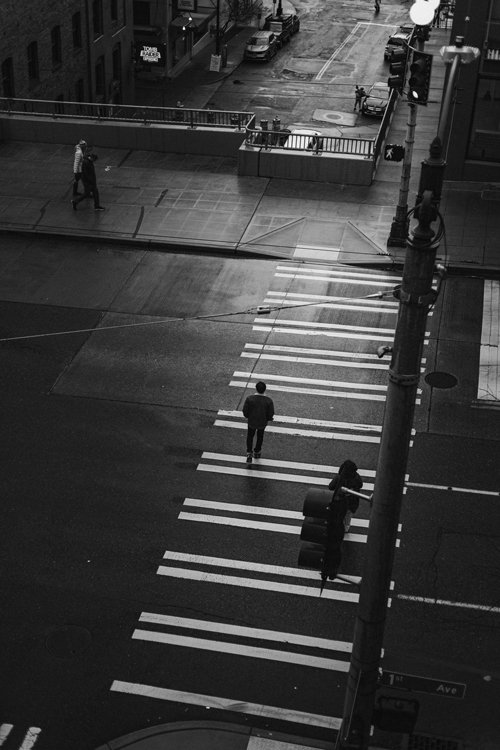
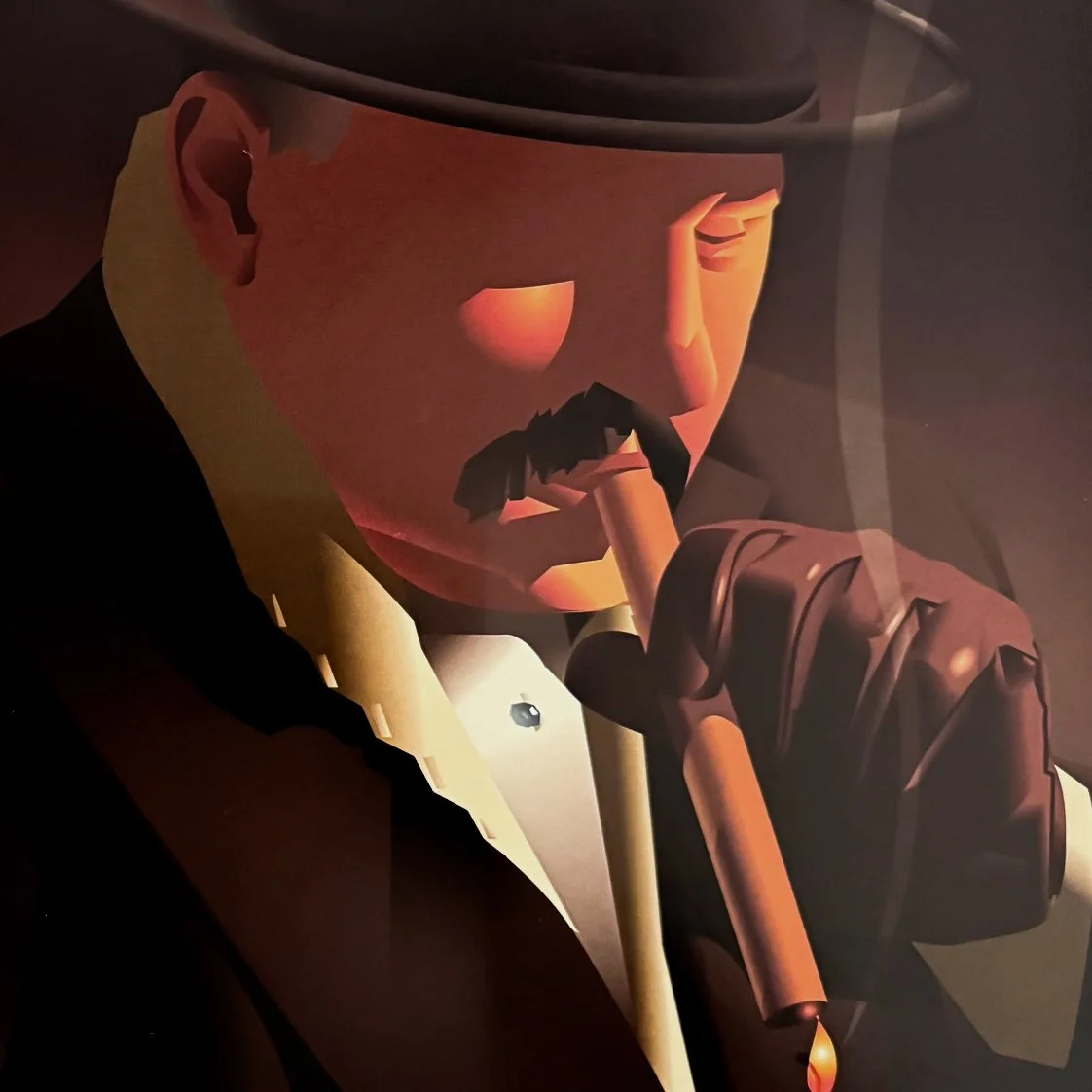
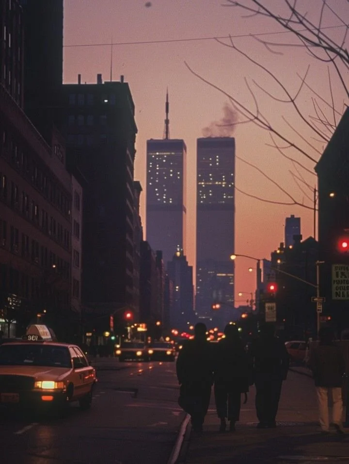
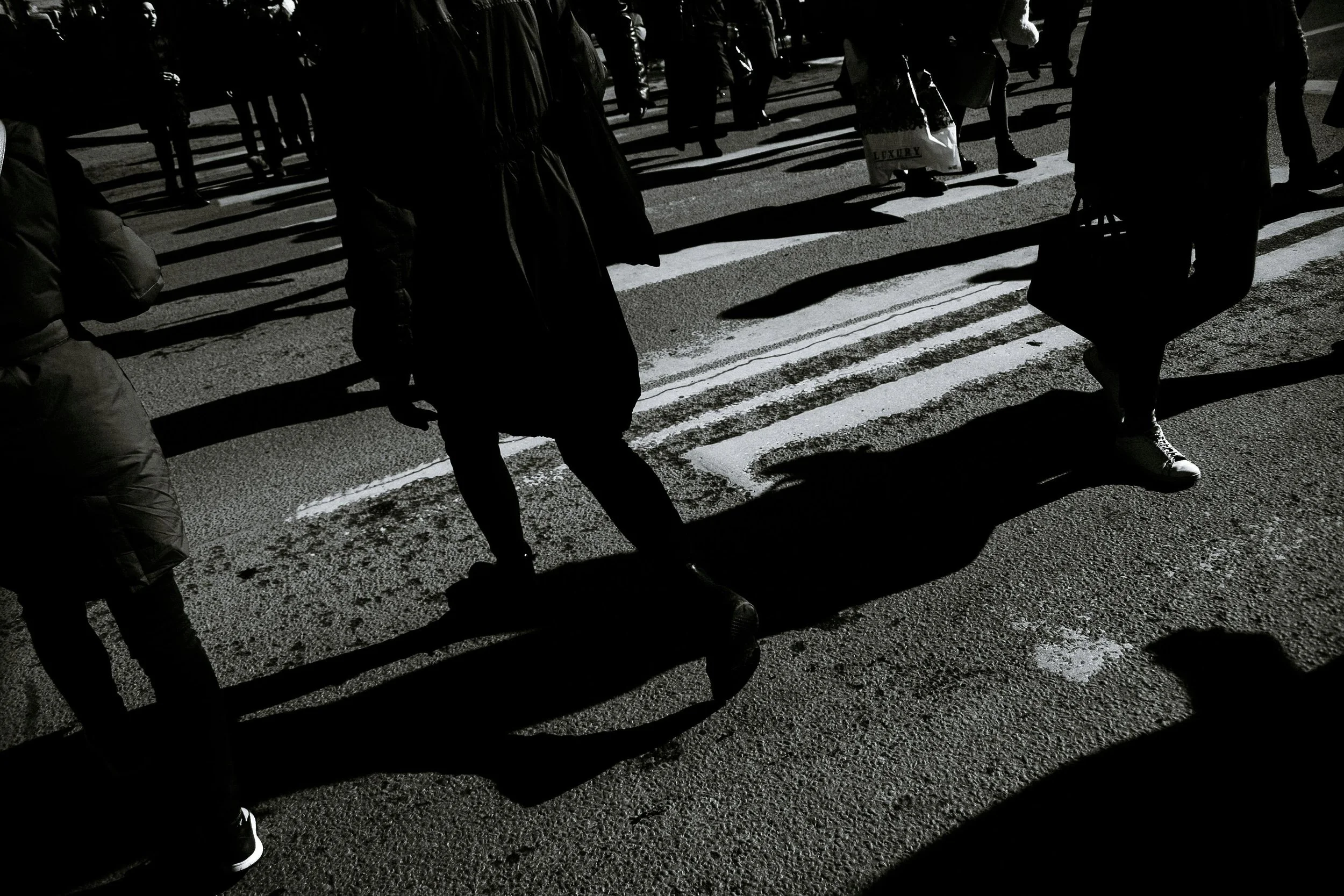
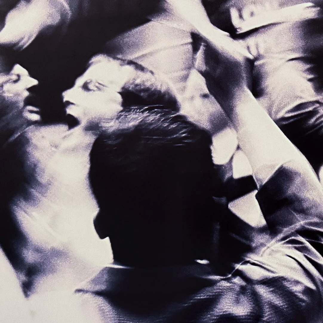
Visually, the campaign leans into the album’s noir, industrial, and metallic undertones. A restrained palette, sharp contrast, and architectural forms establish a tone that reflects themes of power, tension, and ambition. Across imagery, typography, and motion, the art direction explores the contrast between grandiose national identity and emotional detachment—an aesthetic tension that mirrors the album’s commentary on the darker undercurrents of the American dream.
-
Alongside the visual system, the campaign is supported by a narrative framework that blends research, historical context, and contemporary interpretation. Messaging and content reinterpret the album’s themes through a modern lens, connecting its music to broader cultural, social, and aesthetic ideas. The goal is to create material that feels informed and reflective while reinforcing the campaign’s tone and visual language across platforms.
-
This project evolved through iterative exploration—testing visual systems, typographic hierarchies, and applications across multiple campaign formats. Each pass refined the campaign’s voice and clarified how the identity could adapt while remaining cohesive. Rather than forcing predetermined solutions, the process emphasized responding to the material itself—allowing the album’s themes, tone, and narrative to inform decisions across the entire campaign framework.
visuals
Below is a breakdown of selected visual elements from the reissue campaign—explorations in tone, typography, photography, and layout that shaped the overall artistic direction.
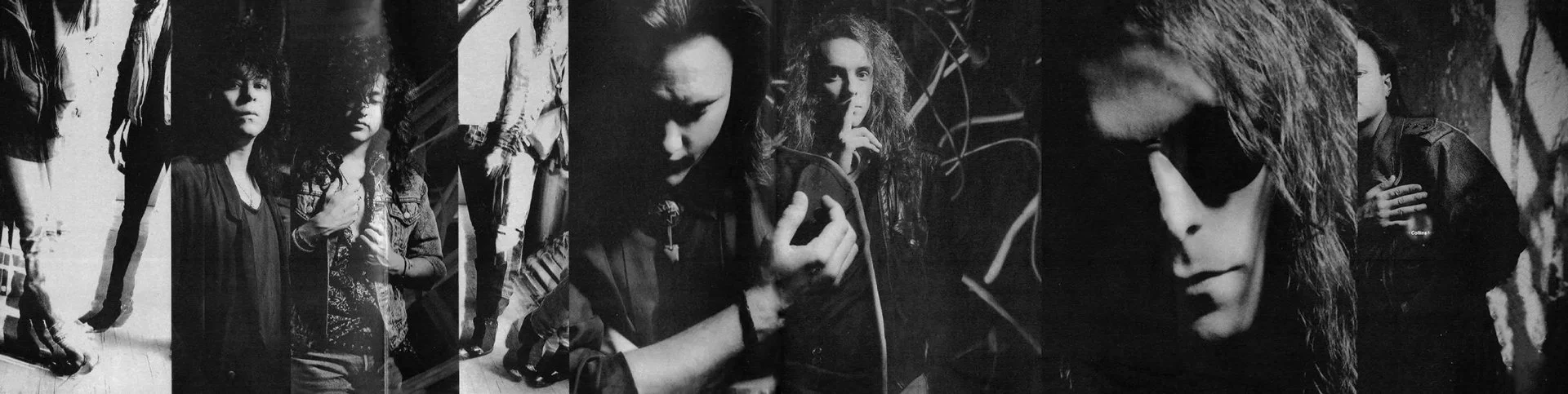
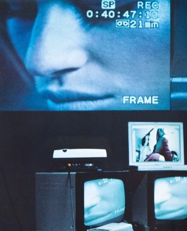
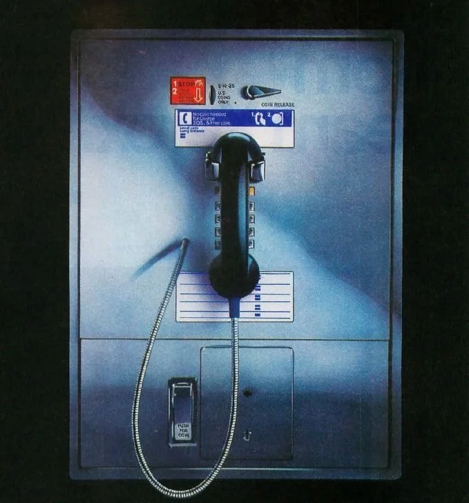
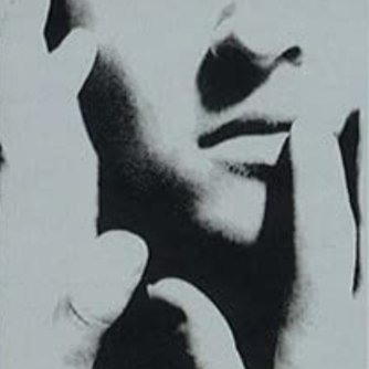
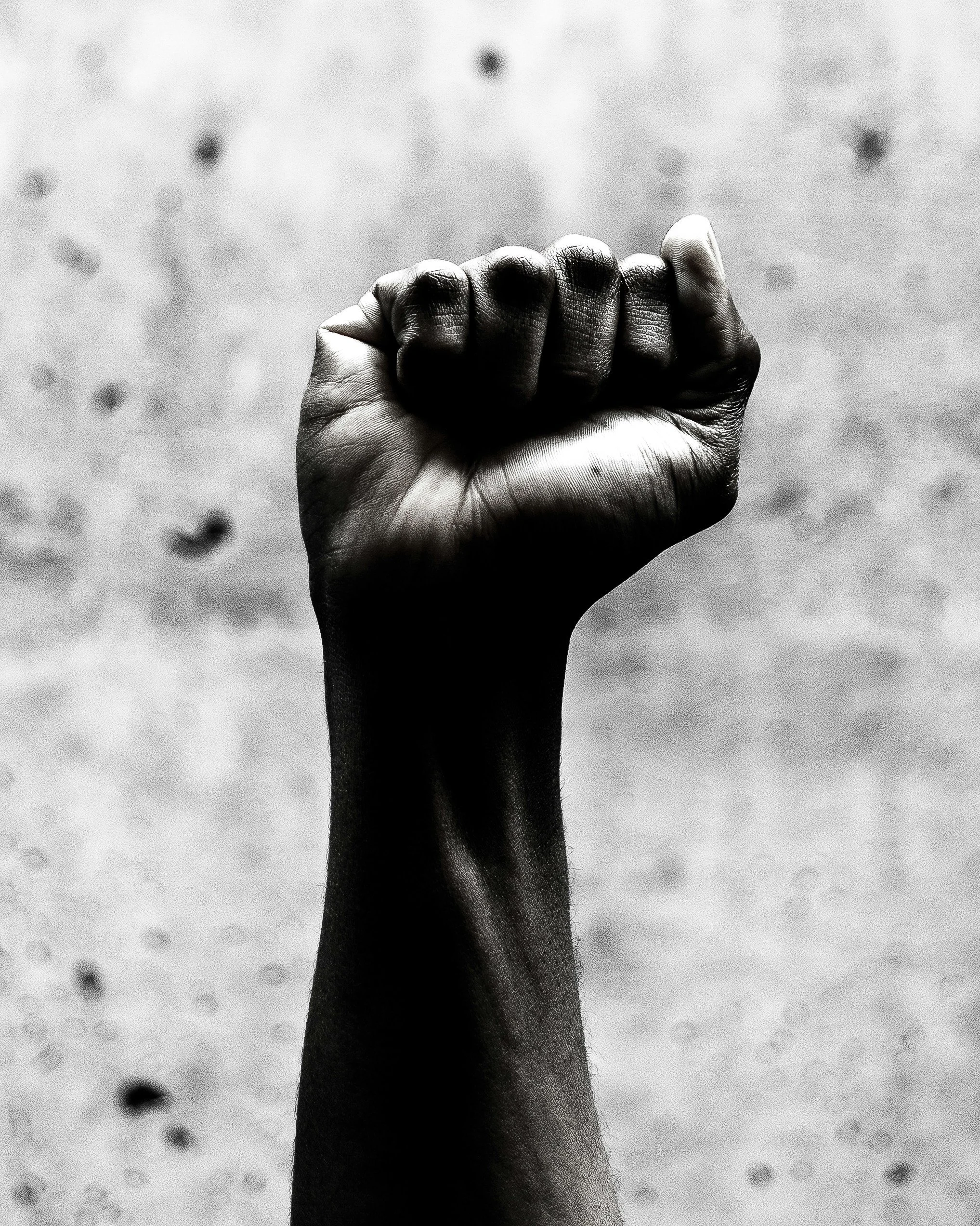
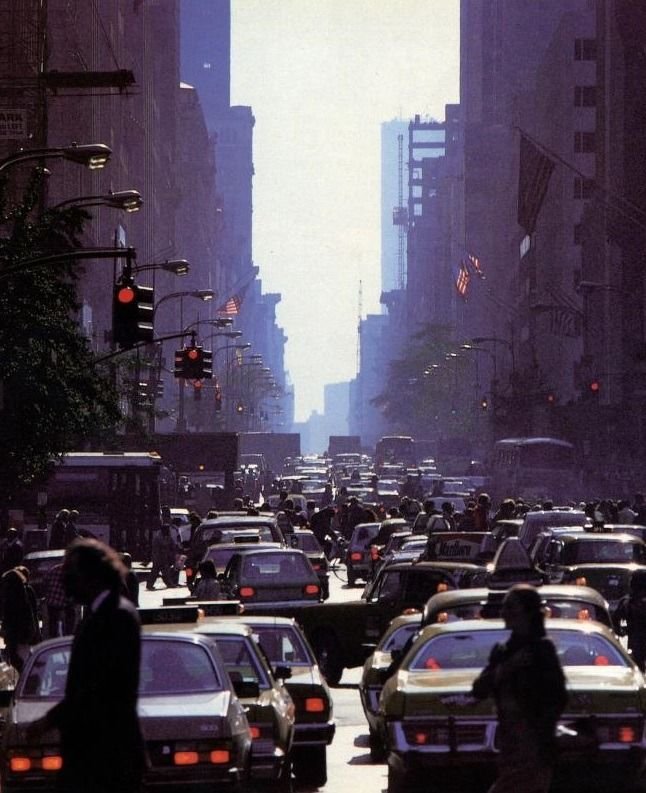
INSPIRATION


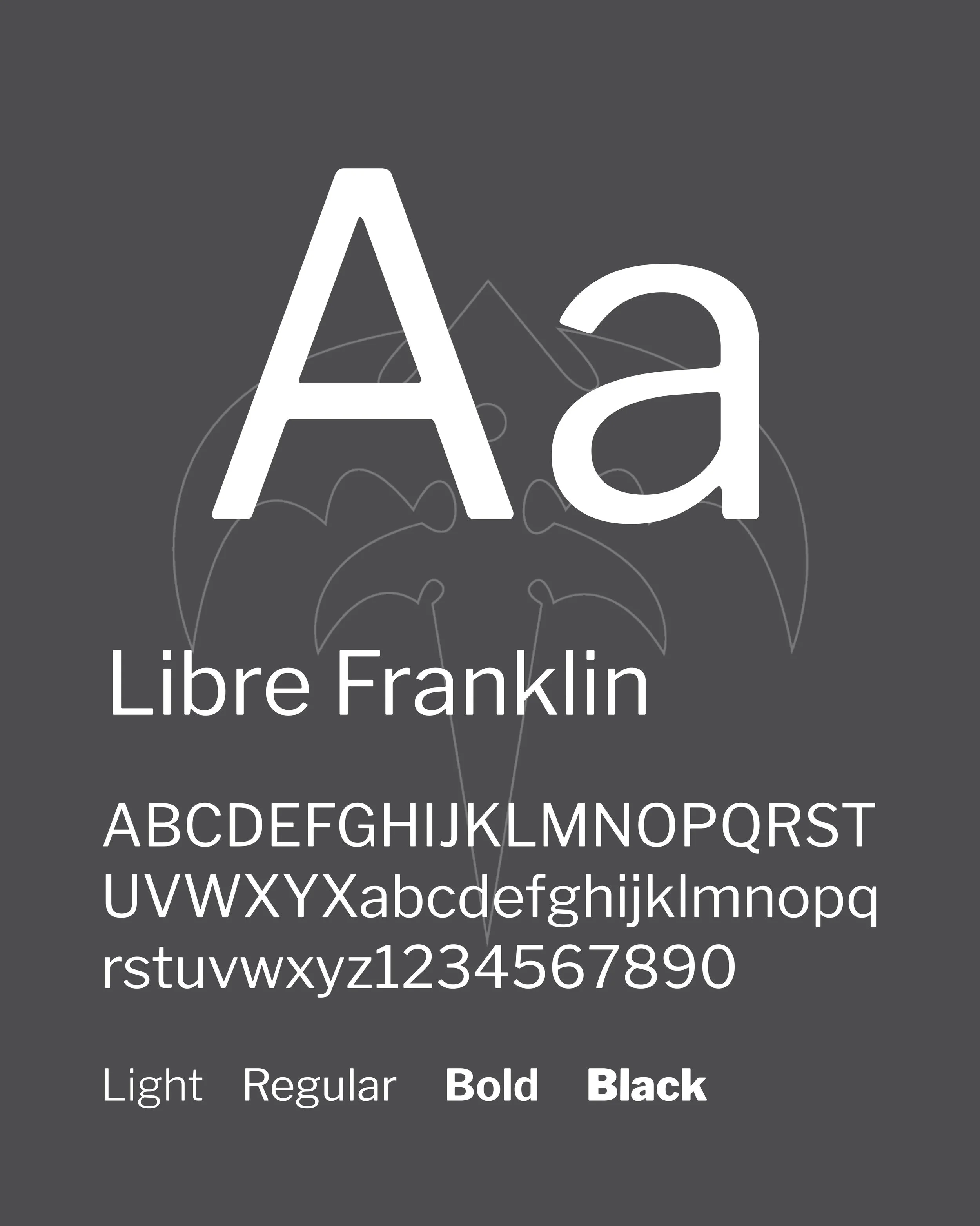
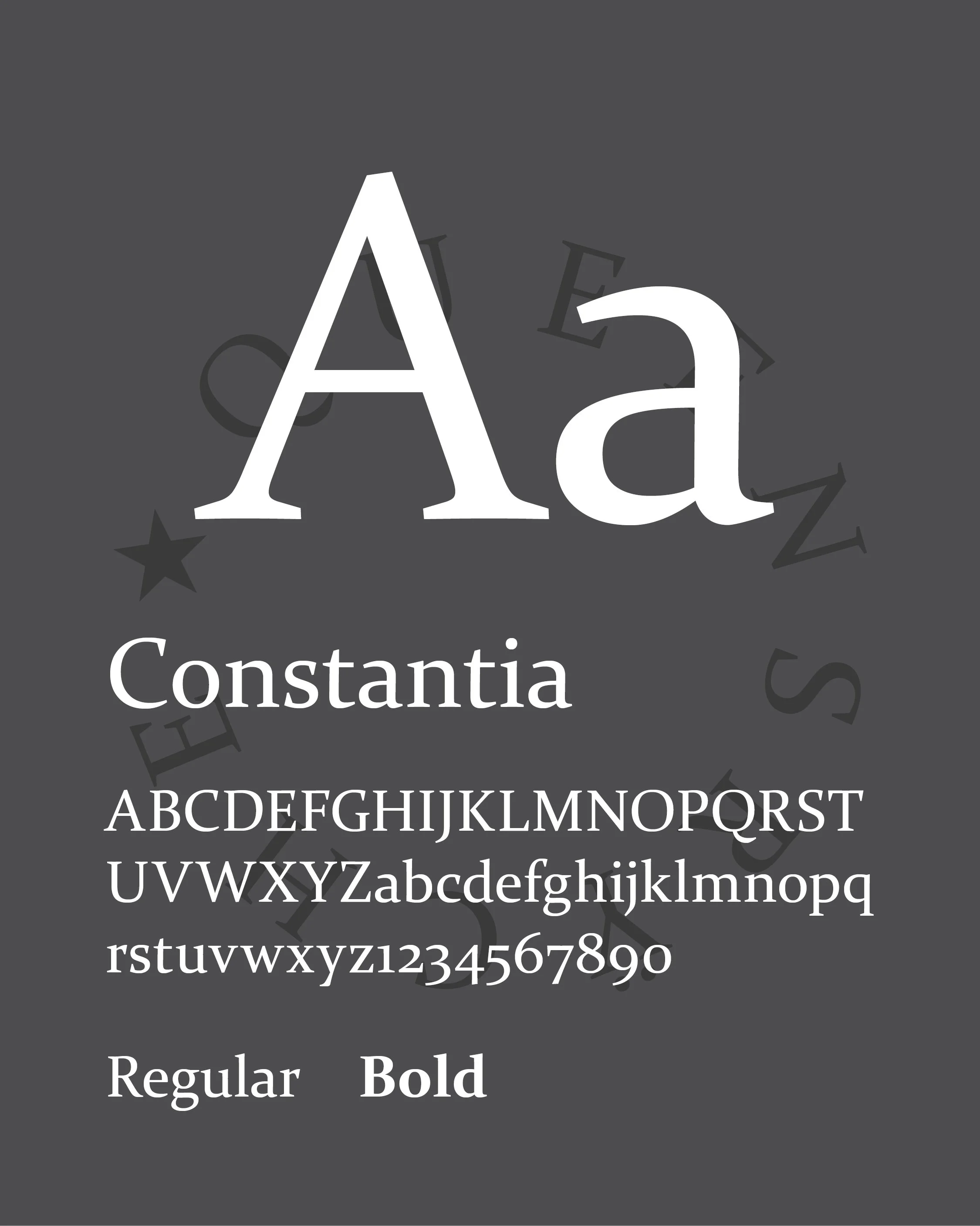
typography
-
The typographic system balances modern clarity with classical weight, reflecting the central tension within Empire. Libre Franklin anchors the campaign with a clean, utilitarian voice—its geometry reinforcing themes of structure, authority, and urban systems. In contrast, Constantia introduces a more human, serifed counterpoint, grounding the identity with warmth and reflection. Together, the pairing creates a visual rhythm that mirrors the album’s interplay between hard-edged ambition and underlying vulnerability.
Sample of the original typography used in the liner notes of Empire
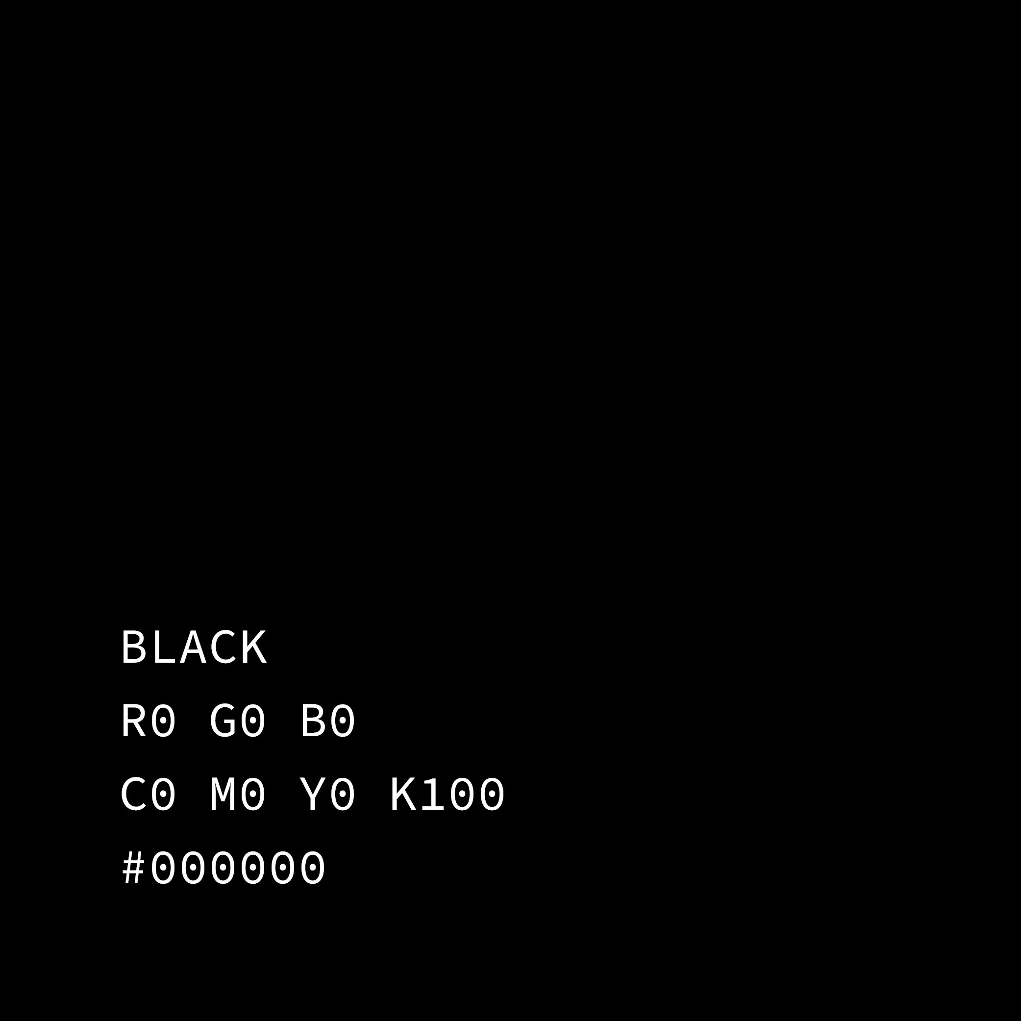
COLOR
-
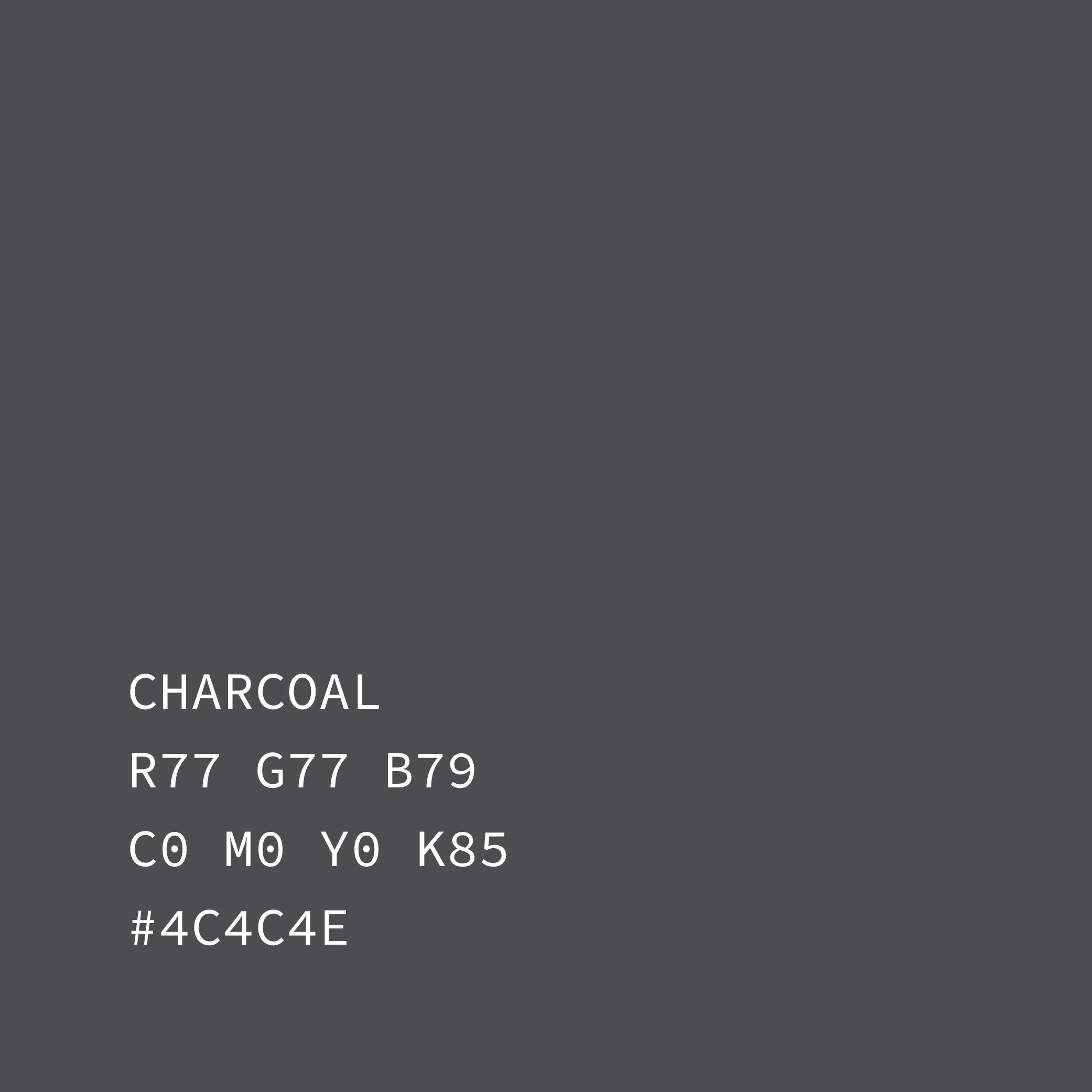
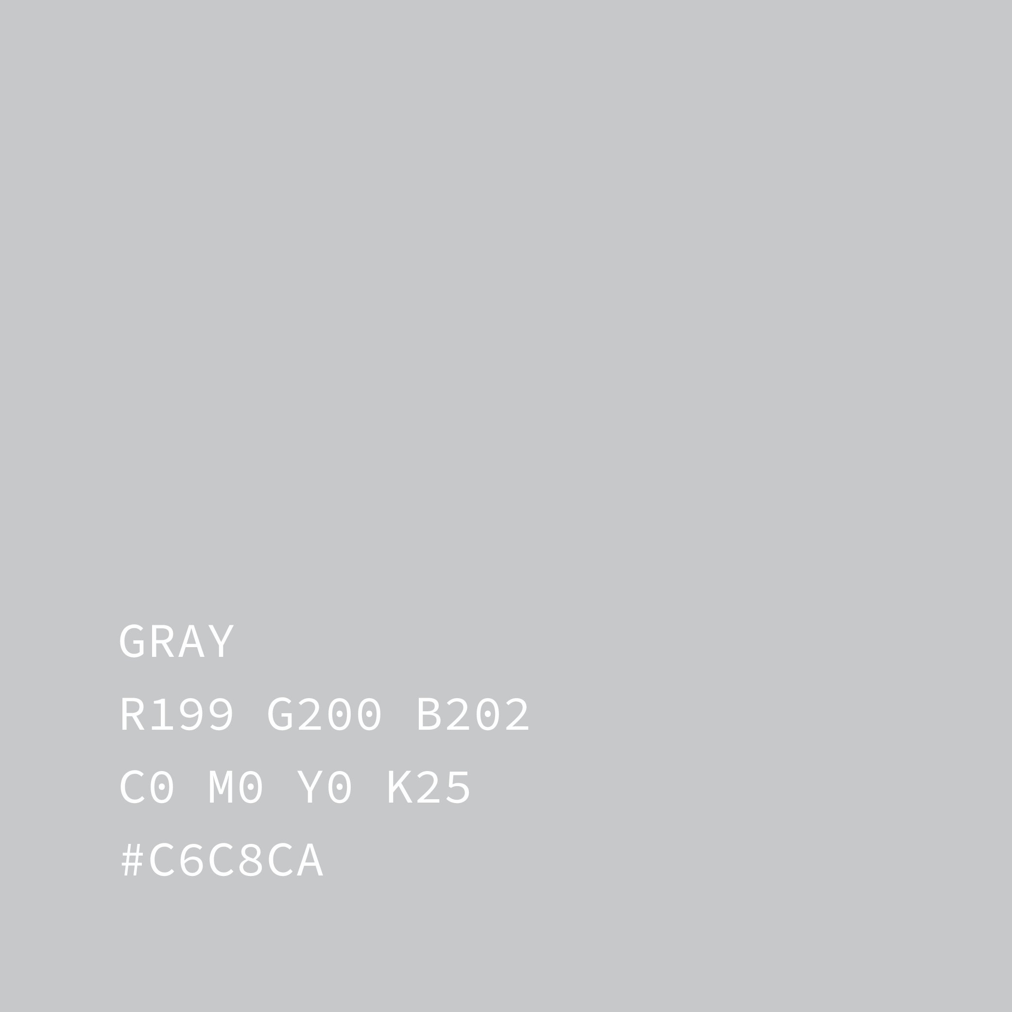
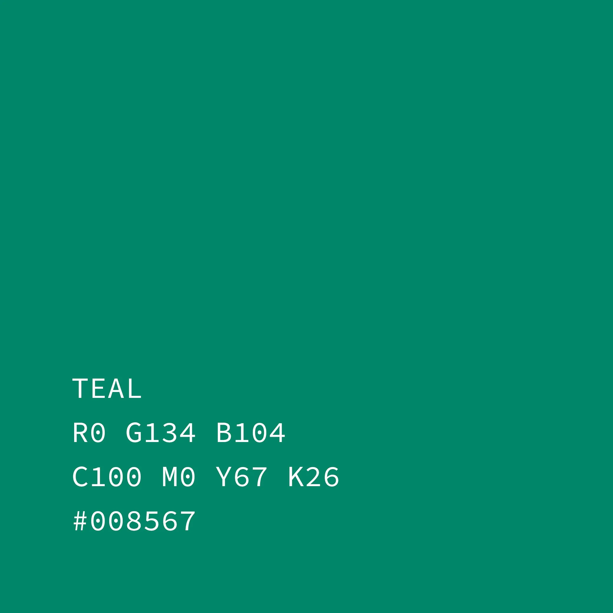
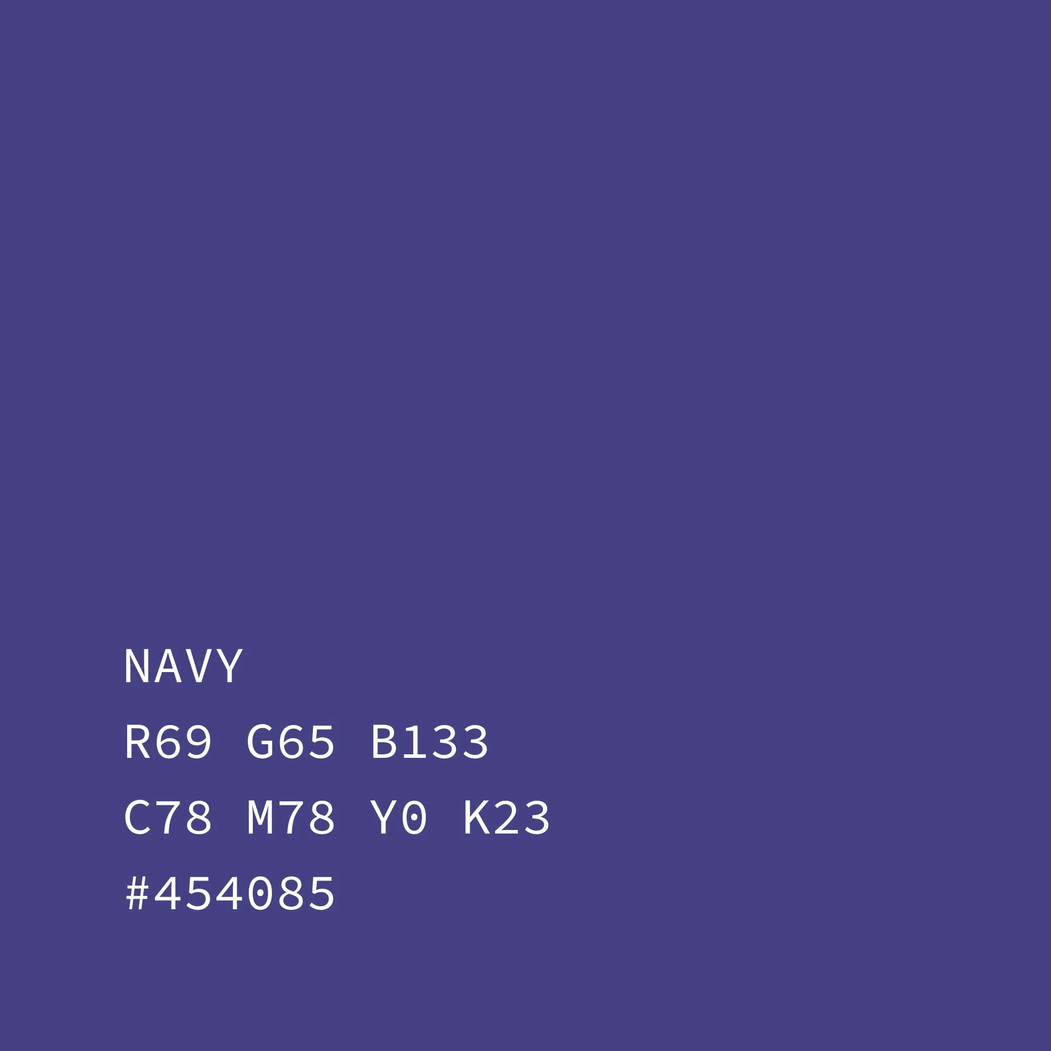
The color palette expands on Empire’s original tones, refining them into a flexible, contemporary system. Black, charcoal, and mid-range grays form the foundation of the campaign—providing a restrained, neutral base that supports dense information and imagery without distraction. Teal and navy are introduced as controlled accents, used sparingly across typography, icons, and navigational elements to create contrast and forward momentum. Additional color enters organically through album art and archival materials, allowing moments of energy while preserving the campaign’s overall tone and restraint.
iconography
-
The iconography builds from Empire’s original visual language and evolves it into a cohesive, contemporary system for use across the campaign. Rather than treating the album’s symbols as static artifacts, they are reimagined as functional design elements—supporting navigation, hierarchy, and rhythm across formats. Each icon is refined with cleaner geometry, lighter weight, and modular construction, allowing it to adapt seamlessly across digital, print, motion, and merchandise applications. The result is a symbol set that feels unmistakably tied to Queensrÿche’s Empire, while operating with the clarity and precision of a modern identity system.

-
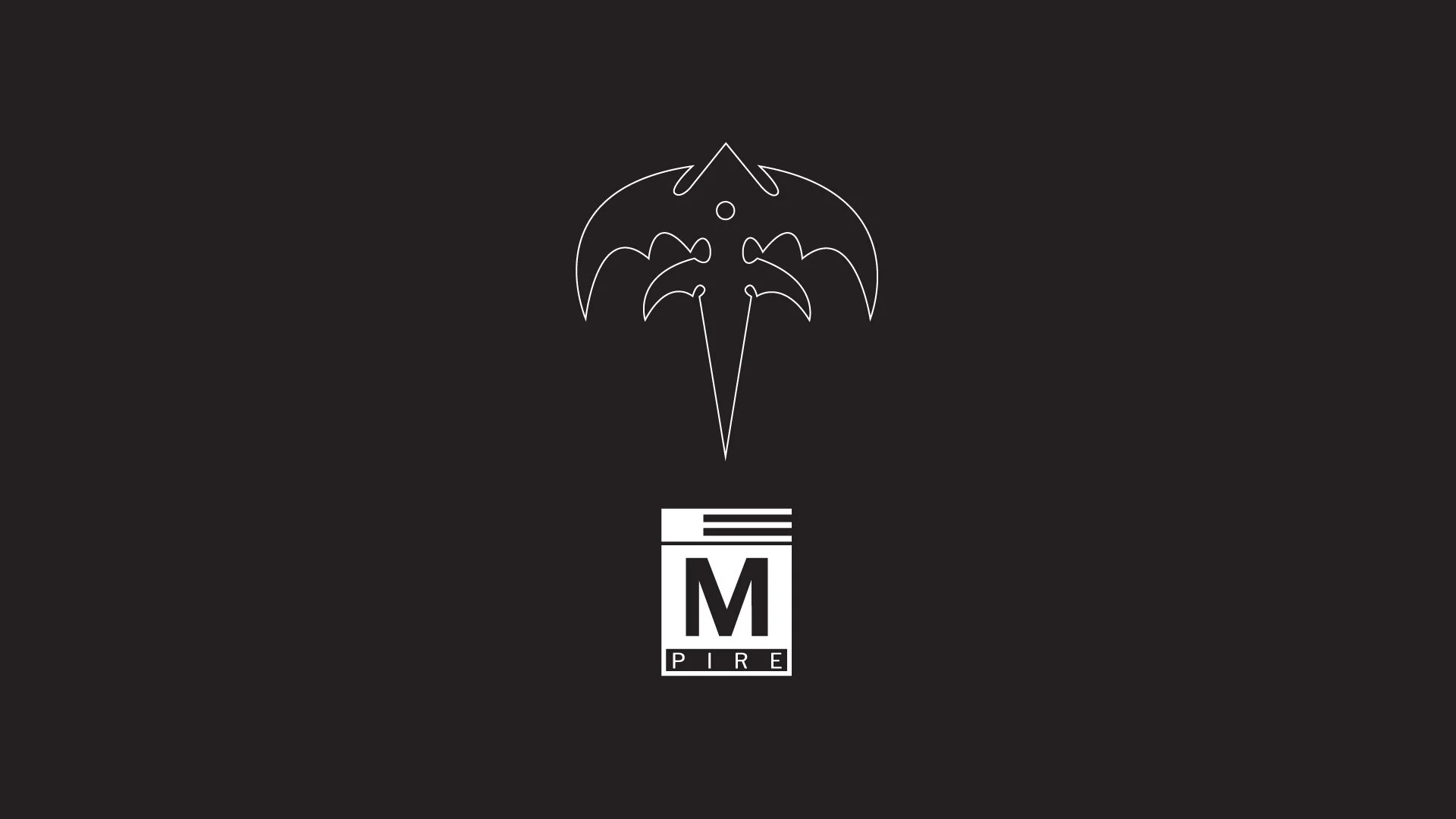
The so-called Tri-Rÿche symbol is reinterpreted as a hollow, line-weight mark with a more architectural than ornamental presence. Opening up the form allows it to breathe within the system and cut through dense compositions without overpowering them. Within the campaign, it functions as a recurring visual anchor—used to frame key moments, highlight messaging, and signal transitions across formats. Its familiarity keeps the identity grounded in Queensrÿche’s Empire, while its stripped-down execution gives the system a crisp, contemporary edge.
-
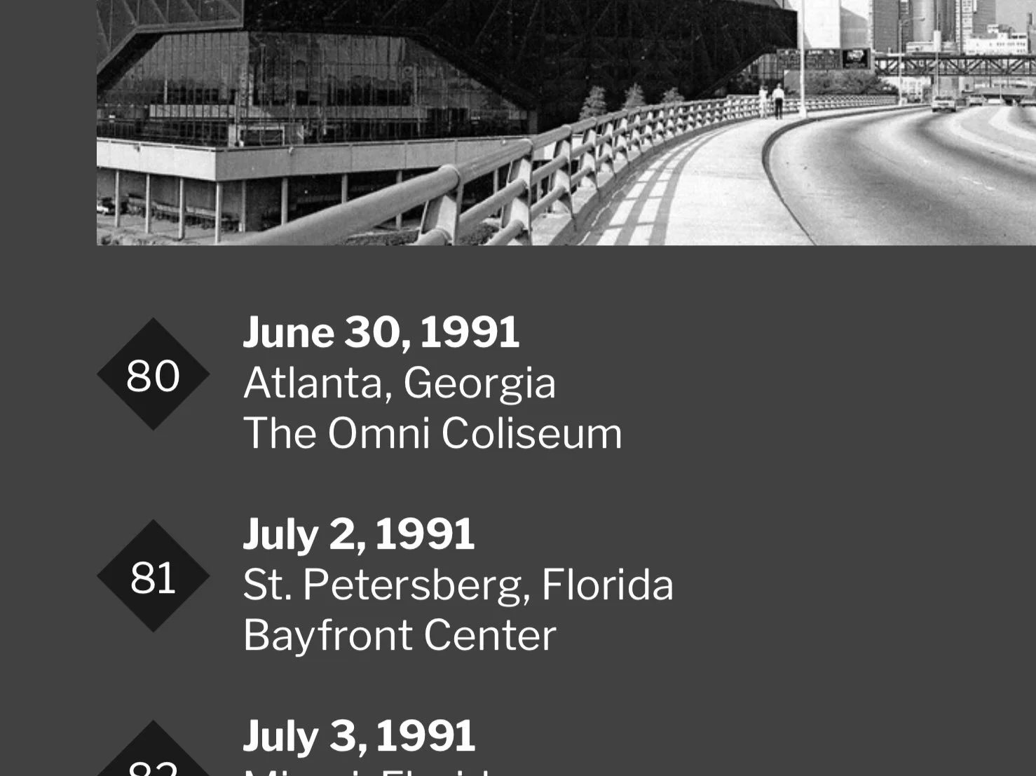
Originally derived from the album’s tracklist, the diamond-framed numerals are expanded into a flexible numbering and emphasis system used throughout the campaign. They appear across timelines, tour references, data callouts, and informational touchpoints—providing structure while reinforcing continuity. The shape offers a clear nod to the original 1990 package design, acting as a visual through-line that bridges archival material with a contemporary campaign framework for Queensrÿche’s Empire.
-
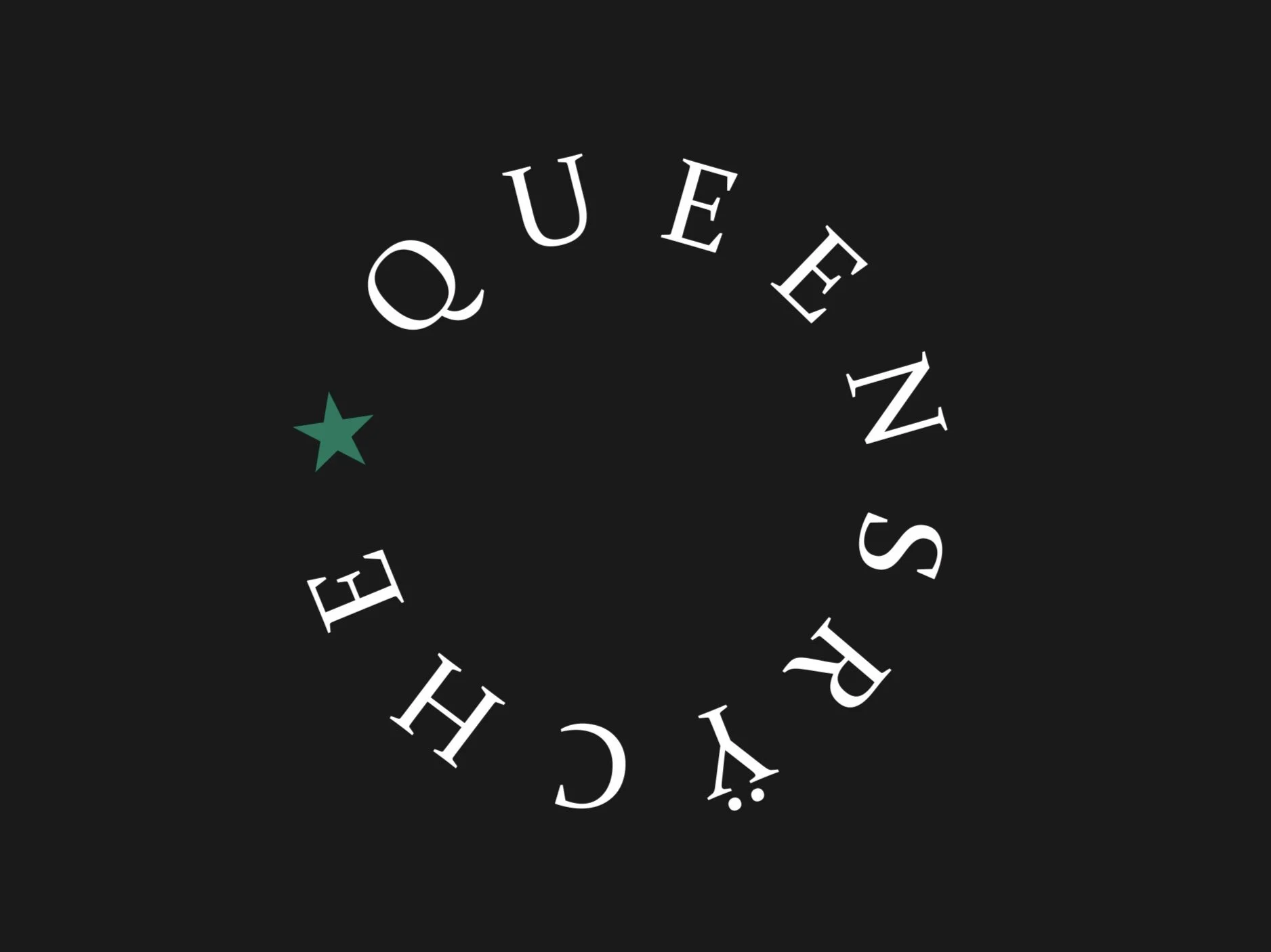
The circular Queensrÿche path-logo with its punctuating star is used sparingly as a symbolic anchor within the campaign. Rather than functioning as a primary mark, it appears at key moments—introductions, conclusions, and select touchpoints—creating a sense of orbit, progression, and return. Its restrained use allows it to ground negative space, add quiet mystique, and reinforce continuity without competing with primary messaging. By remaining minimal and intentional, the mark helps unify the campaign while echoing the cyclical themes at the heart of Empire.
APPLICATIONS
Designed as a flexible ecosystem rather than a fixed set of assets, the campaign identity extends across digital and physical applications. The examples that follow show how the system adapts across platforms, while preserving the atmosphere and narrative at the core of the campaign.
WEBSITE
-
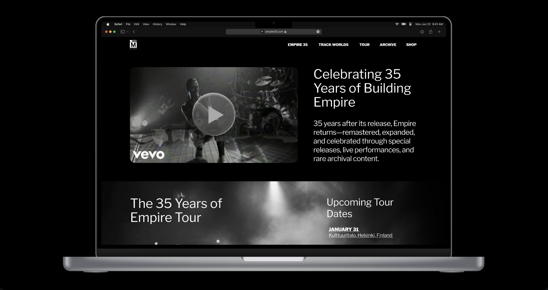
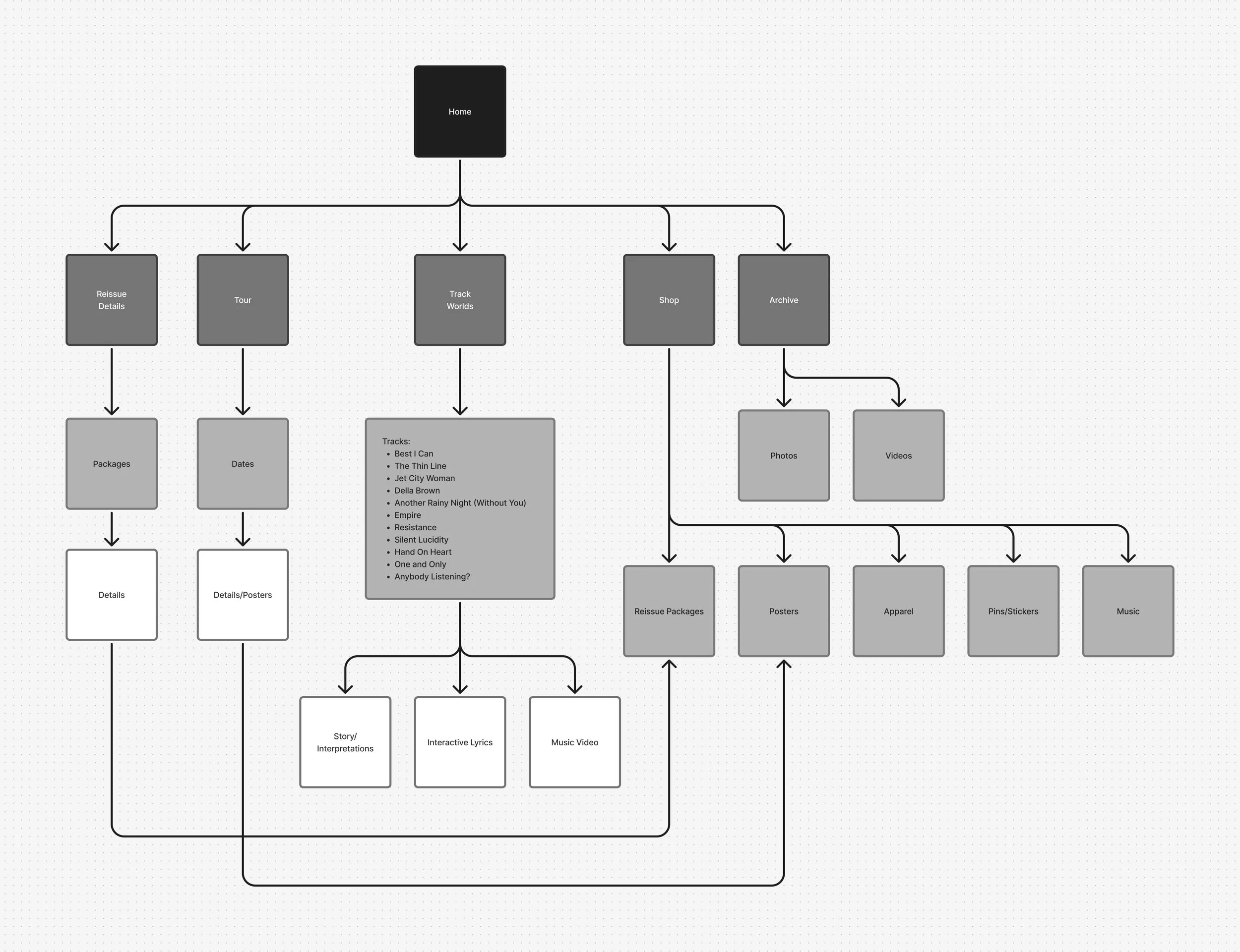
The website was conceived as the central campaign hub—designed to generate interest in the album reissue, upcoming tour, and associated merchandise while commemorating the legacy of Empire as a cultural work. Its structure balances atmosphere with clarity, guiding visitors from discovery to deeper engagement and ultimately toward conversion without disrupting the tone of the campaign. The design process began in Figma with a high-level flow chart to define key user paths and priorities, followed by low-fidelity wireframes to establish hierarchy and pacing. From there, selected pages were built out into full visual mockups, allowing the campaign’s design system, narrative, and motion elements to come together in a cohesive digital experience.
promotional VIDEO
-
As a central expression of the campaign, a short motion piece was developed to establish the atmospheric world surrounding Queensrÿche’s Empire. Drawing inspiration from early-1990s Nike commercials and the stark visual language of film noir, the video brings together archival album imagery, newly designed campaign assets, urban environments, and selective music-video excerpts to create a fast, moody visual rhythm. More than a standalone video, it functions as a tonal gateway for the campaign—distilling the album’s scale, tension, and melancholy into a kinetic introduction. The piece integrates typography, texture, and rapid-cut sequencing to reinforce the broader visual system and demonstrate how the campaign identity translates seamlessly into motion.
album reissue & release strategy
-
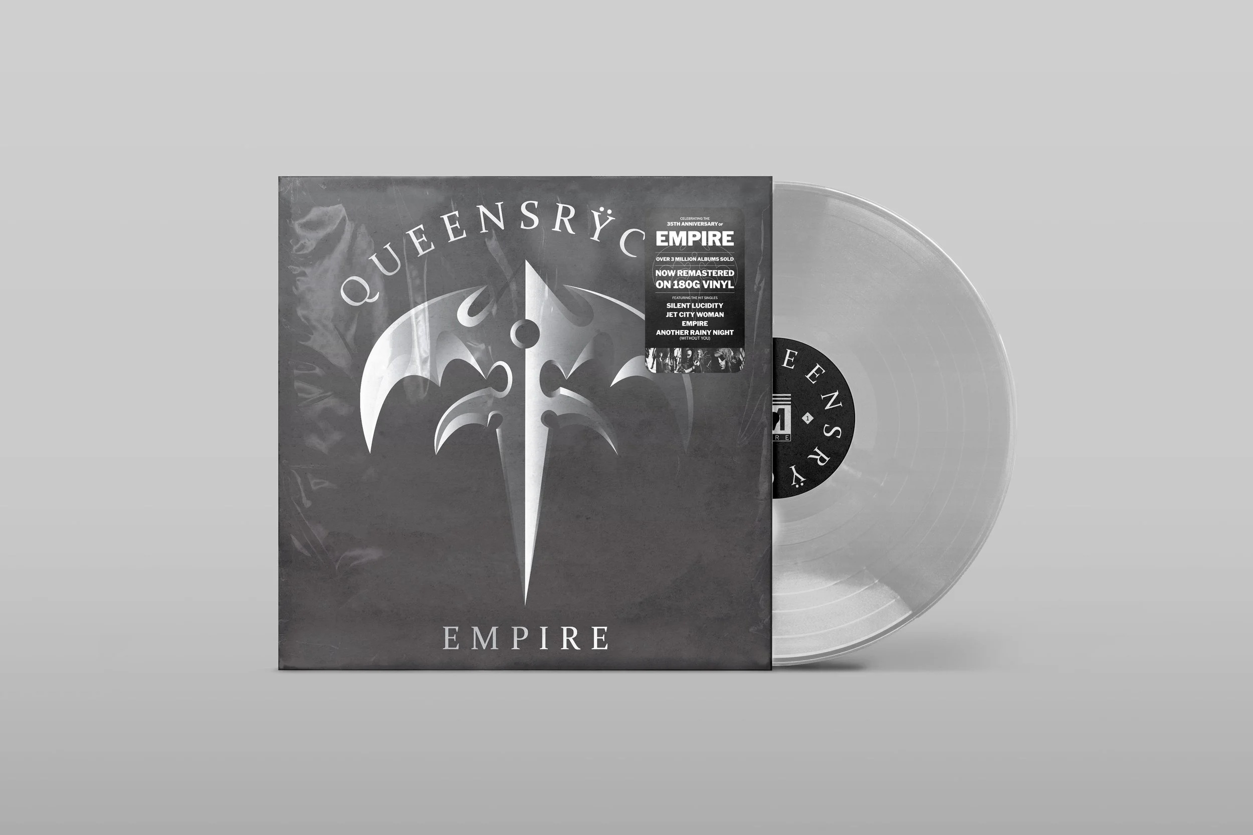
The album reissue features imited vinyl, CD, and cassette editions as commemorative keepsakes—tactile artifacts that honor the legacy of Empire in a streaming-first era. While these formats emphasize collectibility and ritual, the campaign’s primary listening experience lives on digital platforms, supported by an animated album cover for Apple Music and Spotify. Together, the physical and digital releases position Empire as a living work—experienced through modern channels while preserved through design.
campaign poster
-
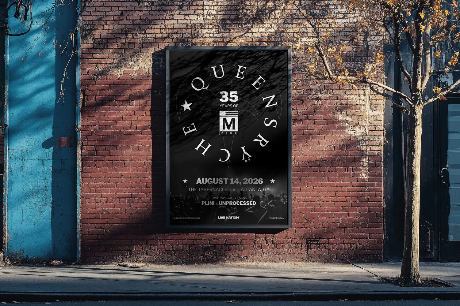
Designed as a companion piece to the album reissue, the poster translates Empire’s core themes into a single, high-impact composition. The layout relies on deliberate contrast—large and small, dark and light, rigid structure and expressive gesture—to mirror the album’s tension between humanity and the systems that contain it. Strong, architectural typography establishes a sense of order and control, while fragmented photography and hand-drawn linework introduce moments of vulnerability and disruption. Together, these elements reflect the emotional duality at the heart of Empire. More broadly, the poster—and the campaign as a whole—serves as a study in designing mood and atmosphere: using composition, texture, and restraint to build a cohesive visual world that audiences can step into. Rather than functioning as isolated graphics, these pieces work collectively to extend the album’s narrative, demonstrating how world-building through design can transform a familiar work into an immersive, contemporary experience.
coffee table book
-
The Building Empires coffee table book serves as the editorial backbone of the 35th anniversary campaign—a long-form exploration of Empire that informed the visual language, tone, and structure of the broader system. Conceived as a retrospective rather than a product, the book blends archival research, original writing, and atmospheric design to examine the album’s themes of power, ambition, and humanity. While not commercially released, it functions as a foundational artifact—shaping the campaign’s typography, iconography, and narrative approach, and anchoring the entire project in a deep, research-driven point of view.
live TOUR applications
-
The tour applications demonstrate how the campaign’s identity system extends beyond primary marketing into the lived experience of a concert. From venue marquees and outdoor posters to commemorative tickets and backstage passes, the system scales fluidly across formats and contexts. Smaller, often overlooked artifacts—apparel, enamel pins, and even guitar picks—are treated with the same restraint and intention, reinforcing the campaign’s visual language at every touchpoint. Together, these applications create an immersive, cohesive world around the tour, where branding is not just seen, but encountered—before, during, and long after the show.
What began as a nostalgia-driven passion project evolved into a broader exploration of what Empire still has to say in 2025. Reimagining the album as a 35th-anniversary campaign became a study in identity systems, narrative cohesion, and the translation of music into multi-platform design experiences. Through typography, iconography, photography, web design, and motion, the work examines how a sonic world can be reintroduced as a cohesive visual ecosystem—intentional, immersive, and scalable. Ultimately, the case study reflects a deeper inquiry into world-building through design: how legacy work like Empire can be honored while being reframed in ways that feel contemporary, expressive, and relevant to modern audiences.
