

DURAVIT
Duravit is a luxury ceramics manufacturer based in Germany. I have been the in-house designer for the marketing department at their North American headquarters since 2017. Here are some various projects I have worked on for Duravit.
overview
-
Ongoing design work for Duravit USA
-
Duravit’s global identity is known for its clean, architectural aesthetic, but translating that into the needs of the US market requires some tweaking. The guidelines are defined yet intentionally open-ended, and all photography and campaign assets come from HQ, often created for European storytelling with different lighting, compositions, and product mixes. Local product availability shifts throughout the year, as well. My challenge is to unify these varied assets, work within a flexible global system, and create premium, consistent, and practical materials tailored specifically to how the US market uses them.
-
Everything from brochures to web banners, large-format signage, magazine ads, technical documents, social media graphics, showroom visuals, and everything in between.
-
2017-Present
-
Delivered consistent, on-brand marketing assets that supported national sales efforts, trade-show visibility, showroom updates, and key product launches.
GOALS
01
Localize Global Aesthetics
Duravit’s visual identity is rooted in minimal, architectural clarity. My job is to carry that DNA into US-facing materials while adapting the tone for a market that often needs more direct messaging and clearer hierarchy. The result is a design approach that stays unmistakably Duravit, but communicates more immediately to architects, designers, and buyers in North America.
02
Design Consistency Across Multiple Channels
Because many of Duravit’s global standards are intentionally broad, I established internal systems that bring consistency to US materials without sacrificing flexibility. A unified grid, a repeatable typographic rhythm, and a modular layout structure ensure that every brochure, ad, showroom plaque, spec sheet, or social asset feels coherent, even when the guidelines leave room for interpretation.
03
Working Within Real-World Constraints
All product photography originates from HQ, which means the US team often works with imagery shot in different locations, lighting styles, and compositions. My role is to harmonize these assets and elevate them through thoughtful layout choices that highlight strengths, downplay limitations, and create a polished final result. The goal is to make every piece feel intentional and premium, regardless of the constraints behind it.
04
Collaboration Across Departments
US-facing design must not only look refined — it must function in the real world. From trade show signage and showroom displays to brochures, magazine ads, and social media, each piece is created to support how the sales team actually uses it. This practical lens shapes my design decisions, ensuring that the materials stay on-brand, clear, and effective across all touchpoints.
key accomplishments
From engineering the foundational design system for the Ready to Ship program to architecting a high-impact series of landing pages for the PL25 launch, these initiatives represent a strategic effort to modernize Duravit’s digital presence. By leading the comprehensive US website overhaul and adapting global brand standards for a premium domestic market, I have focused on creating a cohesive digital ecosystem that prioritizes user experience, operational clarity, and measurable business growth.
READY TO SHIP PROGRAM
ROLE: LEAD DESIGNER / DESIGN PARTNER
DELIVERABLES: RESPONSIVE LANDING PAGE, MULTI-PAGE PRINT BROCHURE
FOCUS: INVENTORY TRANSPARANCY & SALES OPTIMIZATION
TIMELINE: Q3-Q4 2022
During a period of significant market volatility in mid-2022, Duravit faced the challenge of clearly communicating real-time product availability to architects, designers, and consumers. The Ready to Ship program was developed to bridge this gap, requiring a cohesive visual strategy that signaled reliability and immediate access to premium inventory. I led the creative execution for this initiative, designing a high-impact digital landing page and a comprehensive physical brochure that transformed complex inventory data into a streamlined, user-friendly procurement tool. I also developed the foundational design language and structural framework for the Ready to Ship program, creating a scalable system that continues to adapt to Duravit’s evolving business needs and seasonal inventory shifts.
The result was a synchronized omnichannel experience that provided much-needed transparency in the specification process. By aligning the design language with Duravit’s premium brand standards, the program successfully removed friction from the customer journey and optimized logistics. This strategic clarity led to a measurable increase in sales and strengthened partner trust, proving that well-executed design is a critical component of supply chain efficiency and revenue growth.
PL25 launch
ROLE: LEAD DESIGNER / DESIGN PARTNER
DELIVERABLES: A SERIES OF RESPONSIVE EDITORIAL-STYLE LANDING PAGES
FOCUS: MARKET ENTRY & VISUAL IDENTITY
TIMELINE: Q1-Q2 2025
To coincide with the national PL25 rollout, I led the digital debut of several new product collections, focusing on establishing their visual identity within the broader Duravit ecosystem. The objective was to facilitate a high-stakes market entry for these series—not through traditional high-volume advertising, but through a curated digital experience that elevated their perceived value. By architecting a series of editorial-style landing pages, I provided these new collections with a dedicated platform to showcase their unique design language and technical craftsmanship.
My approach centered on aesthetic elevation, using high-fidelity photography and a minimalist UI to ensure these new offerings felt immediately prestigious. By prioritizing the "sensory" aspect of the digital journey, I ensured that even without a heavy promotional push, the products possessed the visual gravity required to capture the attention of architects and high-end specifiers. This strategy turned a standard price list update into a sophisticated brand-building exercise, seamlessly integrating new innovation into the existing portfolio.
MARKET ENTRY
Establishing the visual DNA for new collections through high-stakes, full-bleed imagery that defines the series' personality.
AESTHETIC ELEVATION
Highlighting specific design innovations and materiality to justify a premium market position.
STRATEGIC INTEGRATION
Balancing new product narratives with existing brand standards to ensure a cohesive, multi-series digital ecosystem.
COMING SOON…Global Website Localization & Brand Adaptation
Currently leading the comprehensive digital transformation and architectural overhaul of the Duravit US website to align with modern user standards and premium brand positioning. Case study in development.
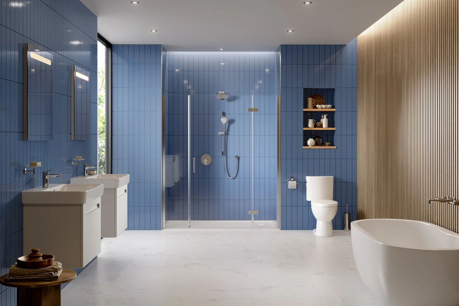
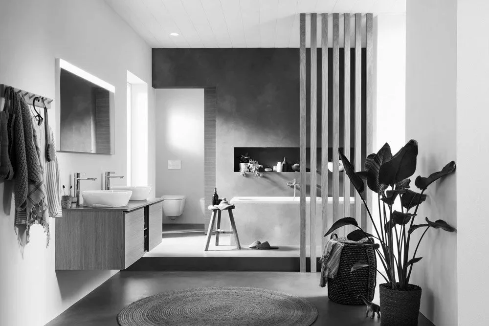
ADVERTISEMENTS
These are some advertisements I designed for various Duravit product series. These advertisements have been featured in magazines such as Interior Design, Elle Decor, Metropolis, Sunset, and Architect’s Newspaper.
FEATURED IN
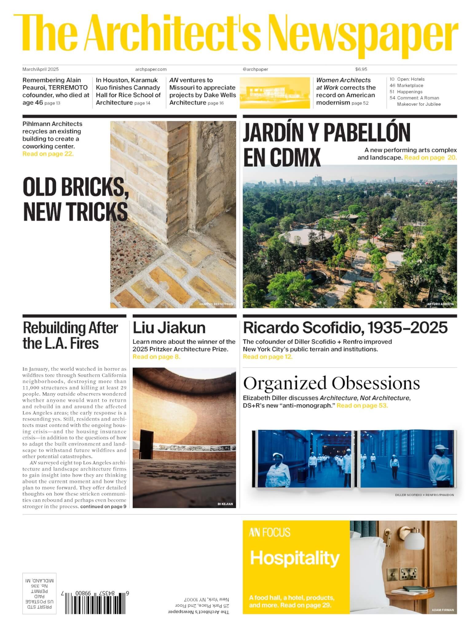
The Architect’s Newspaper - March/April 2025
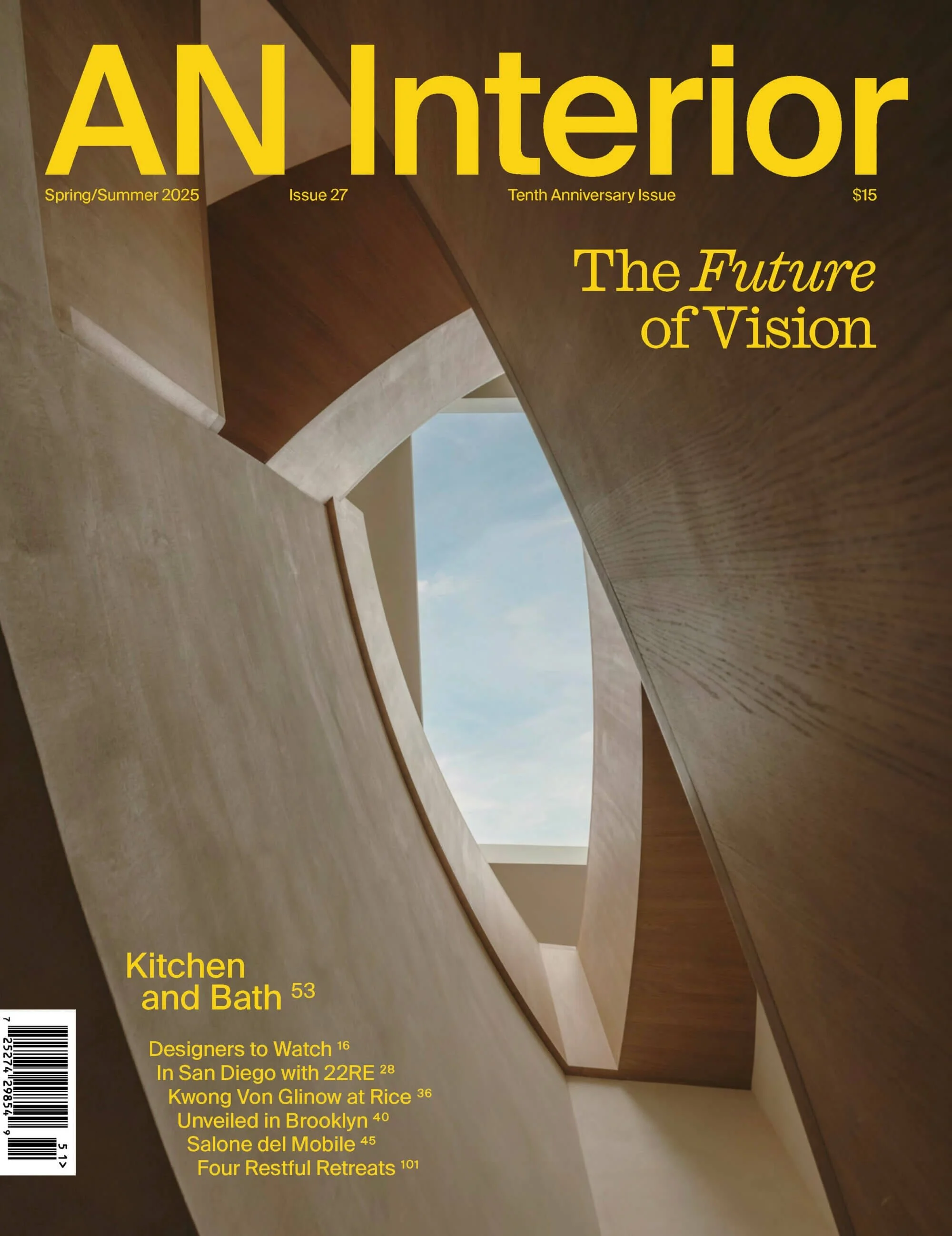
The Architect’s Newspaper - Spring/Summer 2025
FEATURED IN
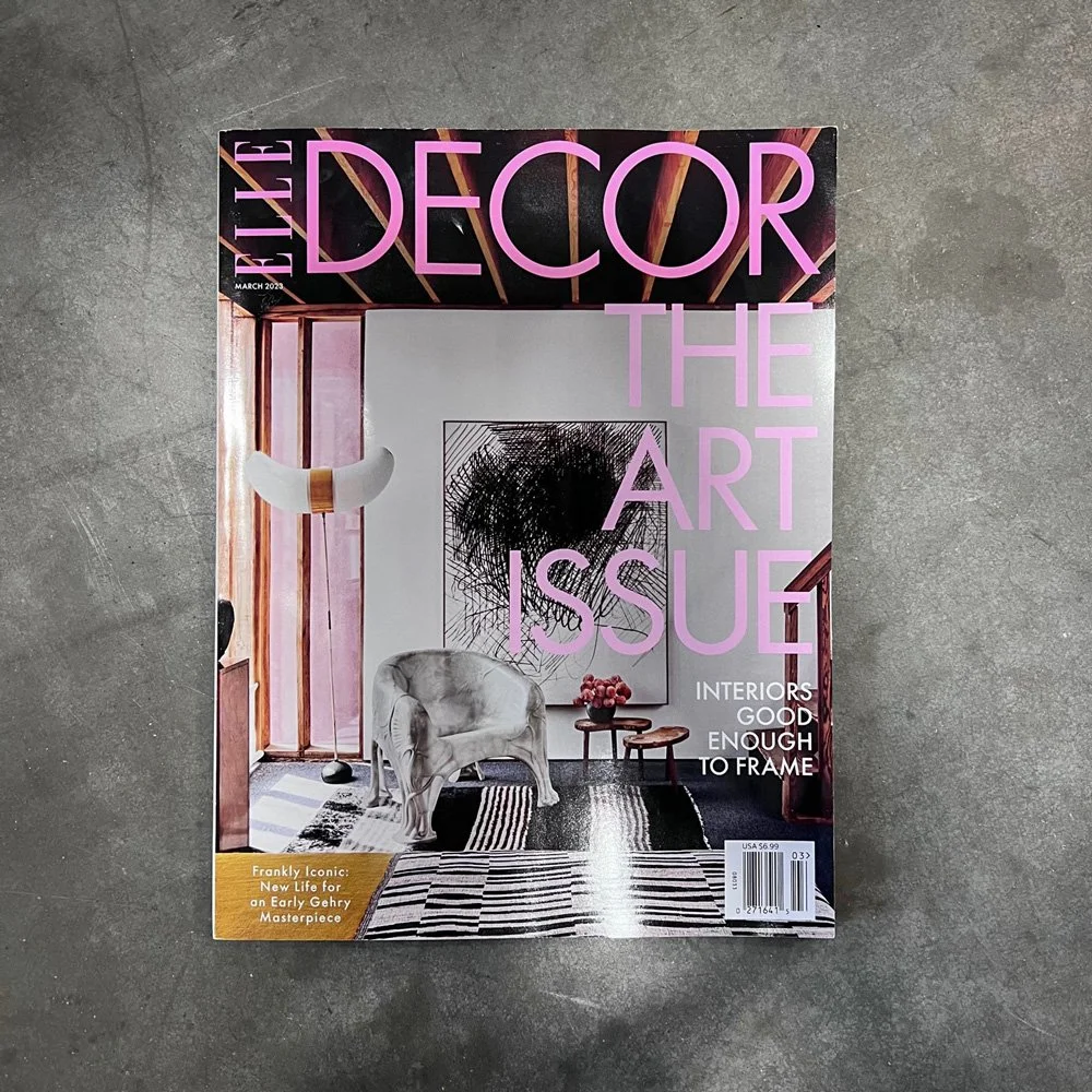
Elle Decor Magazine - March 2023
FEATURED IN


Metropolis Magazine - September/October 2022
Interior Design Magazine - January 2023
FEATURED IN


Metropolis Magazine, July/August 2022
Metropolis Magazine, January/February 2023