
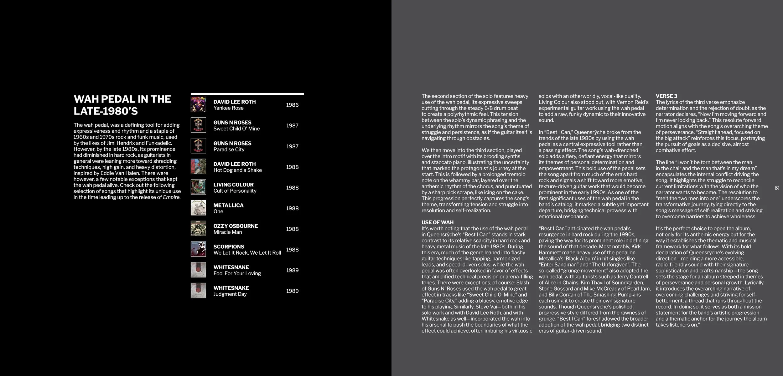
building Empires:
35th anniversary Retrospective
A SPECULATIVE DESIGN STUDY
The following is a self-initiated reimagining of Queensrÿche’s 1990 album, Empire, as a modern editorial experience—a conceptual book titled Building Empires: A 35th Anniversary Retrospective. What was initially fueled by nostalgia, quickly became a focused study in storytelling, branding, and experiential design—translating a musical world into a cohesive visual system. The work explores how typography, iconography, photography, and motion can build a unified identity that both honors a classic work and extends its broader narrative to contemporary audiences.

overview
-
Design a retrospective concept book commemorating the 35th anniversary of the album Empire by the band Queensrÿche, exploring the album’s themes, art direction, and legacy through a modern design lens. The scope includes developing a cohesive visual system, refining the book’s narrative structure, and producing conceptual layouts that blend research, writing, and visual storytelling.
-
The primary challenge was to communicate the impact of a culturally significant album into an editorial format. Every design decision was intended to respect the original concept while still offering a fresh, thoughtful interpretation of the era’s themes, aesthetics, and historical context. Balancing reverence for the source material with original design thinking and personal commentary became the core creative tension of the project.
-
While the physical deliverable is in the form of a retrospective coffee table book, design deliverables include a complete editorial design framework, a flexible grid system, typographic hierarchy, visual motif development, and exploratory layout compositions. Additional deliverables include written essays, historical annotations, color and texture studies, and page designs.
-
The seed for this project was planted in 2015, but actual work began early in 2024.
-
The result is a body of work that demonstrates my approach to long-form editorial storytelling: structured, atmospheric, research-driven, and emotionally grounded. While entirely non-commercial and unofficial, the project serves as a significant creative milestone — merging design, writing, music history, and personal reflection into a singular practice piece. The outcome is a refined understanding of editorial craft and a tribute to a defining album that continues to shape my creative identity.
DISCLAIMER: This project is a conceptual editorial prototype created for portfolio use only. It is strictly non-commercial, and not intended for publication. All intellectual property belongs solely to Queensrÿche and their rights holders.

What does a 35-year-old hard rock album still have to say in 2025?
That question sits at the core of this project—a commemorative exploration of Queensrÿche’s Empire. I first imagined creating something for the album’s 25th anniversary, but I didn’t yet have the will to execute the idea. Still, the idea stuck with me over the years. Empire wasn’t just an album I liked; it became a backdrop to my life. Its themes of power, paranoia, ambition, and hope resonated long before I understood why, shaping not only my taste but the way I think visually and narratively.
One of the first points of inspiration actually came, of all places, from a Sappi paper swatch book I found at school, that was themed around late-’90s and early-2000s fintech. Its imagery—cold, stoic, and detached—felt oddly like a lost companion to Empire. That unexpected connection clarified the direction of this project: it was no longer about nostalgia, but about world-building. The album became a lens through which I could challenge myself editorially: developing a layout system, blending research with personal writing, shaping atmosphere through typography and hierarchy, and creating a visual language that could contain both analysis and emotion.
From the beginning, this project was always meant to be a professional design exercise—a way to merge personal history with craft in order to produce a tactile experience. This concept is not for publication or profit, however it represents a meaningful intersection of my skills and my influences. It asks a simple but compelling question:
How do you honor something iconic while translating it into a visual language of your own?
origin story

approach
Here’s a closer look at the choices that shaped this concept—the structure, tone, and ideas beneath the visuals. These are the principles that guide my long-form work and the way I approach storytelling through design.
-
The backbone of this project was a flexible design system designed to handle long-form content, imagery, annotations, and reflective writing. I built a modular grid structure that allows for varied pacing — from dense analytical spreads to quieter, atmospheric full-bleed moments. This system creates consistency across the book while still allowing each chapter to express its own tone and rhythm.
-
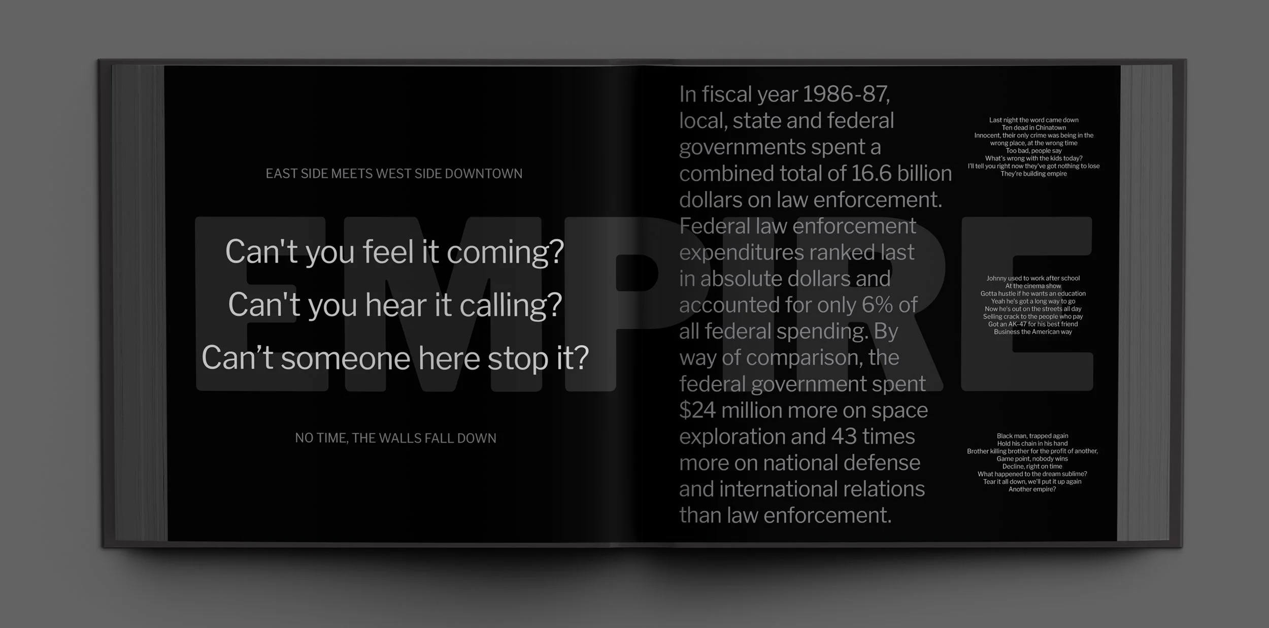
Visually, the concept leans into the album’s noir, industrial, and metallic undertones. I explored a restrained palette, sharp contrasts, and architectural forms to reflect the album’s themes of power, tension, and ambition. The imagery and typographic treatments were chosen to evoke the contrast between grandiose national identity and cold detachment—an aesthetic tension that mirrors the album’s commentary on the darker undercurrents of the American dream.
-
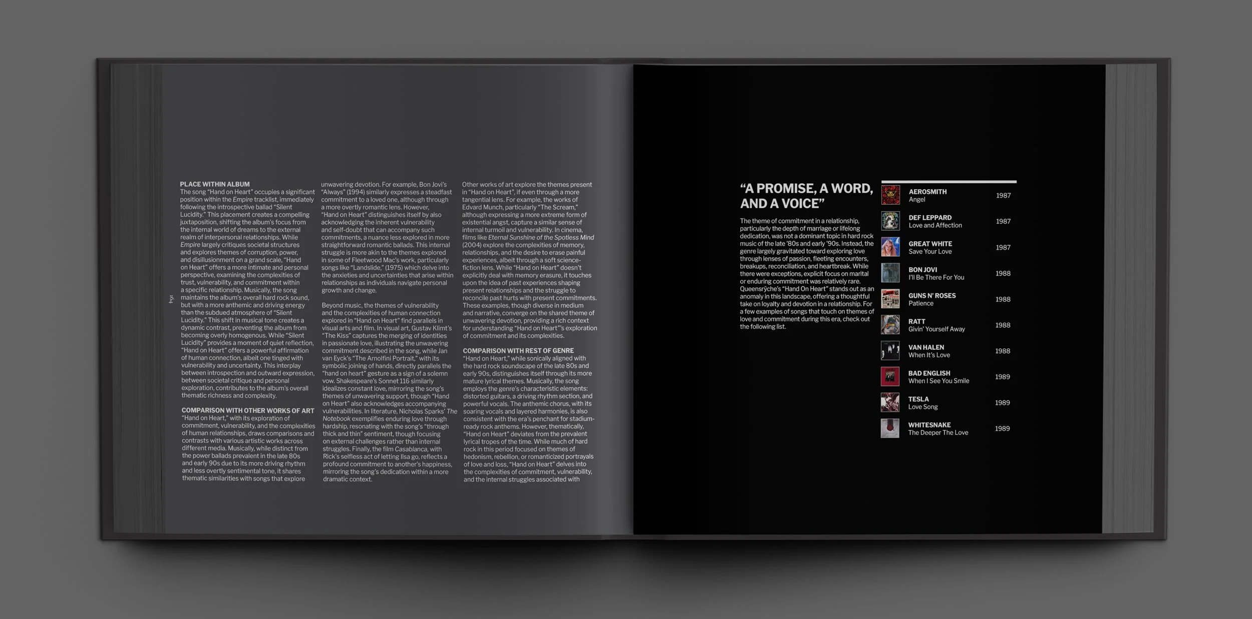
Alongside the visual work, I developed written material that blends research, historical context, and personal interpretation. Each section interprets the album through a contemporary lens, connecting musical themes with cultural, social, and aesthetic ideas. The goal was to create content that feels reflective and informed while reinforcing the book’s design language through tone and structure.
-
This project evolved through continuous refinement — exploring multiple layout variations, testing typographic hierarchies, and adjusting the balance between imagery and text. Each iteration clarified the book’s voice and visual identity, allowing the concept to mature organically. The process emphasized listening to the material itself: letting the themes, mood, and album narrative guide the final choices.
visuals
Below is a breakdown of selected visual elements from the retrospective—explorations in tone, typography, photography, and layout that shaped the book’s artistic direction.
VISUAL INSPIRATION


cover
-
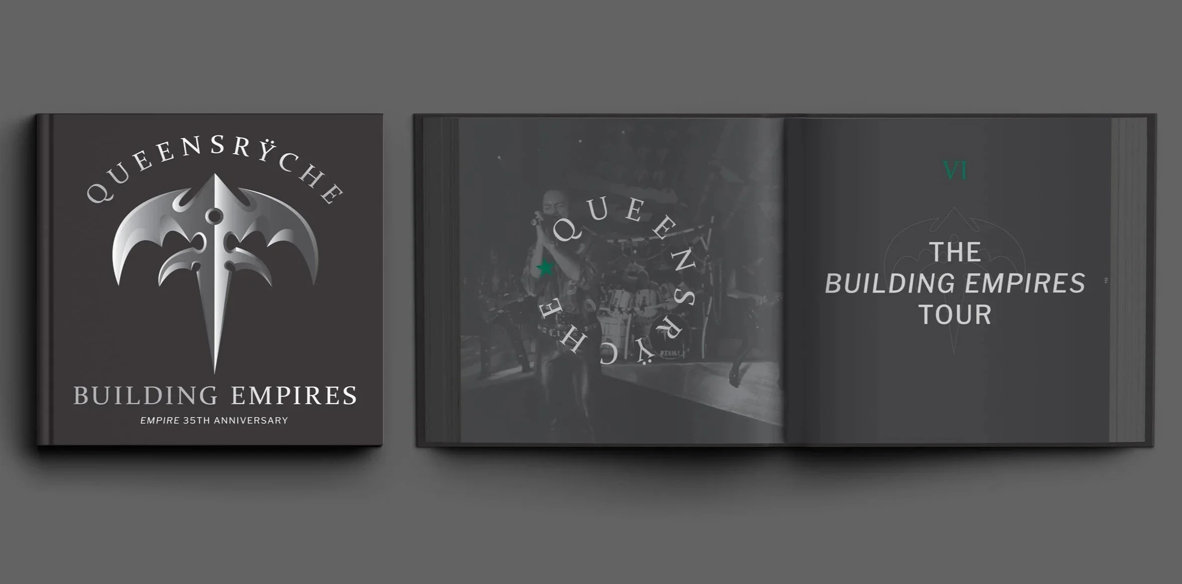
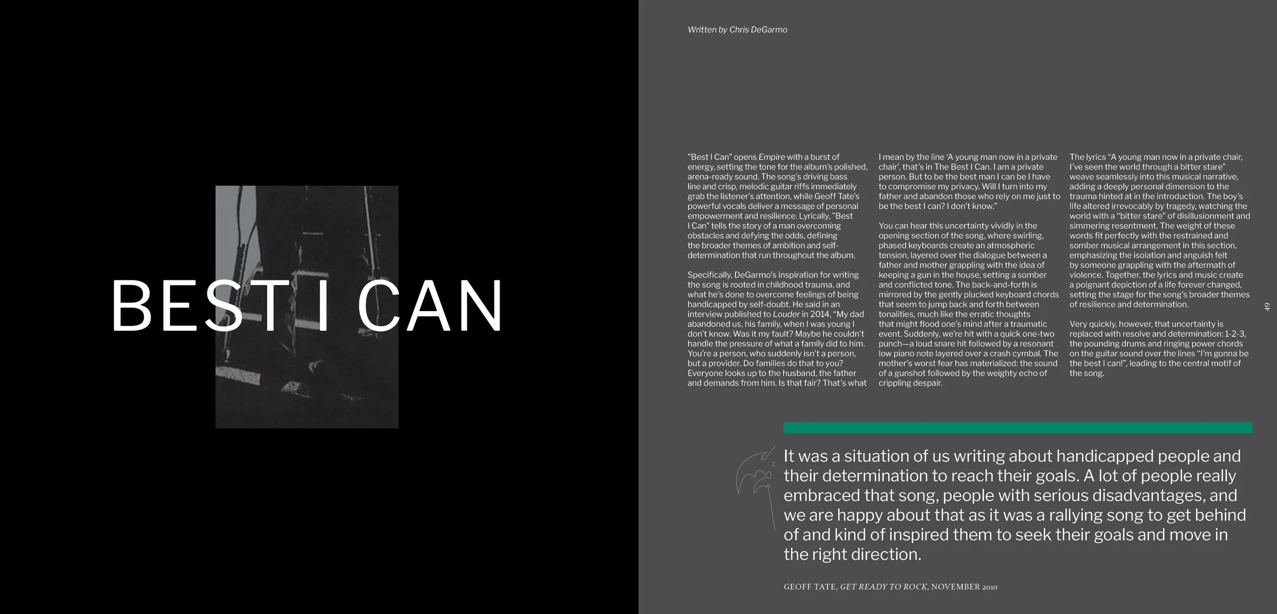
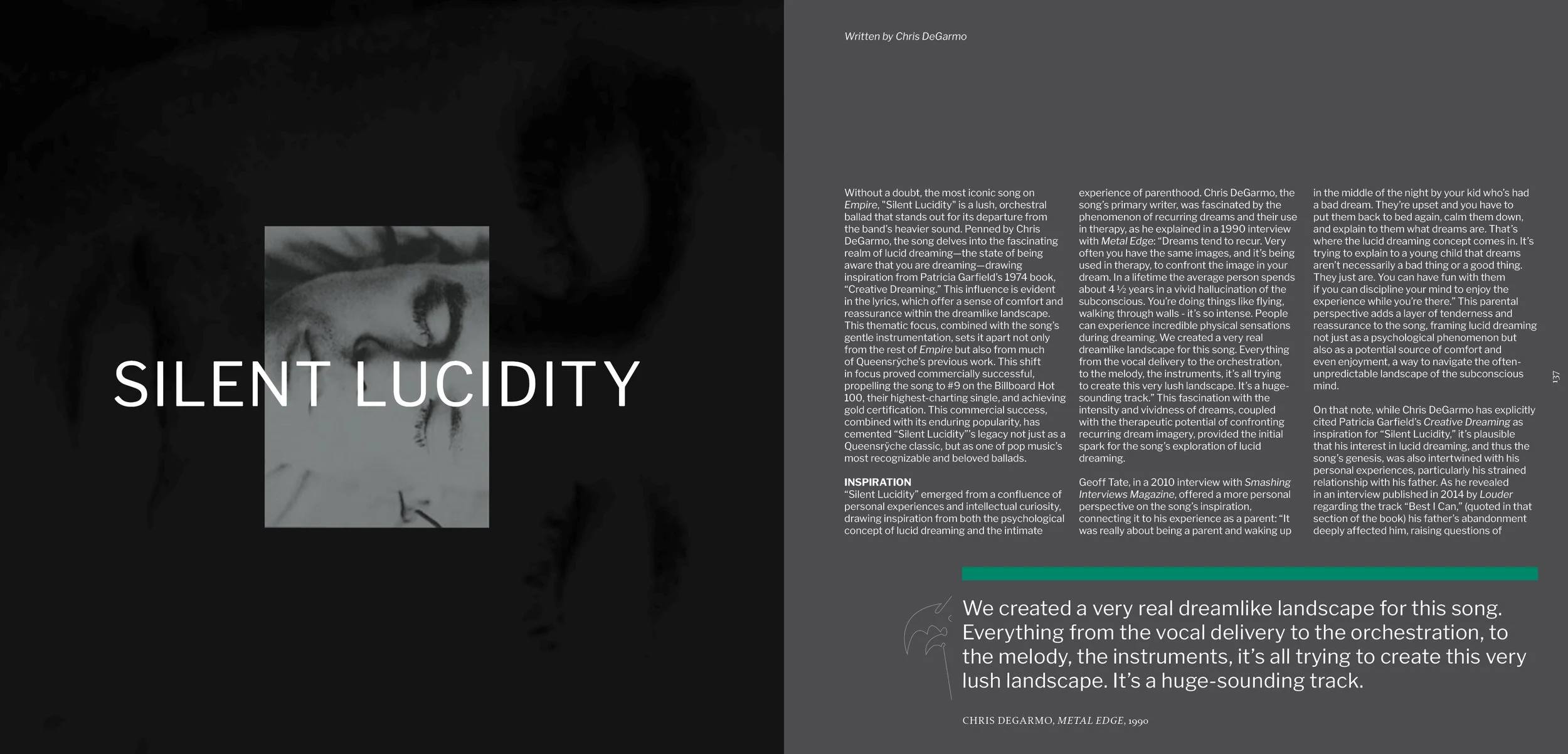
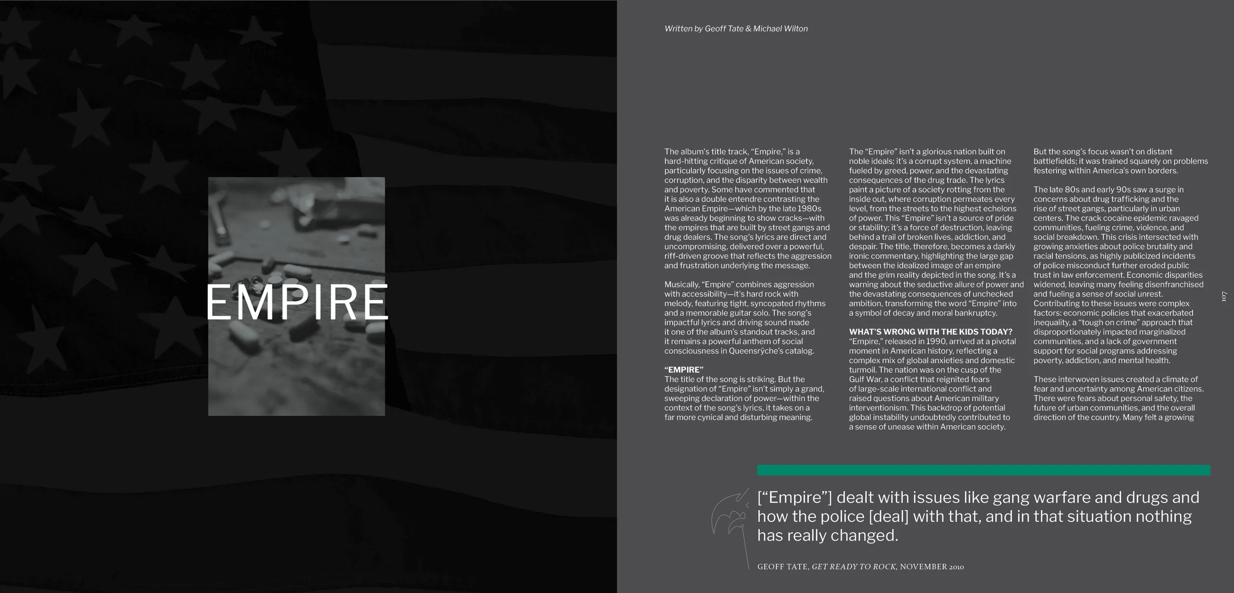
The cover reimagines the original album art through the lens of time, shifting the pixelated Queensrÿche emblem from a rising, enigmatic signal into a fully realized and ominous force. Where the 1990 cover hinted at something emerging, this modern concept asks what that “Empire” looks like decades later—solidified, towering, and inescapable. The visual treatment builds on the album’s architectural mood and civic tension, presenting the emblem not as a digital ghost but as a looming structure within the world it once foreshadowed. It serves as a thematic gateway into the project’s broader world-building, grounding the book in a visual language where idealism, power, and decay converge.
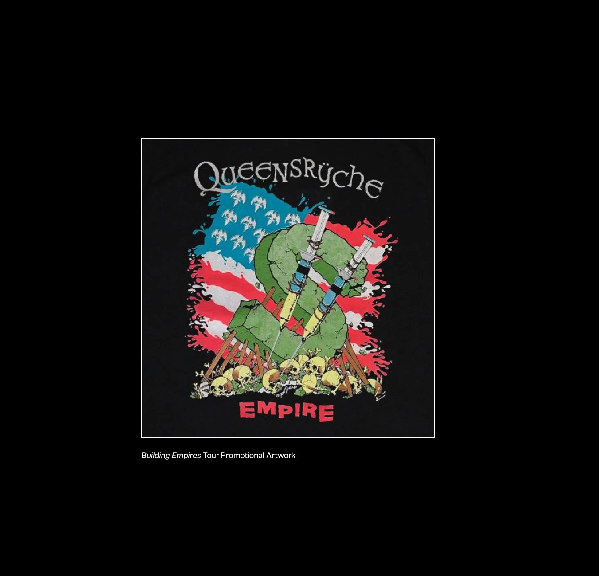
Original album artwork for Empire, 1990
typography
-
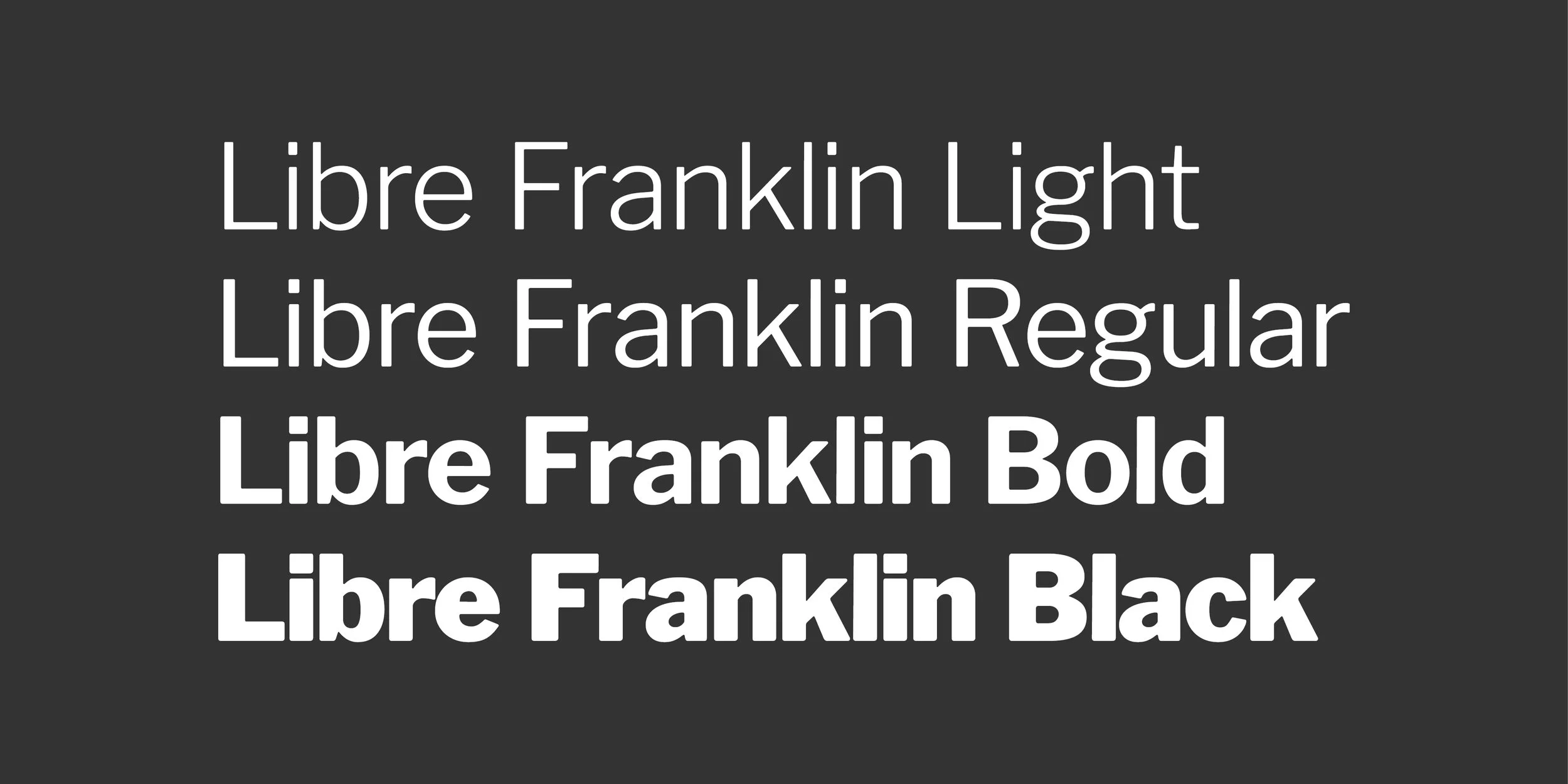
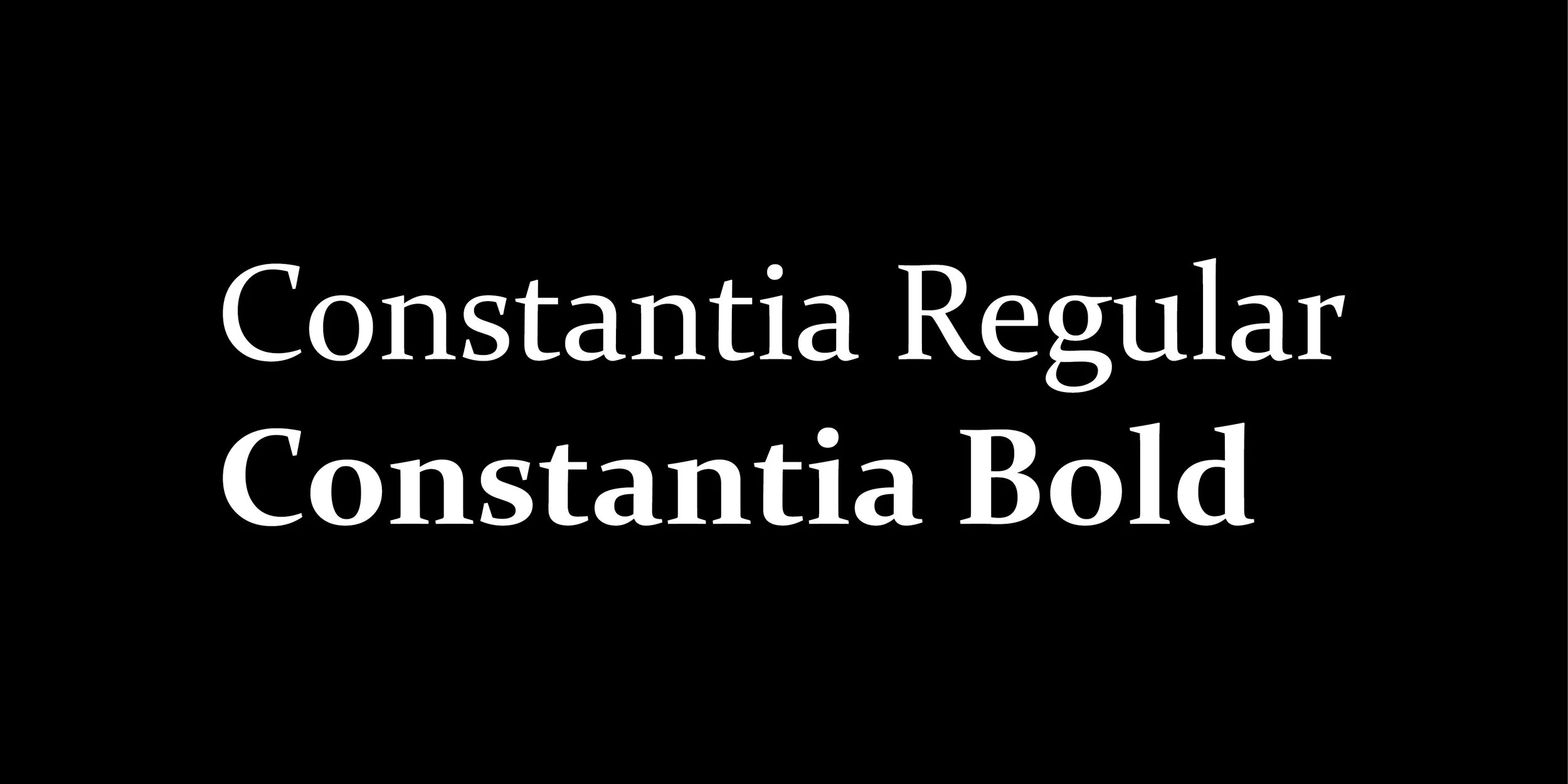
The typographic system blends modern clarity with classical weight—reflecting the tension at the heart of Empire. Libre Franklin anchors the design with its clean, utilitarian geometry, capturing the album’s urban atmosphere and its focus on structure, power, and systems. In contrast, Constantia introduces a more human, serifed presence—echoing the emotional undercurrent of the record and grounding the layouts in a tone that feels reflective rather than purely mechanical. Together, the pairing creates a visual rhythm that mirrors the album’s interplay between hard edges and vulnerable themes.


Sample of the original typography used in the liner notes of Empire
LYRICAL TYPE SPECIMENS
-
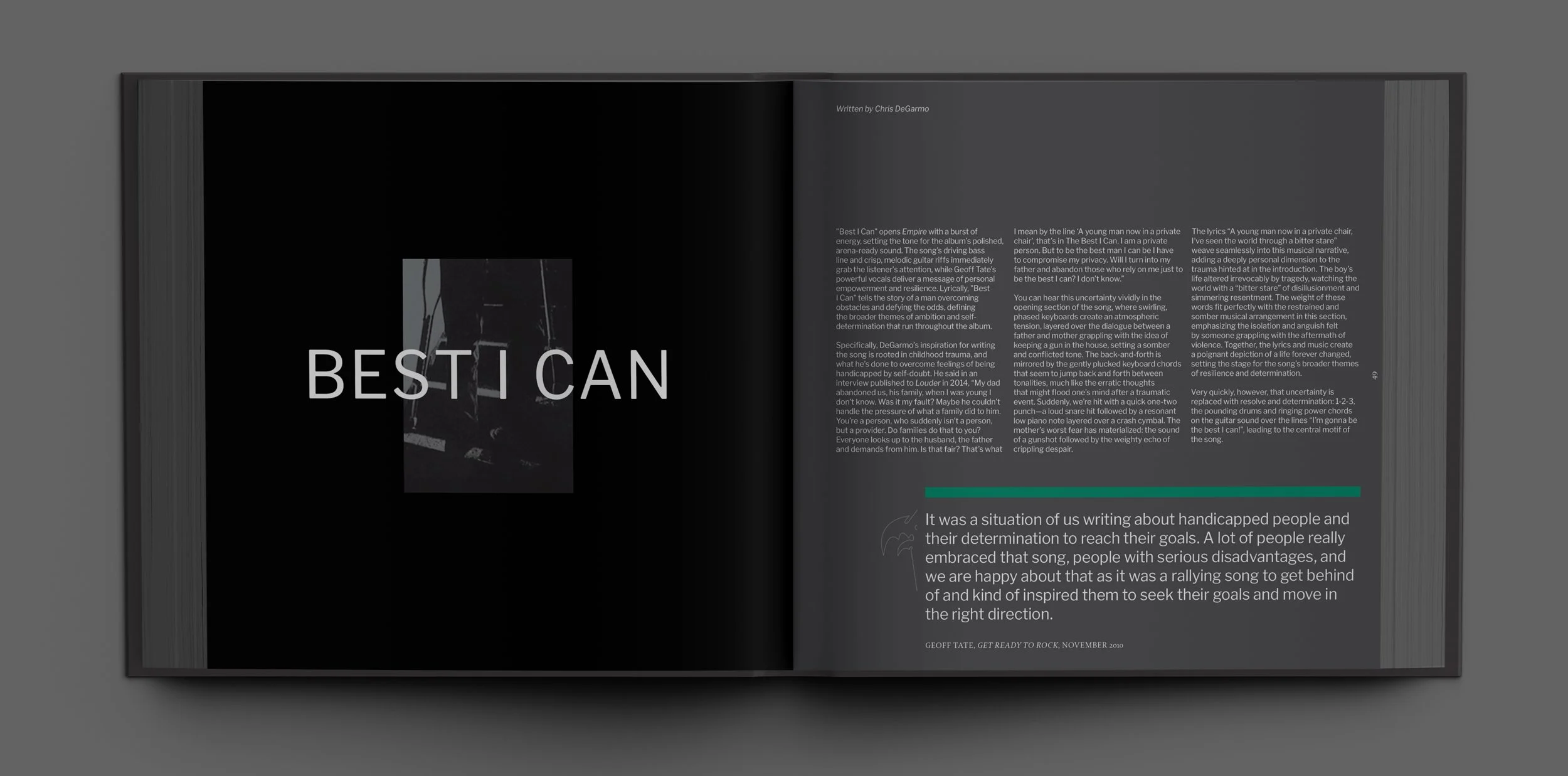
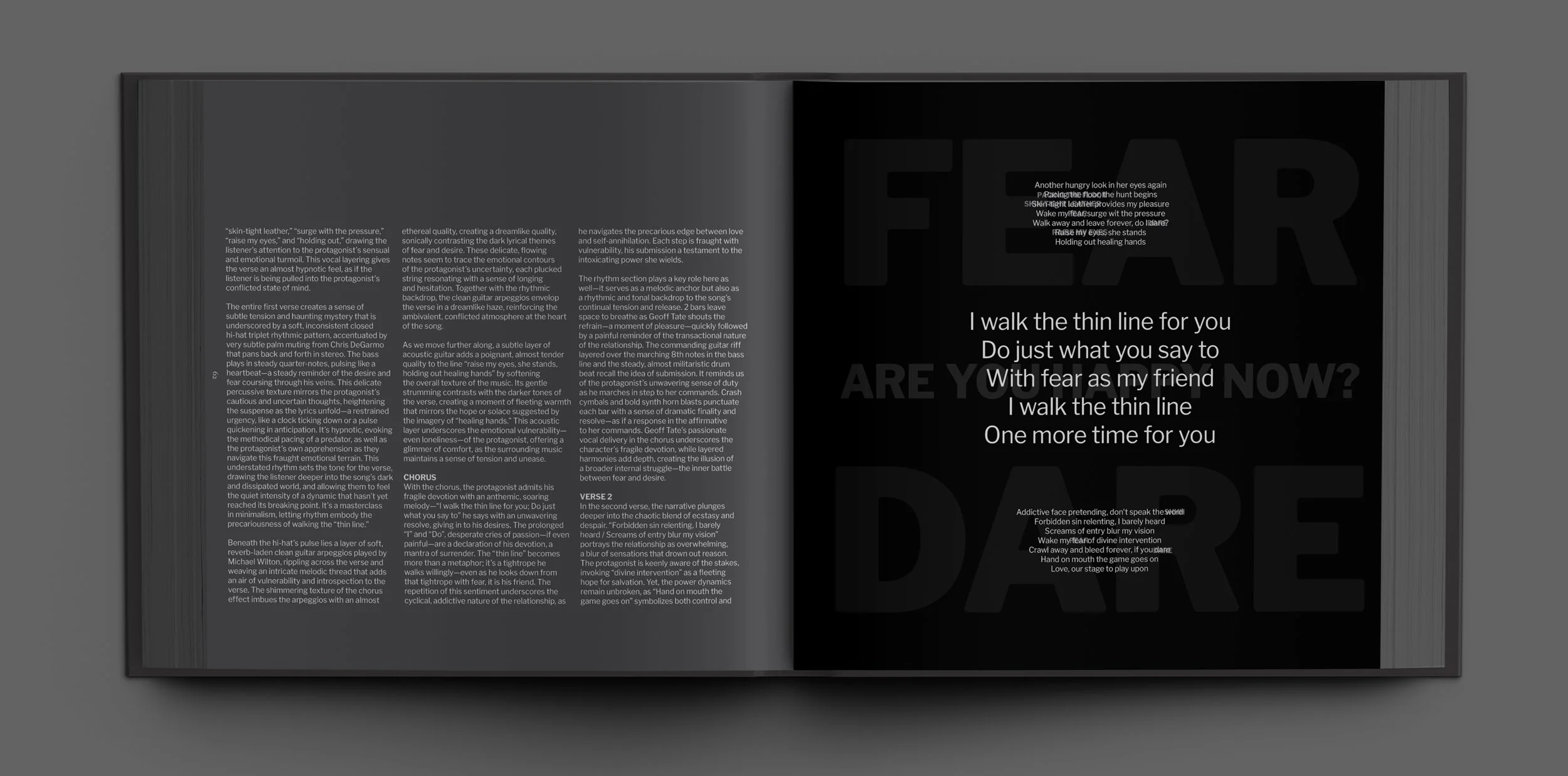
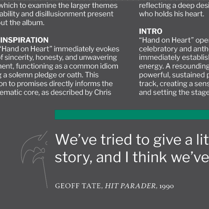
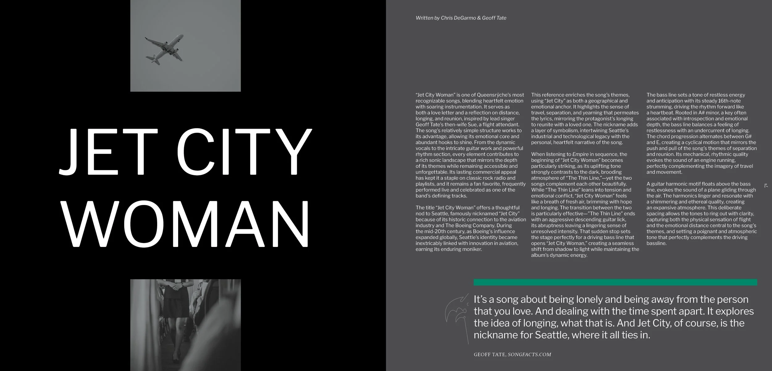
The book features typographic experiments for each of the songs’ lyrics. These type specimens reinterpret the lyrics as atmospheric compositions rather than literal text blocks. Each spread treats the words as material—stretching, isolating, or layering them to mirror the emotional charge of the songs themselves. For “Jet City Woman,” shown here, the typography becomes a physical environment: large, ghosted letterforms evoking movement and the distance between the protagonist and his love interest, while smaller text drifts across the page like faded memories. These pieces function as visual meditations on the album’s narrative, using scale, hierarchy, and rhythm to extend the music into a typographic language.
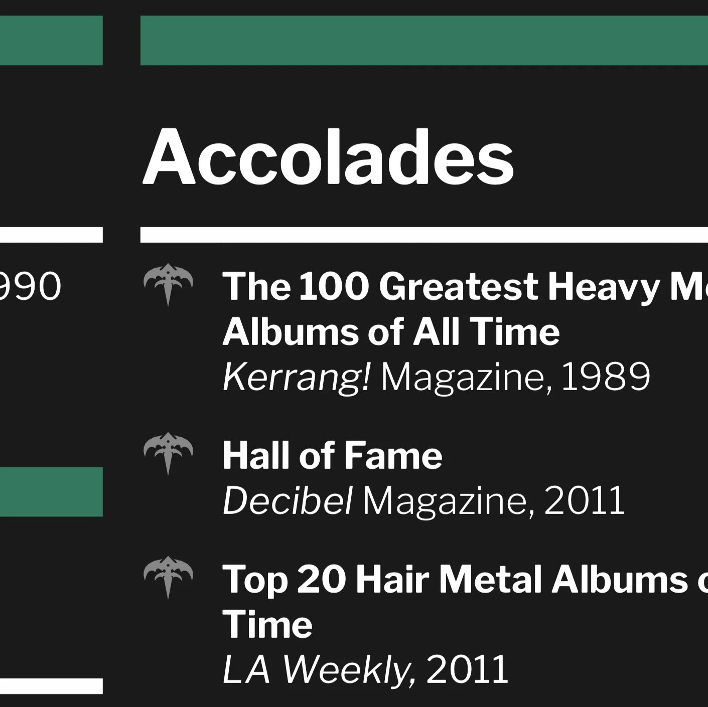
iconography
-
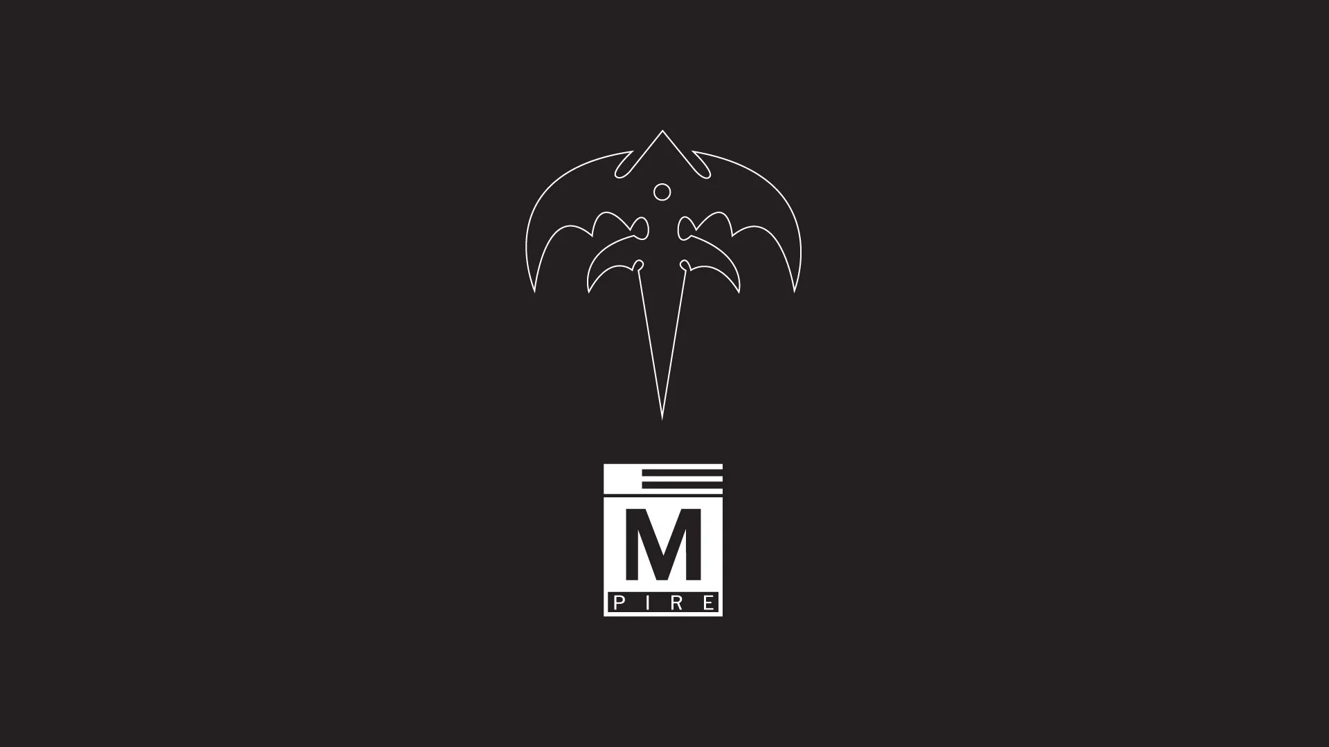
The iconography for this project builds directly from Empire’s original visual language, then pushes it into a cohesive, modern system fit for a large-format book. Rather than treating the album’s symbols as relics, the design treats them as functional tools—anchors for navigation, hierarchy, and rhythm. Each icon is reinterpreted with cleaner geometry, lighter weight, and modular usage so it can flex between chapter markers, data visualization, and narrative breaks. The result is a set of symbols that feel unmistakably Queensrÿche, but now operate with the precision of a contemporary identity system.

The so-called Tri-Rÿche symbol is reimagined as a hollowed, line-weight icon that feels more architectural than ornamental. Opening up the form allows it to breathe on the page and punch through dense layouts without overwhelming them. In practice, it becomes a visual “spotlight”—a recurring anchor used for chapter openers, pull-quote frames, and structural transitions. Its familiarity keeps the reader oriented, while its stripped-down style keeps the system crisp and modern.
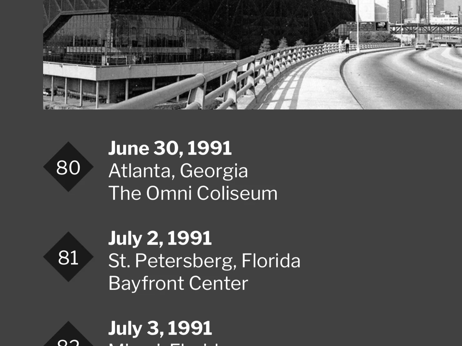
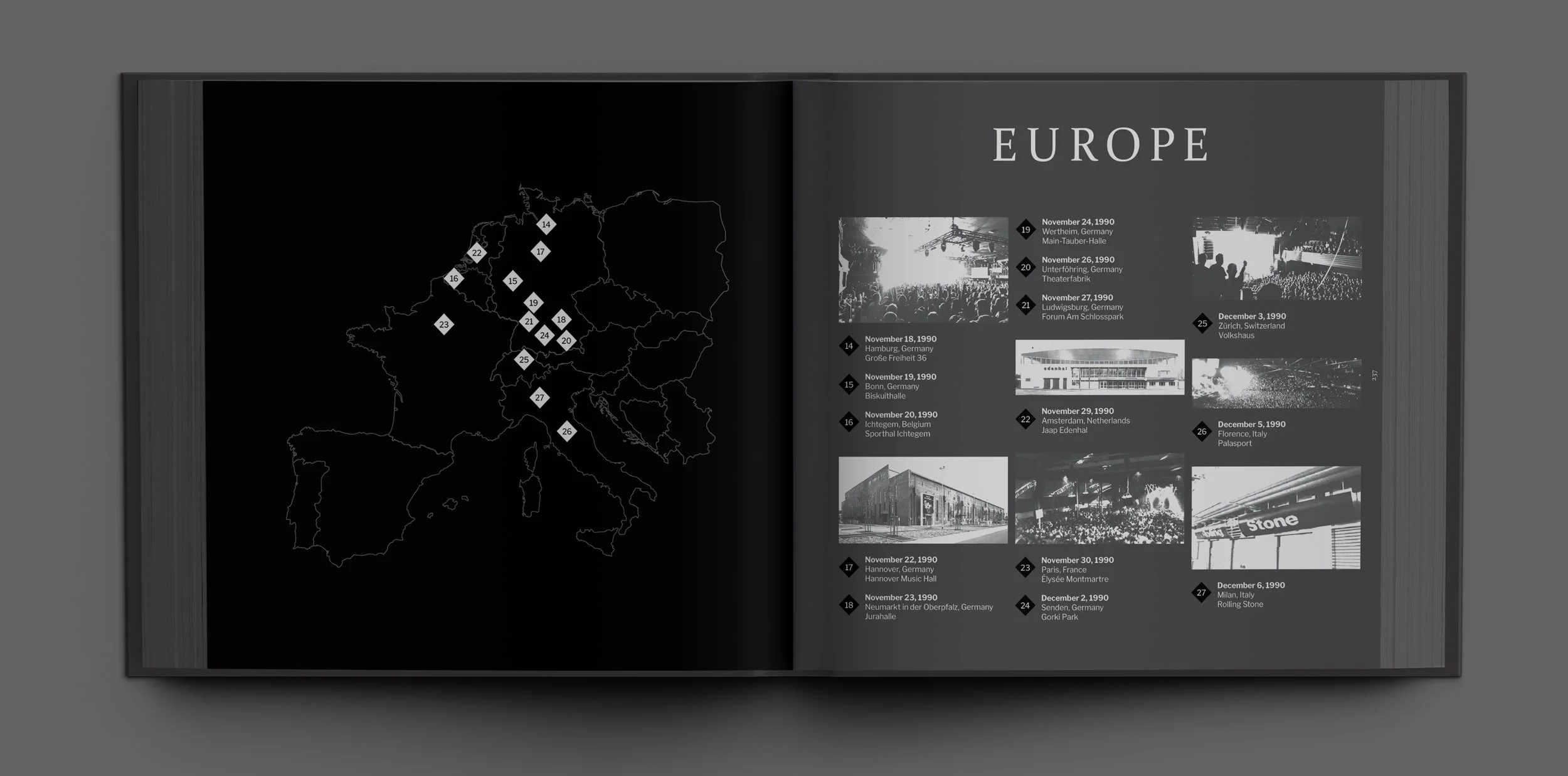
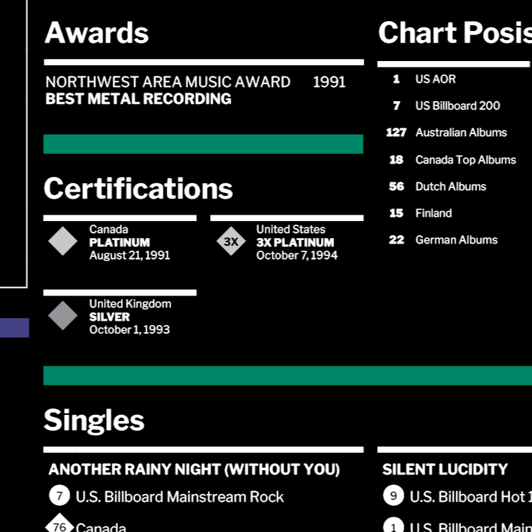
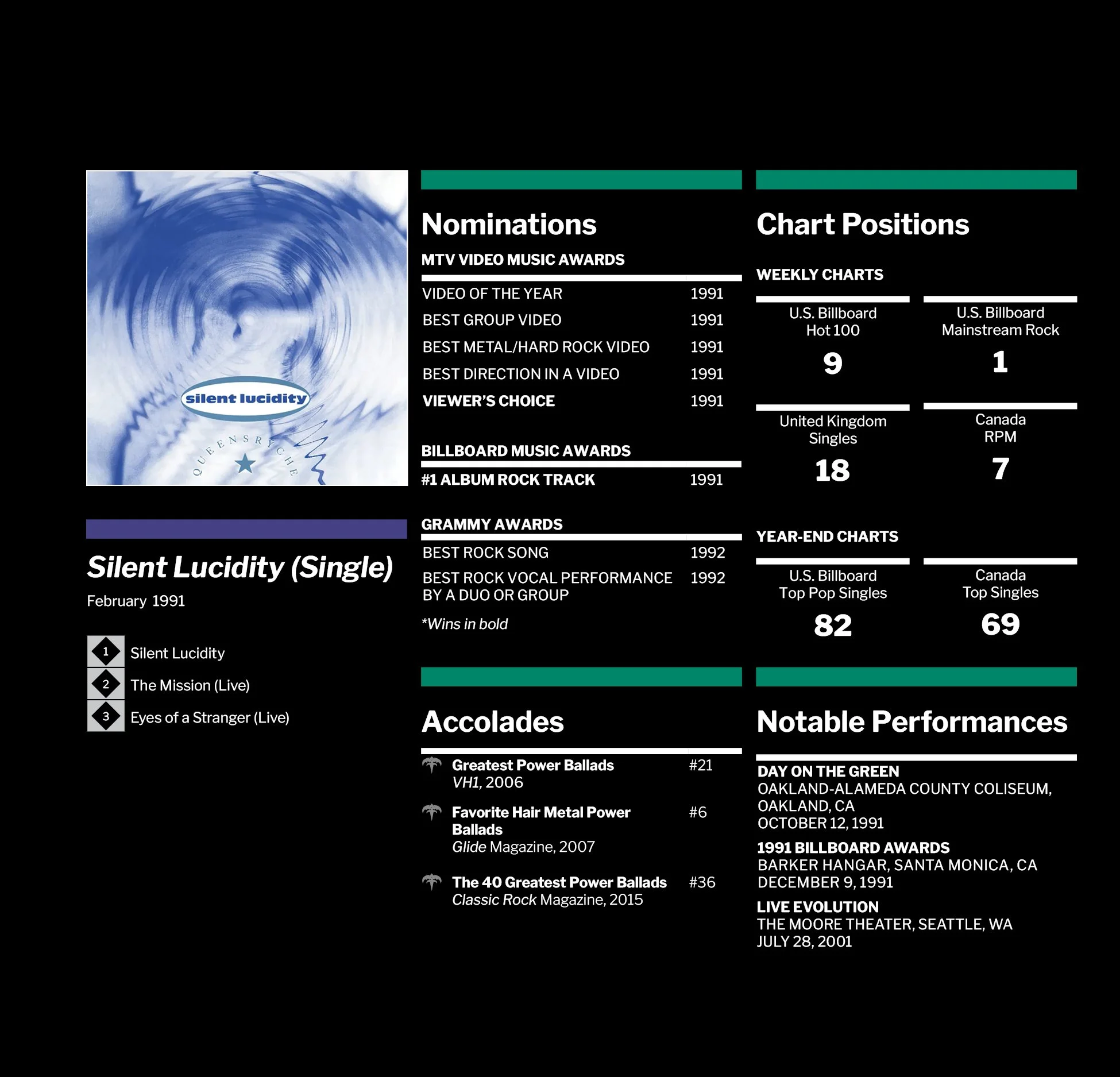
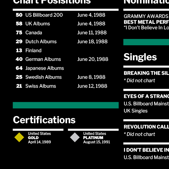
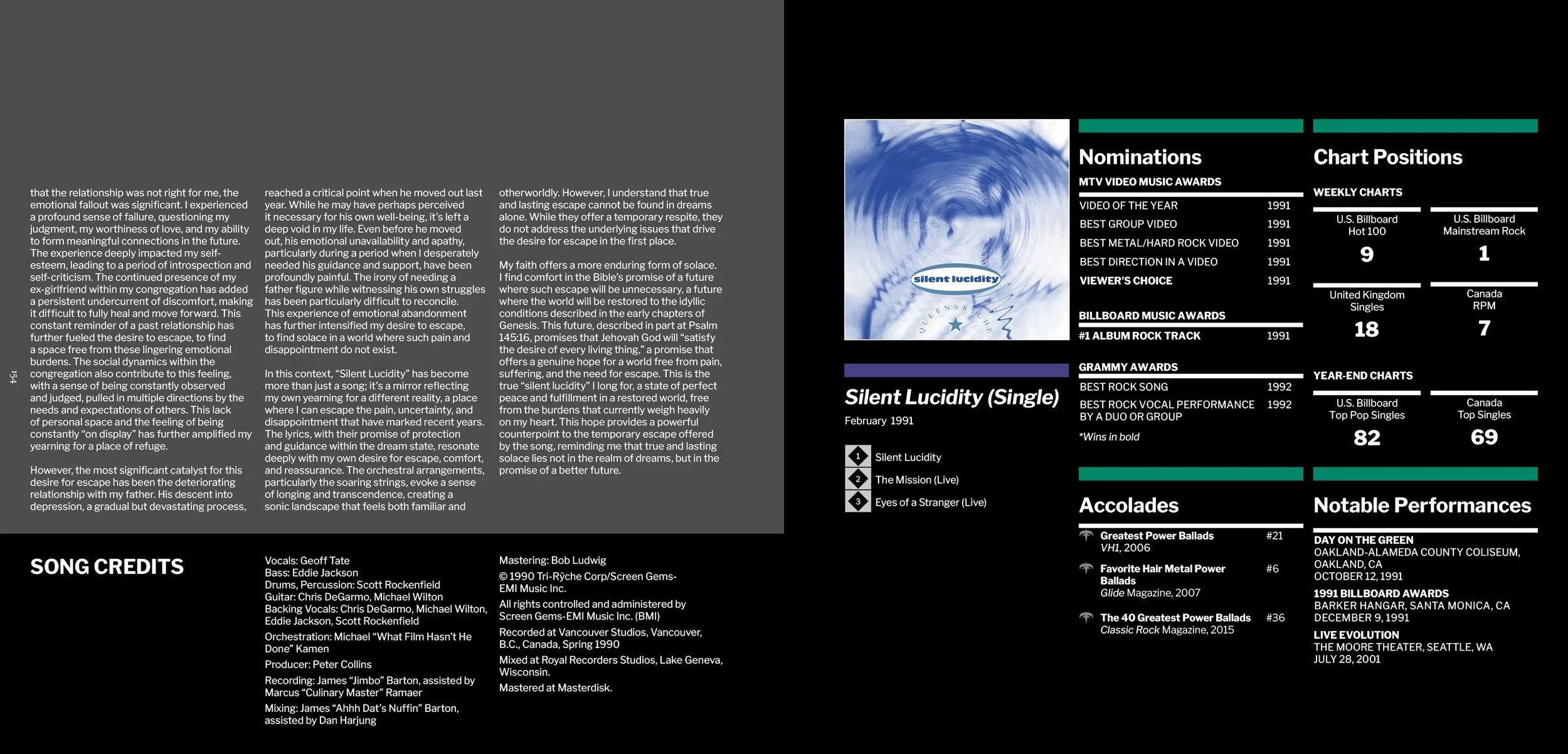
Originally created to number the album’s tracklist, the diamond-framed numerals are expanded into a full typographic numbering system across the book, giving it new life in the form of timelines, tour dates, chart positions, and sidebars. The shape gives an unmistakable nod back to the original 1990 package design, and it acts as a subtle through-line—bridging archival material with new editorial structure.
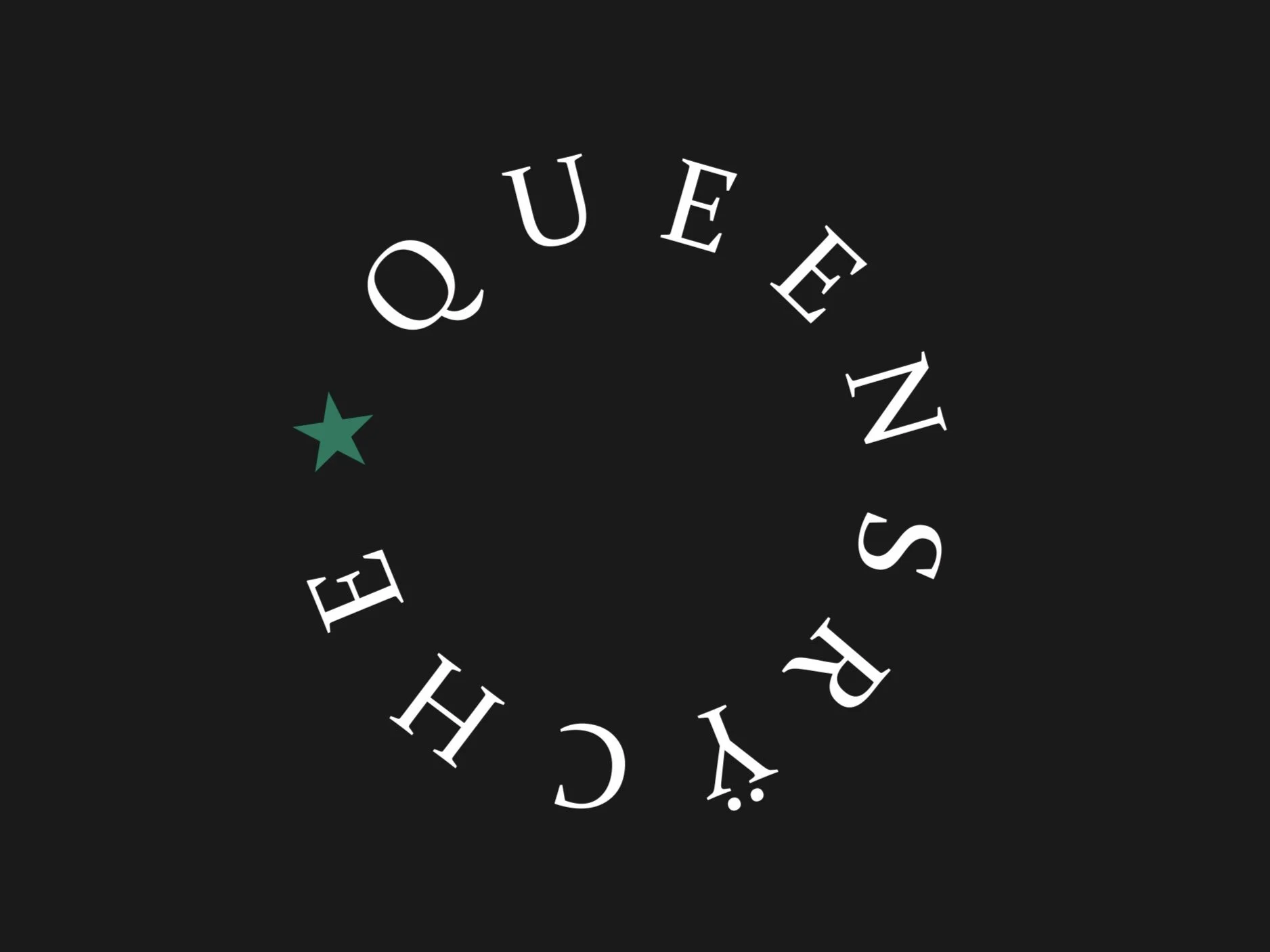
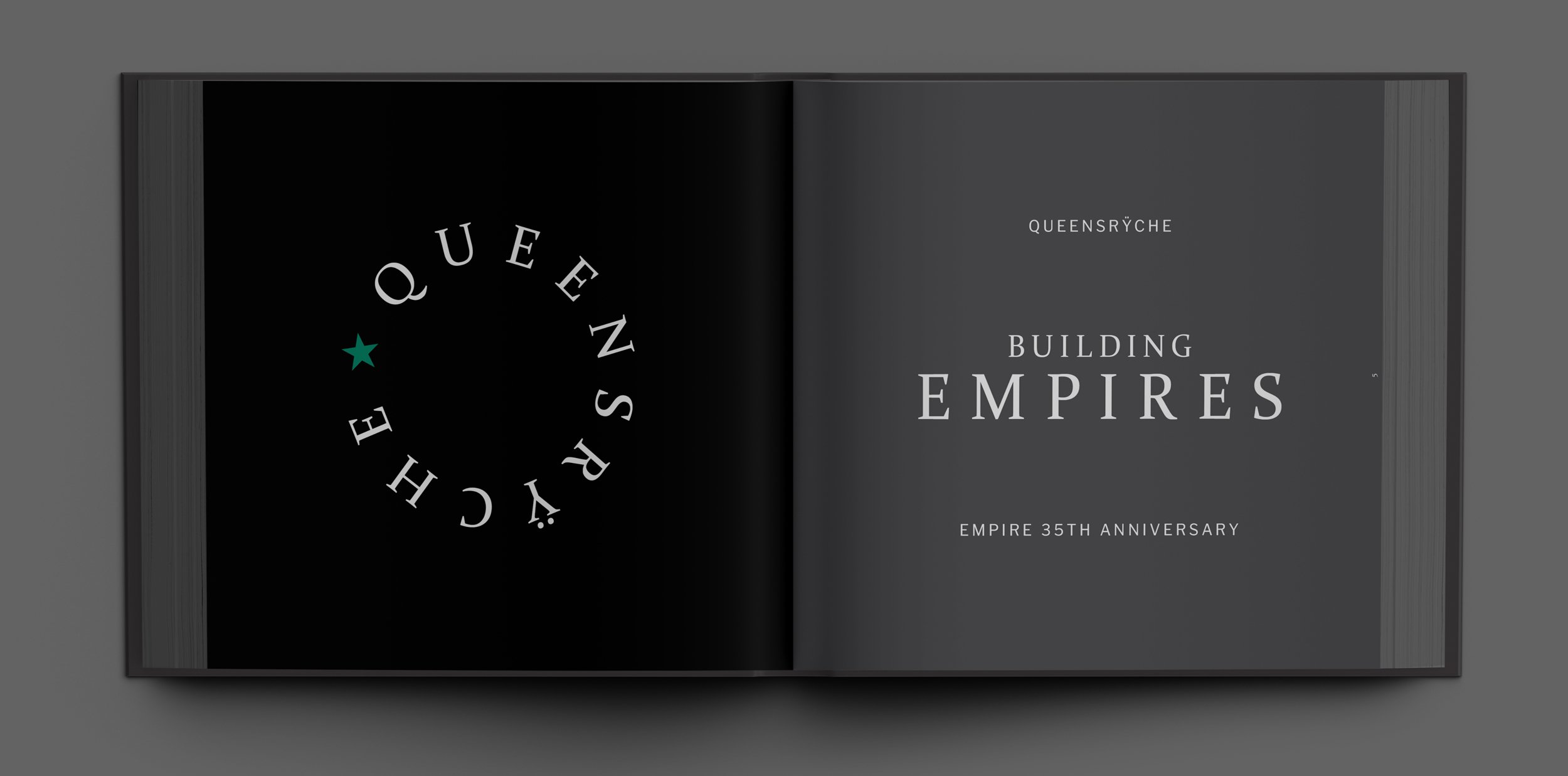
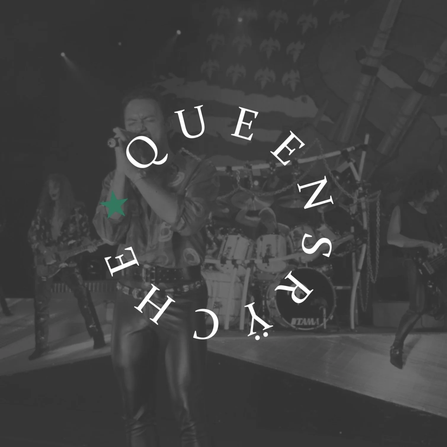
The circular Queensrÿche path-logo with the punctuating star is used sparingly but purposefully, functioning like a thematic “stamp” within the system. Its presence at the beginning and end of the book creates a quiet bookend effect—an emblem that hints at journey, orbit, and return. It also works as a flavor element throughout, grounding whitespace, and adding a touch of mystique without stealing focus. By keeping its usage minimal and symbolic, the icon reinforces the book’s tone while giving the overall system a sense of closure and continuity.

COLOR
-
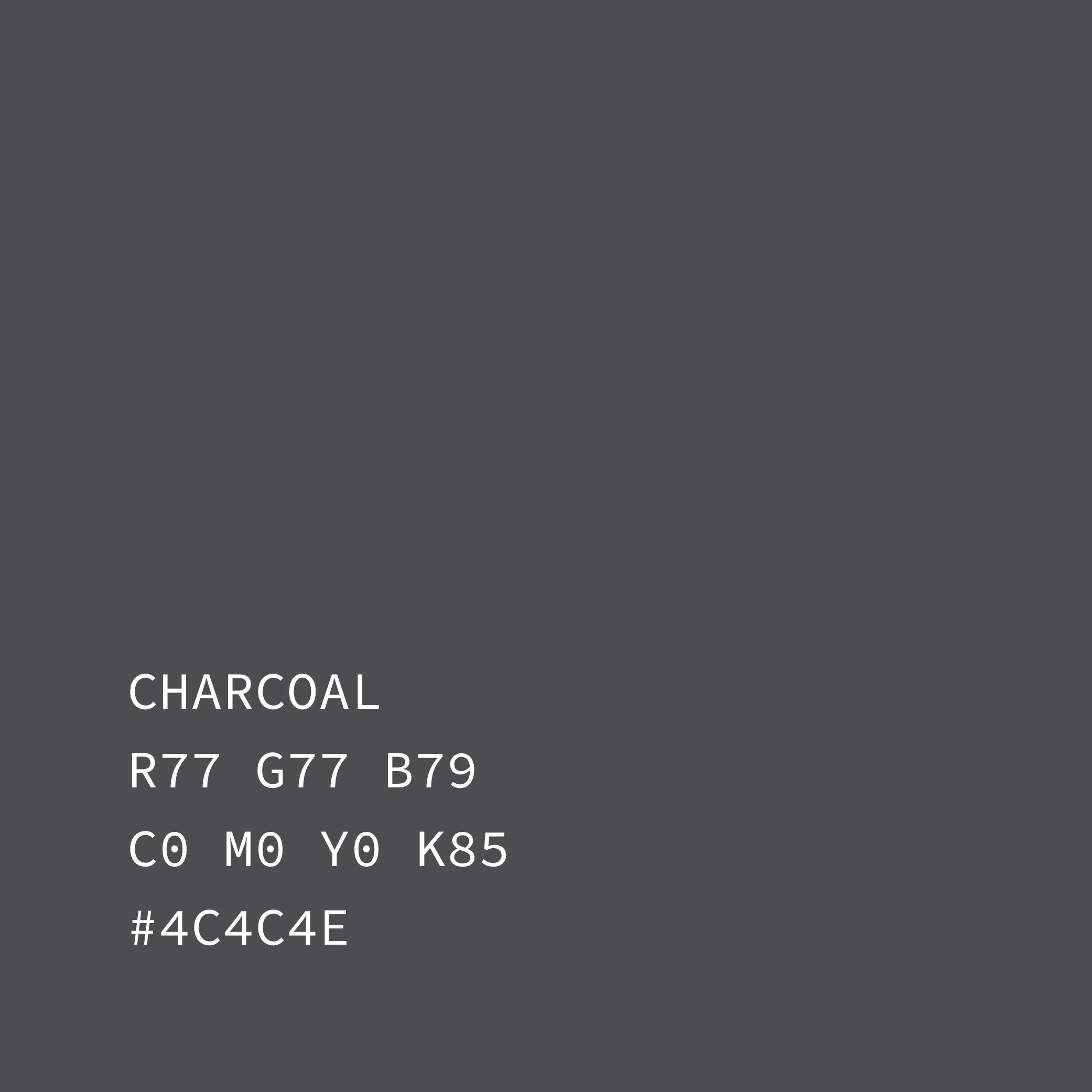
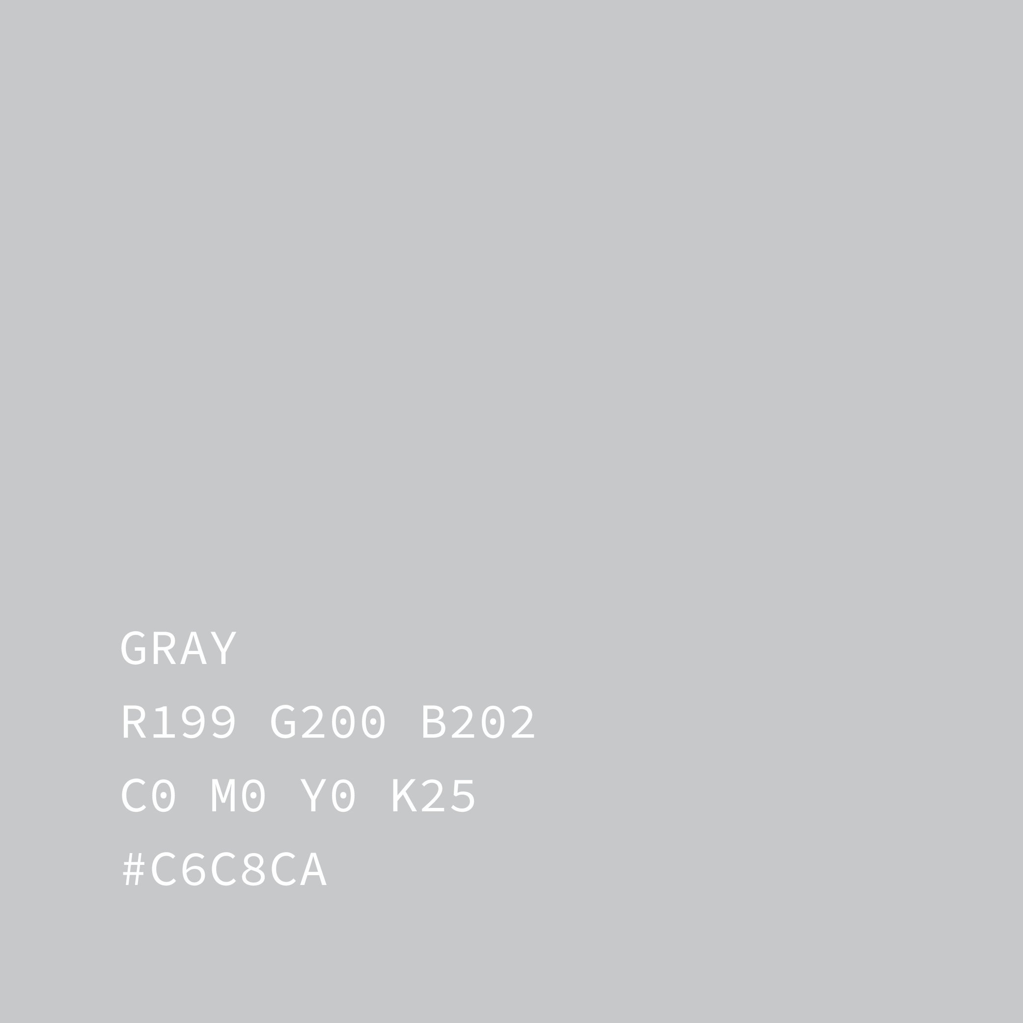
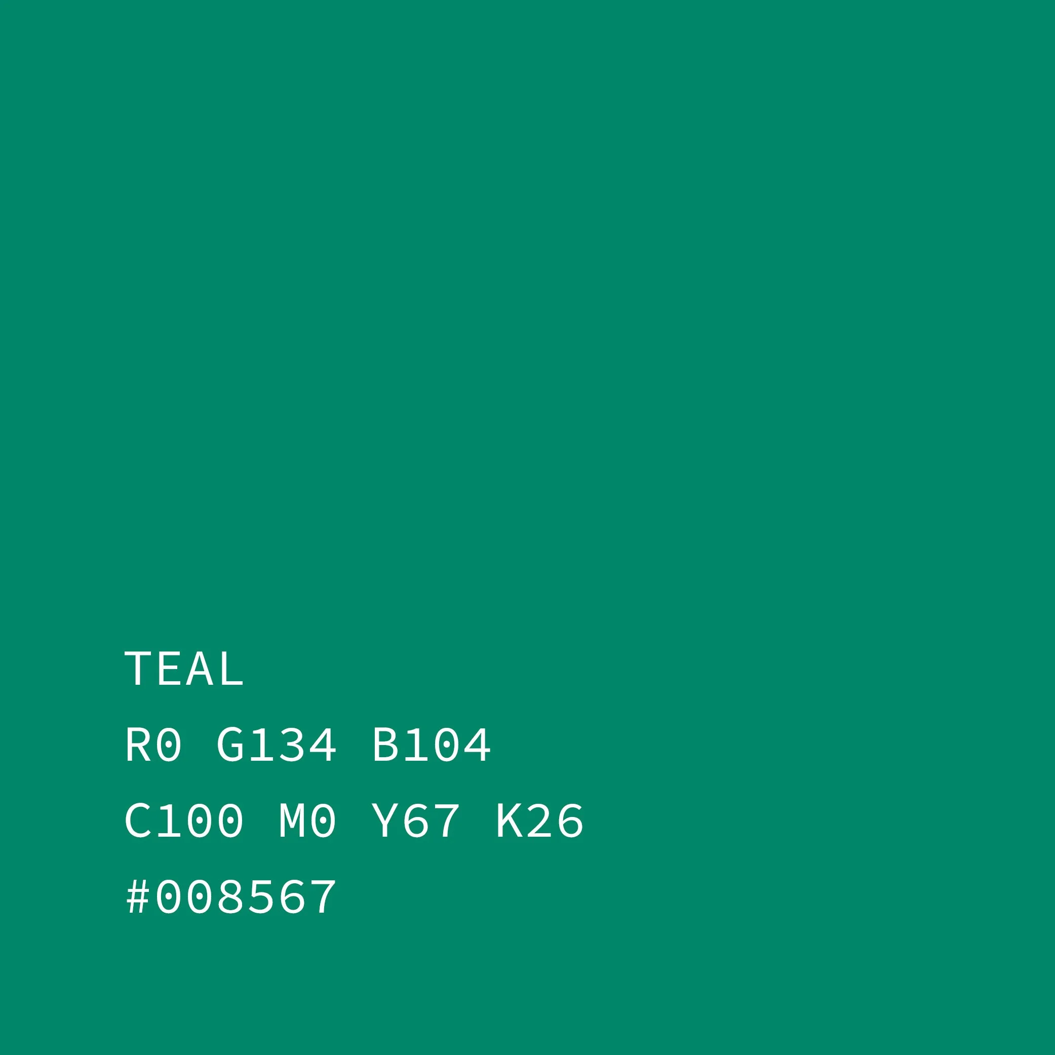
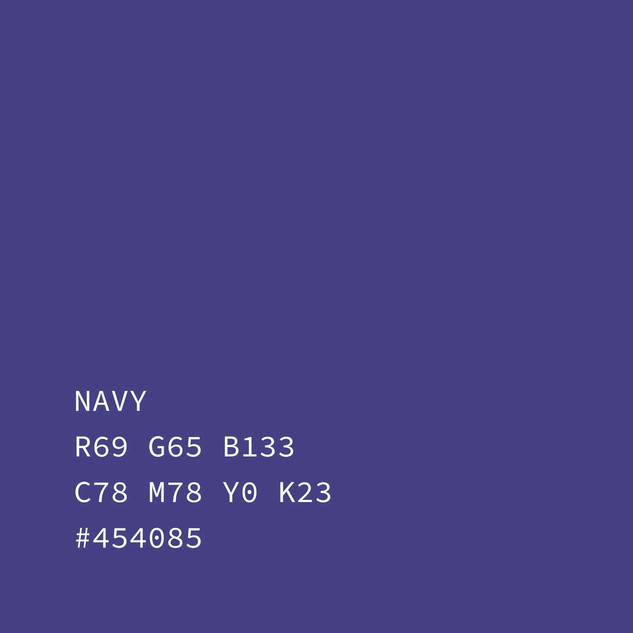
The color palette expands on Empire’s original tones, refining them into a flexible, modern system. Black, charcoal, and medium gray form the backbone of the layouts—quiet, neutral backgrounds that let dense archival content sit comfortably on the page. Teal and navy serve as controlled accent colors, used sparingly for rules, icons, and key navigational elements to give moments of contrast and momentum. Additional color enters the system organically through album art, single covers, and other archival materials, creating subtle bursts of energy without overwhelming the editorial tone.

layout system
-
The book is built on a flexible six-column grid, giving each spread a strong underlying structure while still allowing for expressive variation. Core text is divided into three balanced columns, anchored by a lowered hang line that introduces extra breathing room—creating a calmer, more atmospheric reading experience and giving imagery and bold headers space to shine. Most images are centered to maintain visual stability, but the grid is intentionally pushed and pulled throughout: asymmetric compositions, full-bleed moments, and five-column offsets break the rhythm in purposeful ways. On pages with light content—such as infographics or single-release data—the system loosens entirely, allowing centered, minimal layouts to carry more impact and serve as visual rest stops within the book’s flow.
photography
-
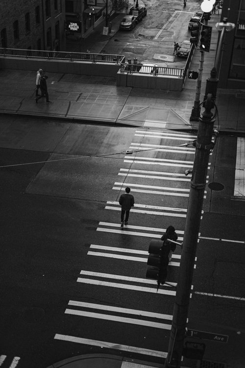
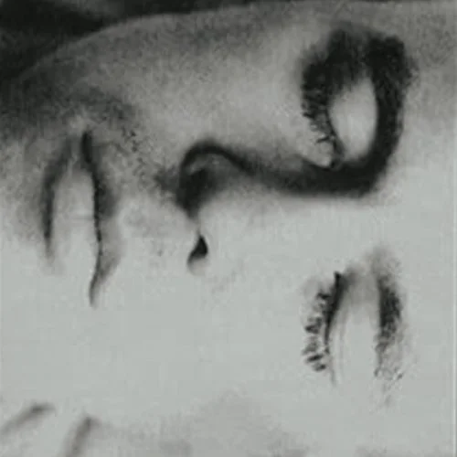
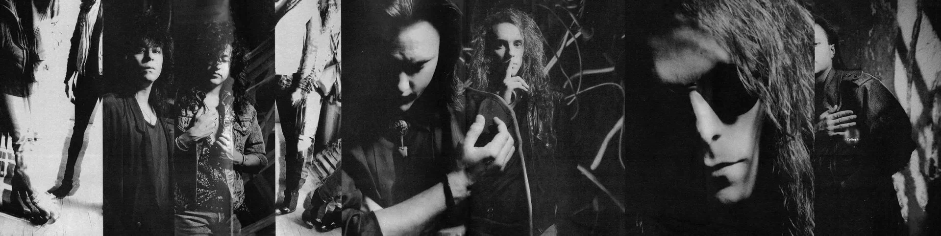
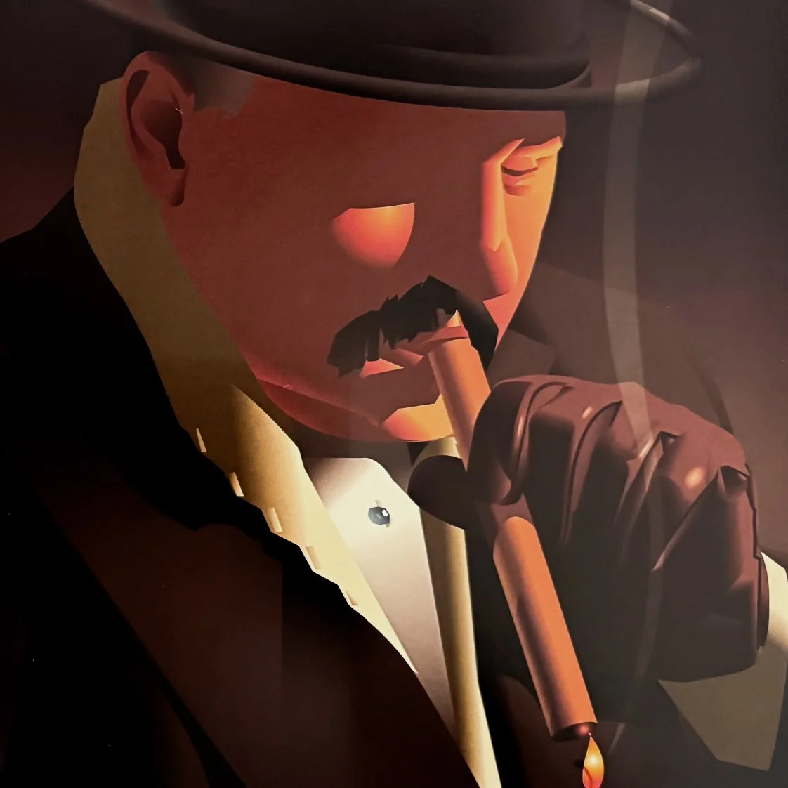
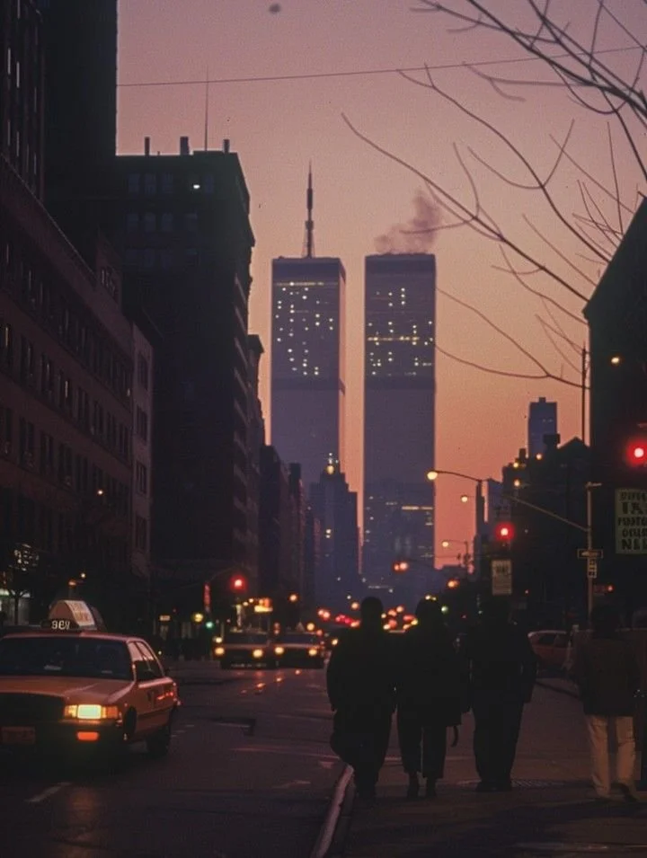
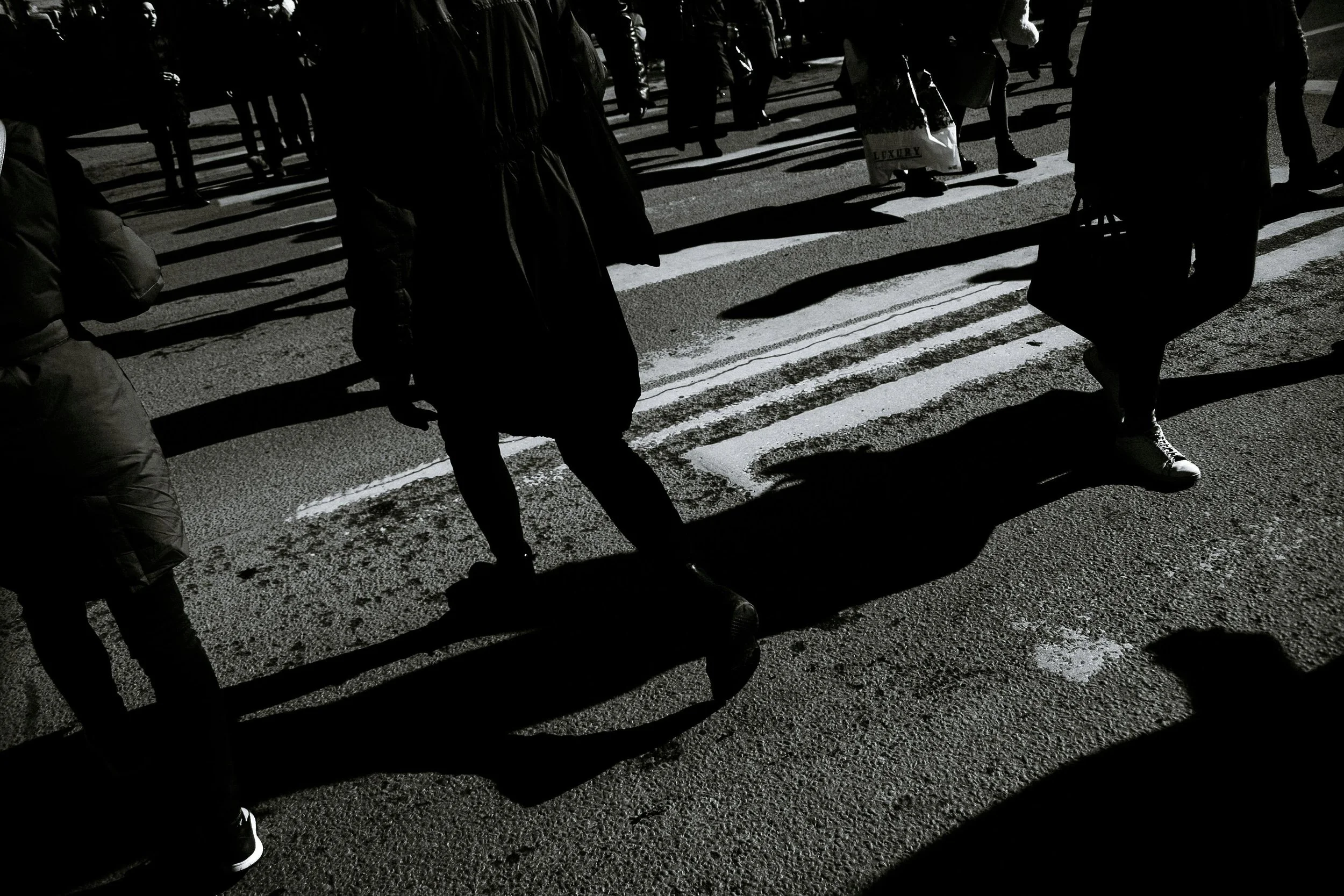
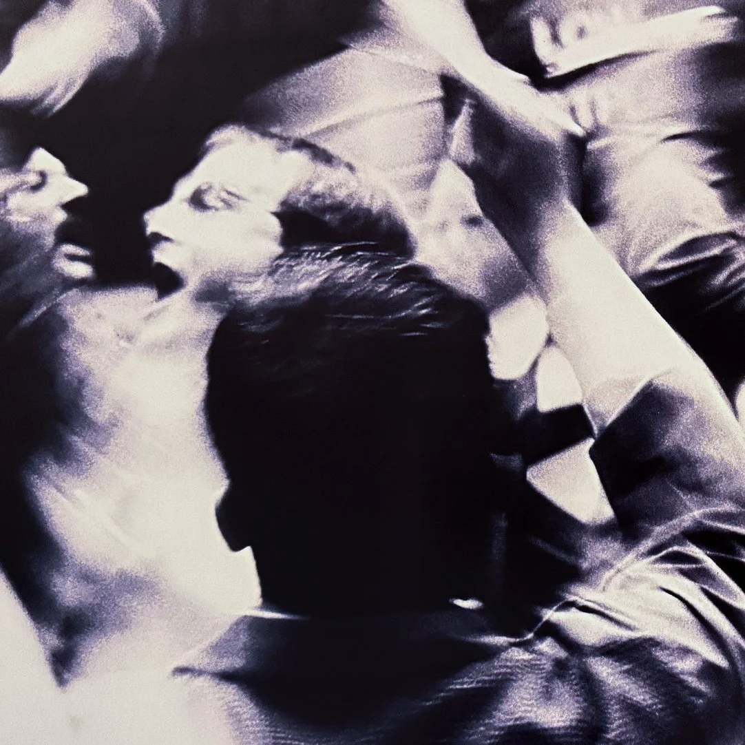
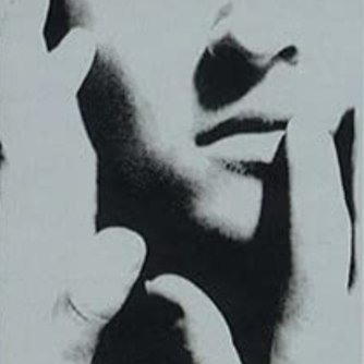
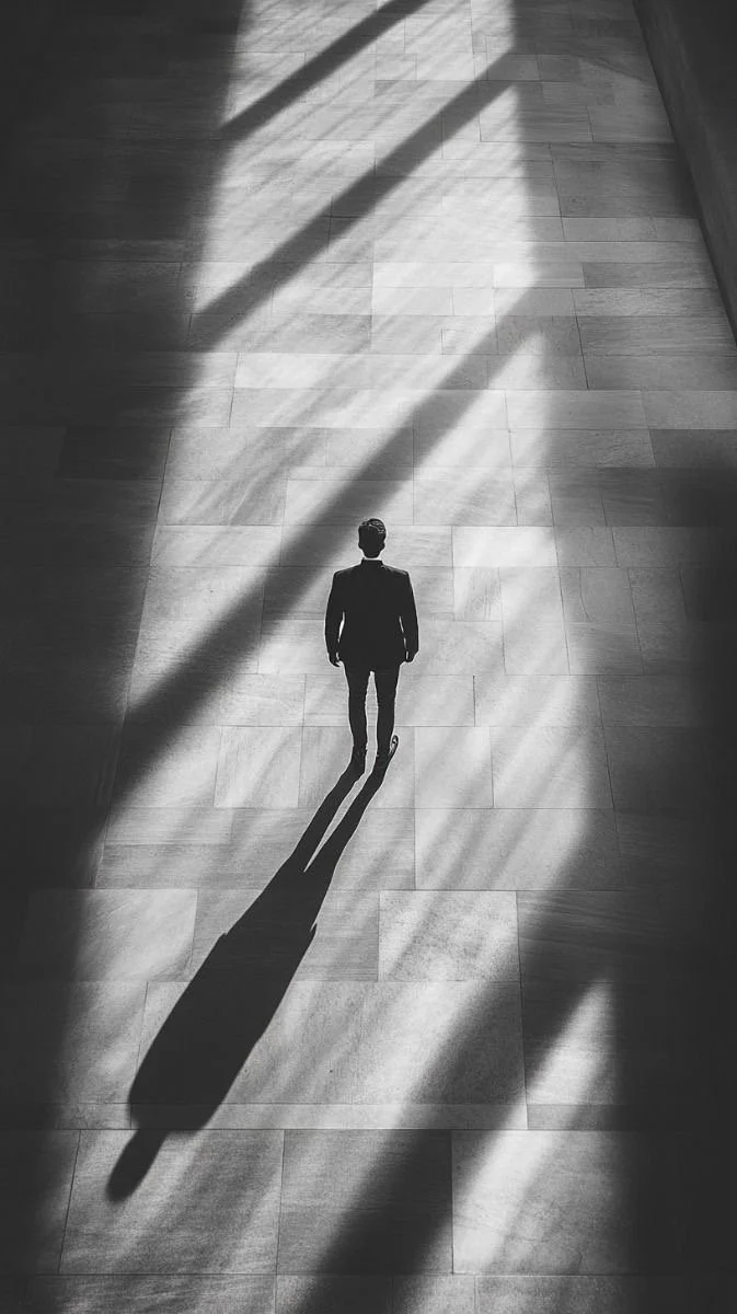
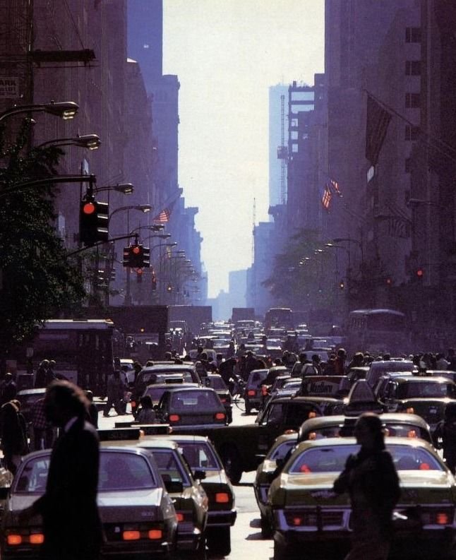
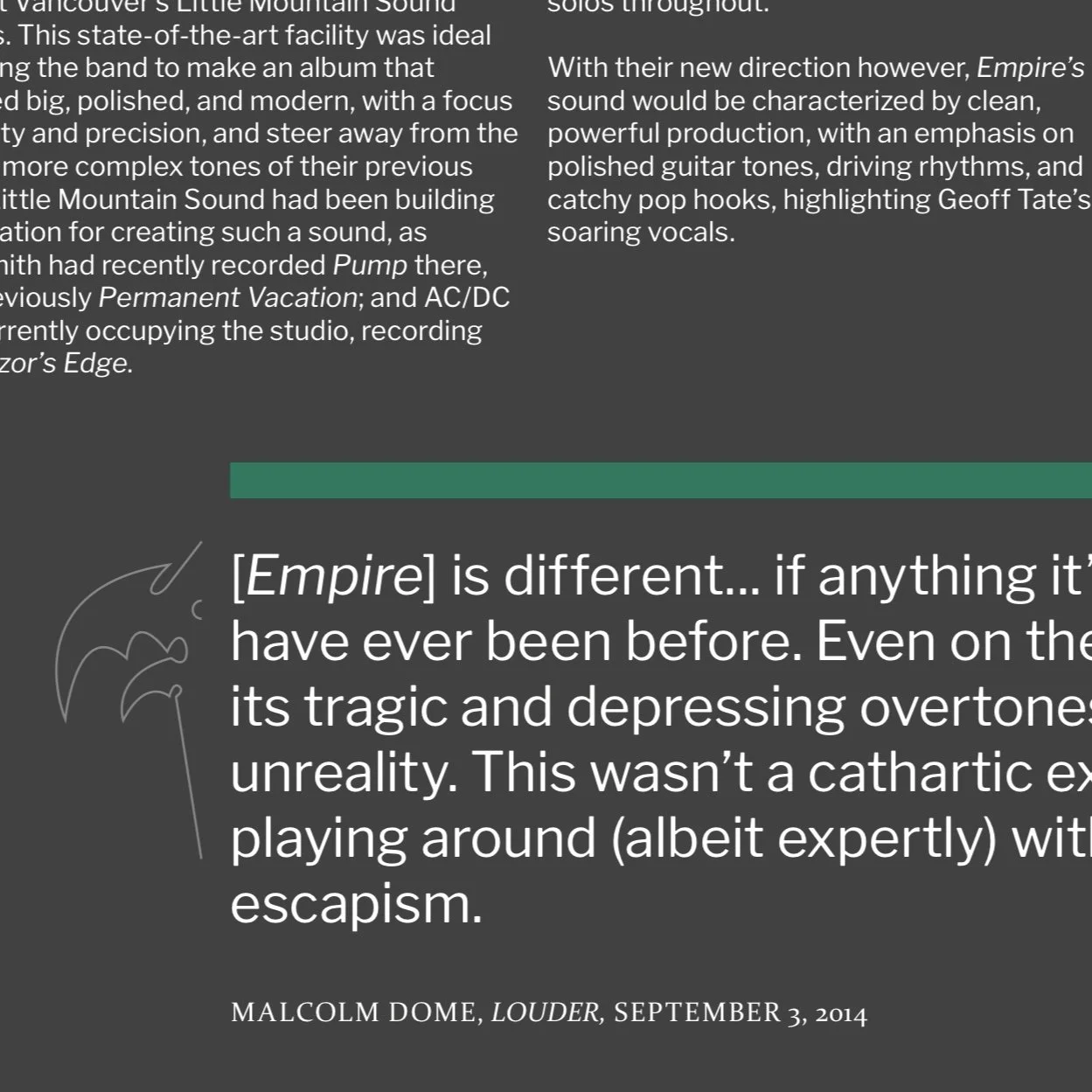
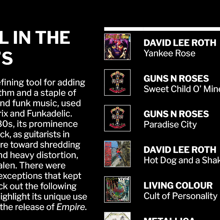
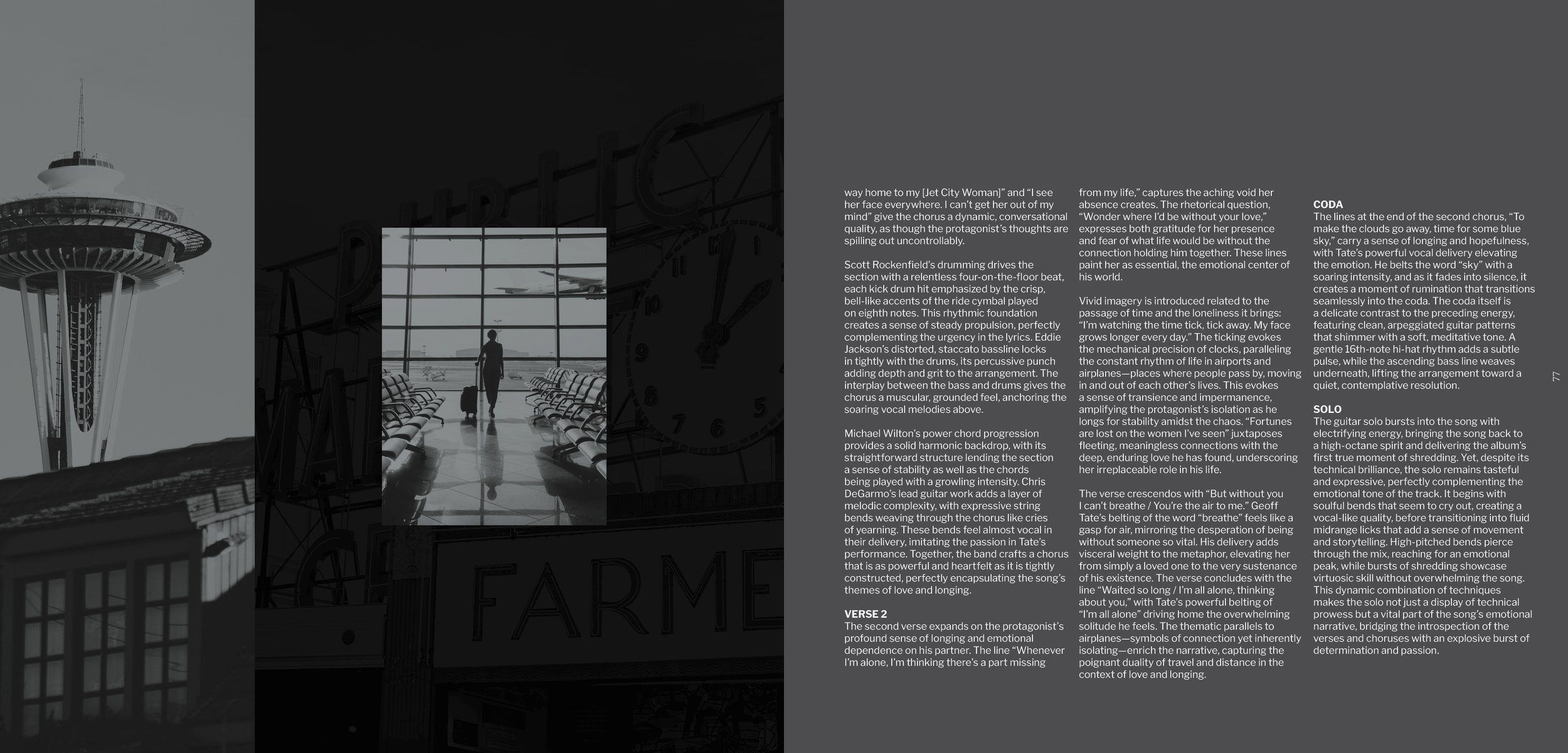
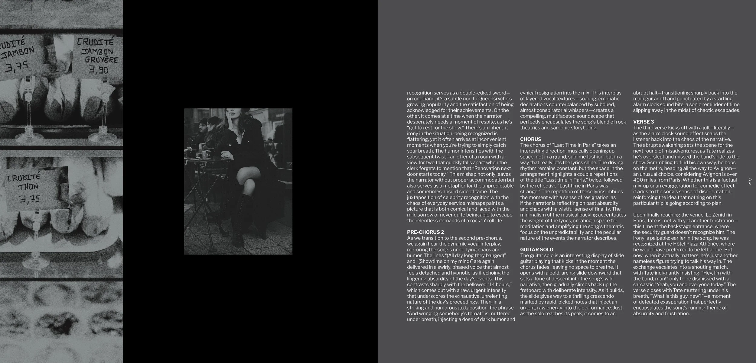
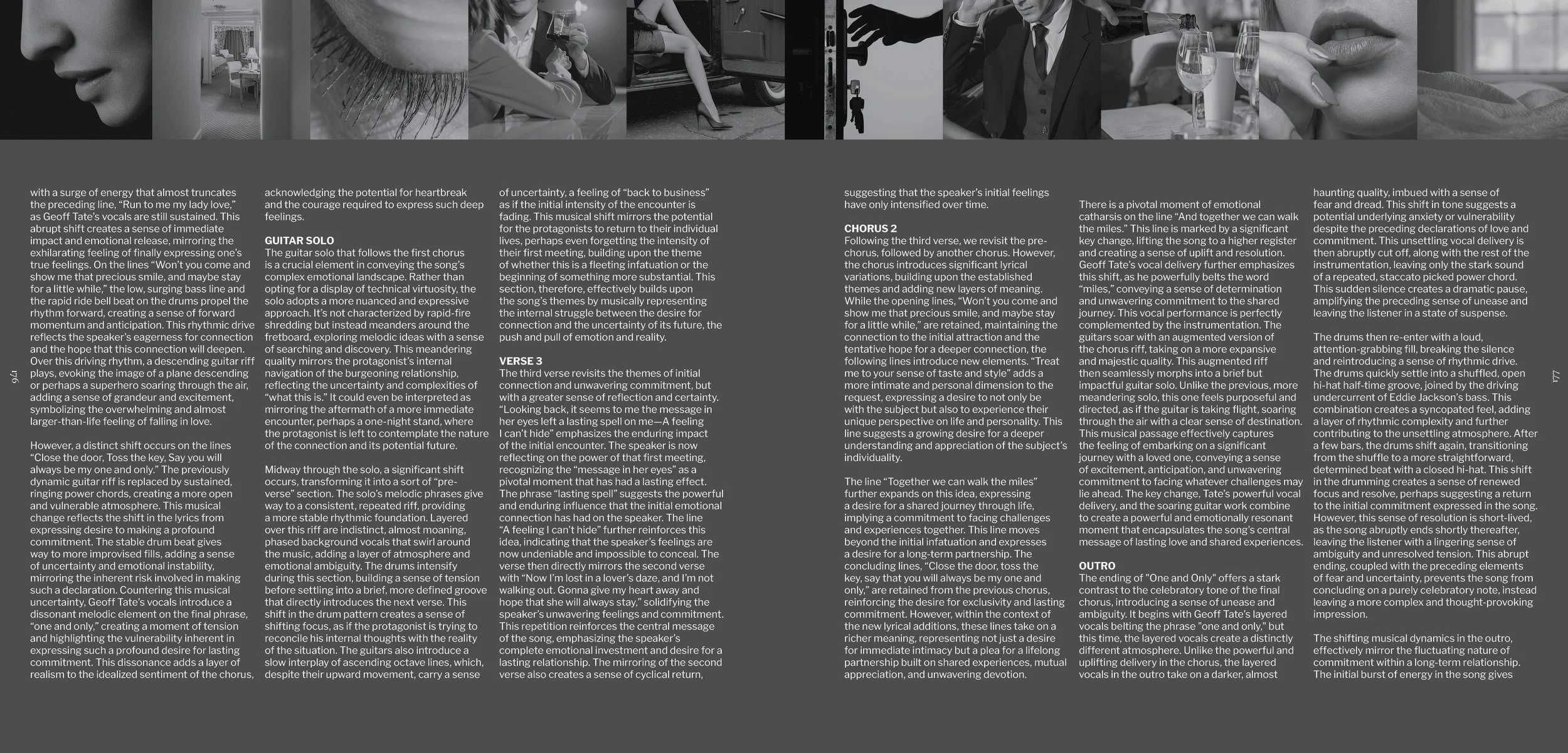
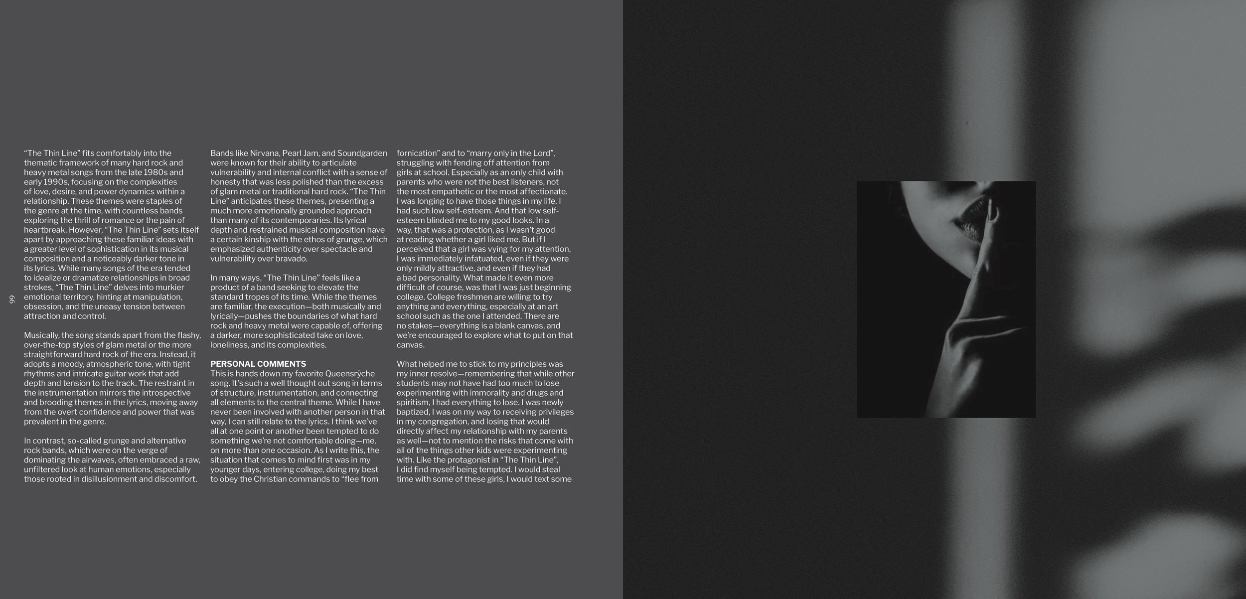
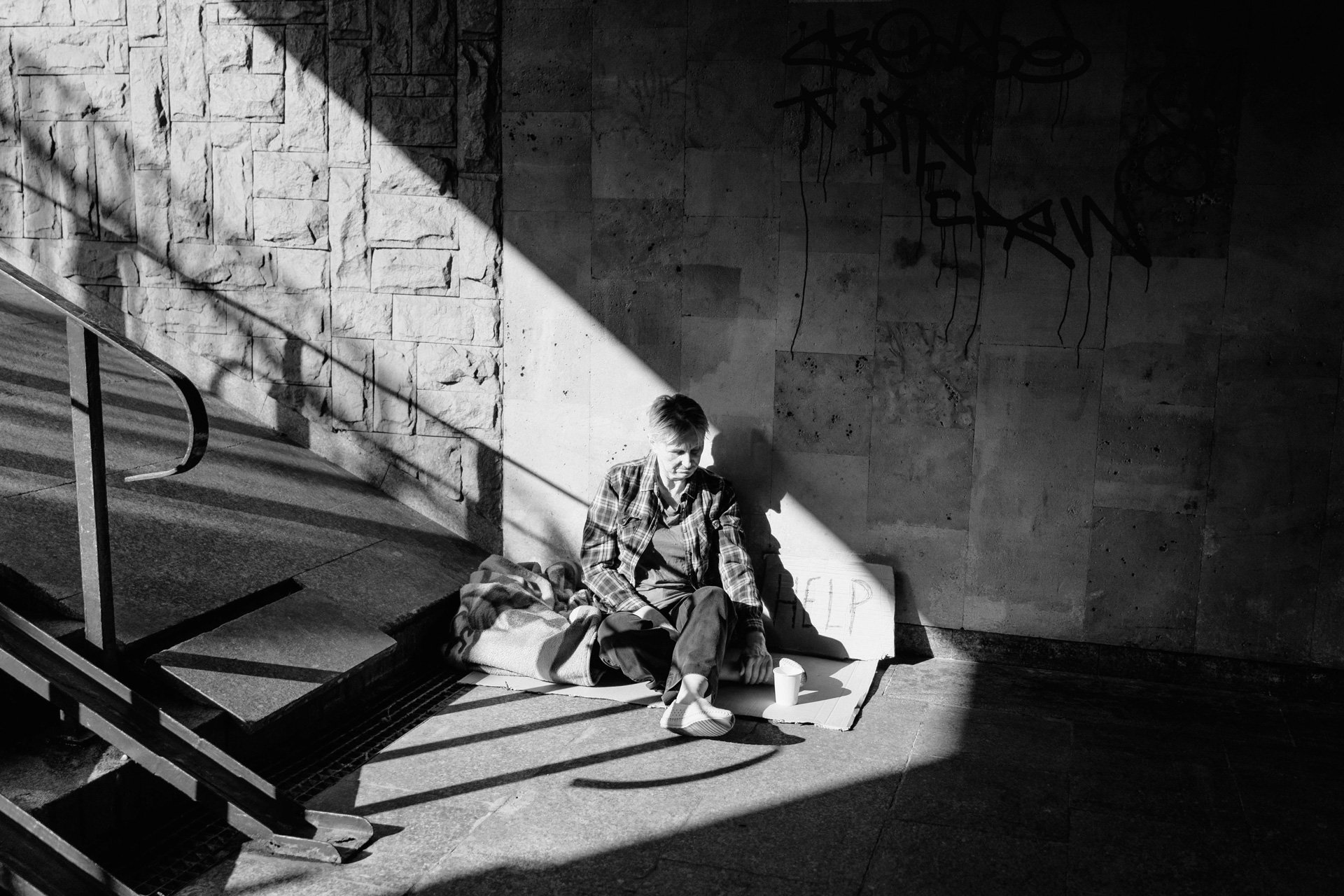
The photographic direction draws heavily from Empire’s original visual mood, reinterpreting it through a contemporary, cinematic lens. Silver-toned overlays, obscured subjects, and incomplete faces create a sense of distance and anonymity, echoing the album’s themes of isolation and societal unease. Wide, atmospheric landscapes and soft-focus details build a world that feels both expansive and eerily empty—grand in scale yet emotionally hollow. Together, these images form a visual undercurrent that runs through the book: melancholic, ominous, and quietly overwhelming in a way that mirrors the music’s tension.
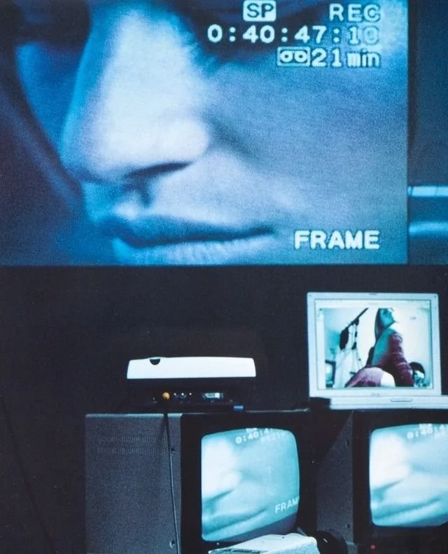
INTRODUCTION VIDEO
-
To extend this project beyond the printed page, I created a short motion piece that captures the atmospheric world surrounding Empire. Inspired by the pacing of early 90s Nike commercials and the stark contrast of film noir, the video stitches together archival album imagery, newly designed assets, cityscapes, and selective clips from music videos to establish a fast-paced and moody visual rhythm. The goal was to distill the album’s tension—its scale, grit, and melancholy—into a kinetic introduction that sets the tone for the full retrospective experience. Built in Canva, the piece blends typography, texture overlays, and rapid-cut sequencing to create a cohesive motion identity that complements the broader design system.
This project began as a nostalgia-driven passion piece, but quickly evolved into a broader exploration of what Empire still has to say in 2025. Reimagining the album as a visual experience became a study in branding, narrative structure, and the translation of music into a coherent design language. Through typography, iconography, photography, and motion, the work examines how a sonic world can be rebuilt as a visual one—immersive, intentional, and thematically resonant. Ultimately, the case study reflects a deeper inquiry into world-building in design: how to honor the past while crafting new contexts that feel relevant, expressive, and built for modern audiences.
