

M&E Products
Building a More Complete Digital Experience for an Established Wholesale Brand



M&E Products needed a website that better represented its business, organized a growing product catalog, and gave customers a clearer path from discovery to purchase. I designed and built a responsive e-commerce experience that extended the existing brand into a more cohesive digital system.
TIMELINE2026
MY ROLEUX/UI
Content
E-Commerce
Web Design

Extending the Brand Beyond the Logo
M&E Products already had an established identity and a specialized product offering, but its digital presence did not fully communicate the breadth or professionalism of the business. The opportunity was not to reinvent the brand, but to extend it—creating a website that felt like a natural continuation of M&E while making its products easier to understand, browse, and purchase.
I worked directly with the client throughout the project, helping define the site structure, organize product information, develop content, establish the visual direction, and build the final ecommerce experience. The result was a more complete expression of the M&E brand and a platform the business could continue managing after launch.

MY PROCESSUndertand
I worked directly with the client to understand the business, product offering, customer needs, and limitations of the existing digital experience. Reviewing available content and product information helped define a clearer site structure and identify opportunities to strengthen both navigation and presentation.
Organize
A major focus was turning a varied product catalog into a repeatable content system. I established clearer categories, consistent product-page structures, and a hierarchy for descriptions, specifications, imagery, pricing, and supporting information.
Extend the brand
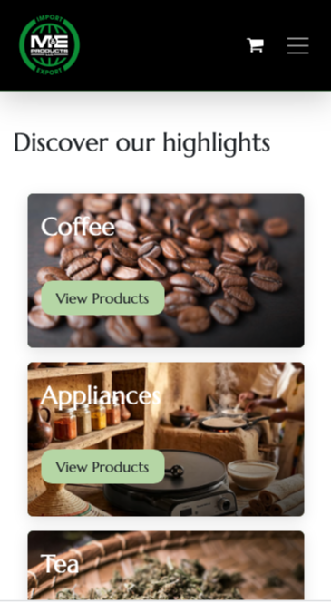
Rather than redesigning M&E’s identity, I translated it into a broader digital language—using typography, color, spacing, imagery, and interface patterns to create a cohesive e-commerce experience across desktop, tablet, and mobile.
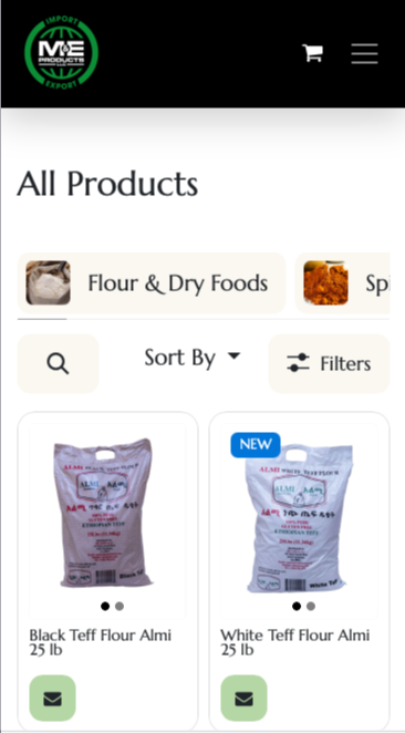
The site architecture was designed around how customers encounter M&E’s products rather than simply reproducing an internal catalog structure. Clear categories, consistent naming, and repeatable layouts create predictable paths from browsing to detailed product information.
PRODUCT DISCOVERY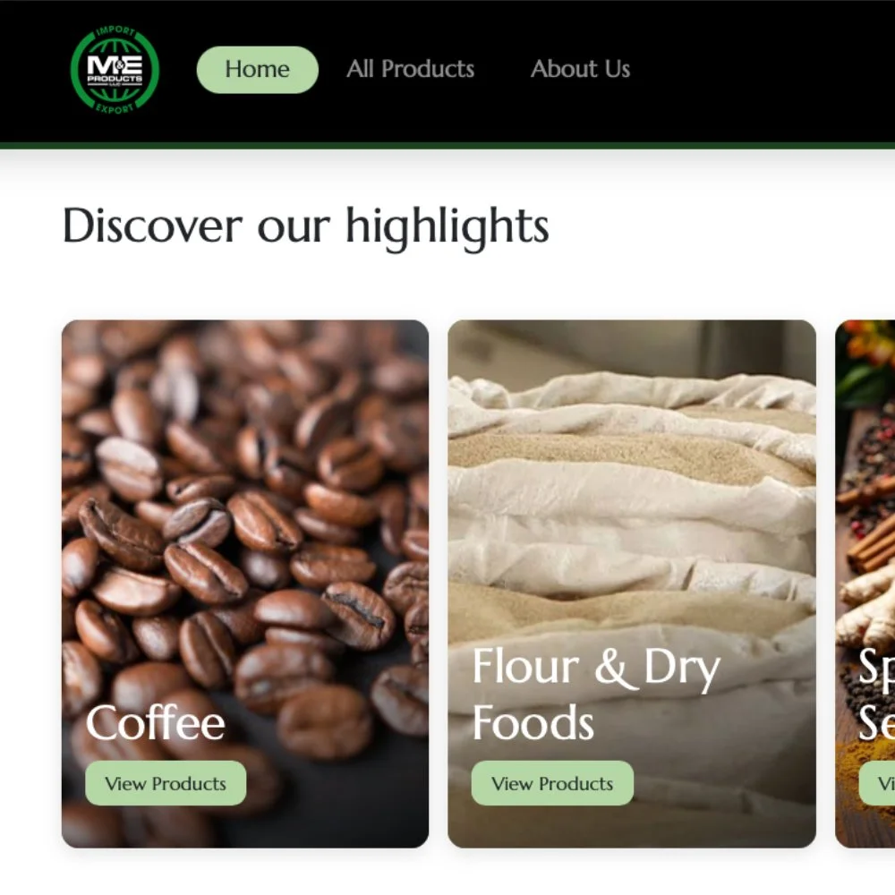
Navigation
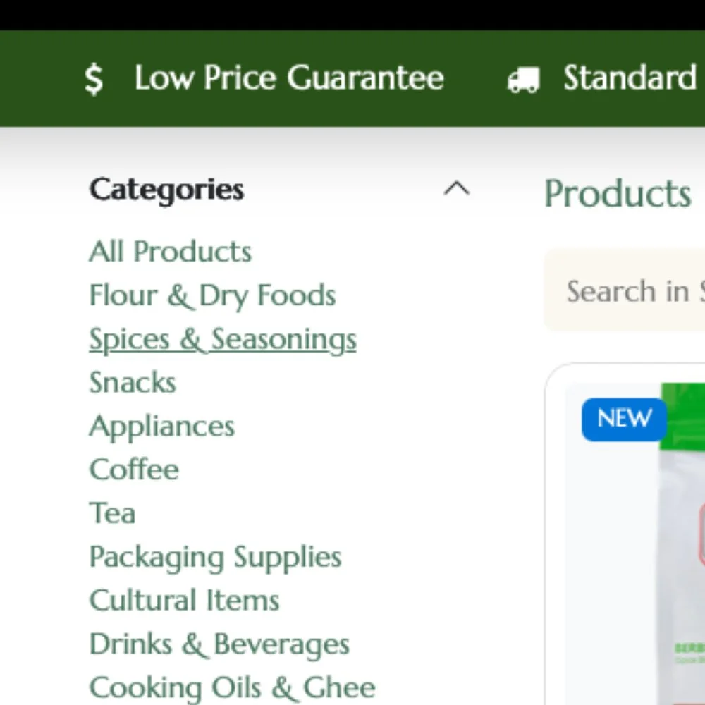
Product Categories
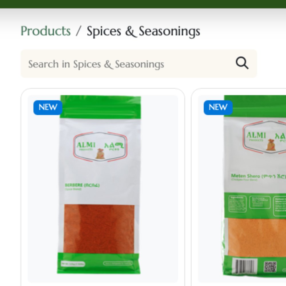
Search
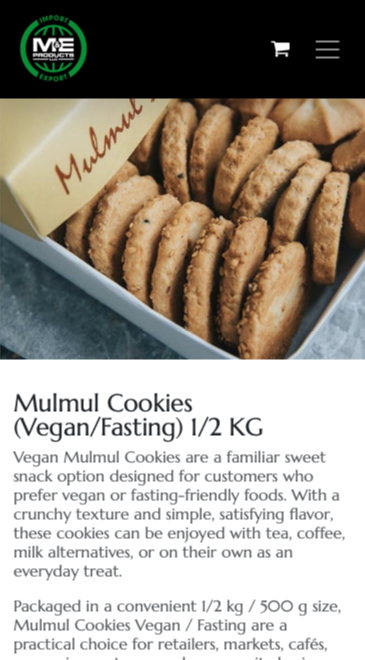
I created a reusable product-page system that could accommodate different product types while maintaining consistent presentation across the catalog. Specifications, descriptions, imagery, pricing, and purchasing information follow a shared hierarchy, allowing the site to grow without requiring each new product to become a new design exercise.
PRODUCT FRAMEWORK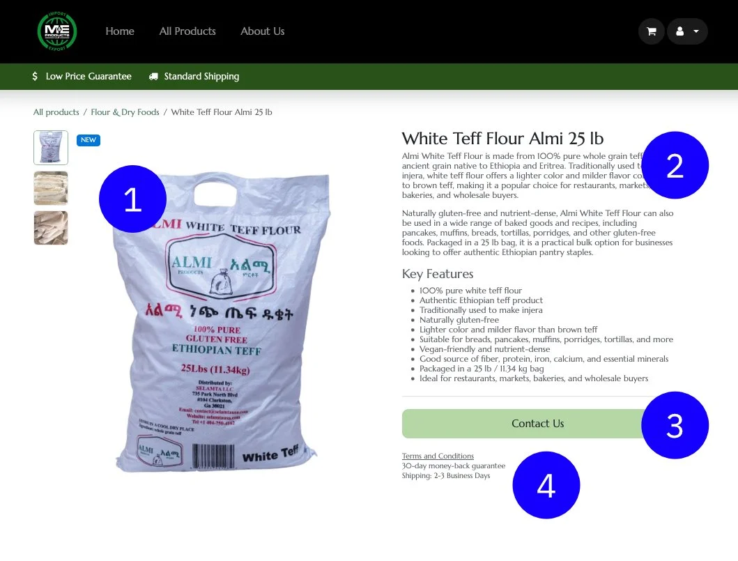




Product Imagery
Product Info
Purchasing Info
Shipping/Return Info
Responsive behavior was considered throughout the build so navigation, product discovery, and purchasing remained clear across desktop, tablet, and mobile—not simply compressed versions of the desktop experience.

Design Beyond the Interface
The project also included organizing product information, writing and refining product descriptions, configuring ecommerce content, and establishing consistent standards for future additions. The goal was to create both a better customer experience and a website the business could realistically maintain after launch.
OUTCOME